This appendix will provide ggplot example R code and output for of all the graphs that we might use this term. For further information, I highly recommend Kieran Healy’s Data Visualization book and Hadley Wikham’s ggplot2 book.
All the examples provided will use the standard example datasets that we have been working with throughout the term.
Barplots
Barplots are used to show the distribution of a single categorical variable.
You only need to specify the variable you want in the x aesthetic.
2
The geom you want is geom_histogram. You can vary the binwidth size with the binwidth argument. I am also using the col argument to change the color of my column borders.
Figure C.2: A histogram of movie runtime. Remember that you can (and often should) adjust binwidth size.
You can also calculate density instead of count, if you prefer, by adding the y=after_state(density) option to the aesthetics. Density is the proportion of cases in a bin, divided by the bin width. If you plot a histogram with density, you can also overlay this figure with a smoothed line approximating the distribution called a kernel density.
I use y=after_stat(density) to get density instead of absolute count. In practice the histogram will look the same, but this allows me to overlay the kernel density figure.
2
The geom_density geom will plot a kernel density smoother which basically just smoothes out a histogram. I made it semi-transparent with alpha=0.5 so that you can see the histogram beneath it.
Figure C.3: A histogram of movie runtime with a kernel density plot ovelayed.
Boxplots
You can also plot quantitative distributions using a boxplot.
We specify the variable we want with y not x. I also find it useful to set x="" to avoid odd tickmark labels on the x-axis.
2
The geom we want is geom_boxplot. I like making the outlier.color a bright color.
Figure C.4: A basic boxplot of movie runtime. Boxplots of single variables aren’t that interesting but can sometimes be useful for detecting outliers.
Comparative Barplots
Comparative barplots allow us to compare the distribution of two categorical variables. Basically, we plot the conditional distribution of one of these variables across the other variable.
By faceting
The first approach to the comparative barplot is to use faceting to make multiple panels.
The basic structure of the plot is identical to a univariate barplot.
2
We condition on a second variable by using the facet_wrap command to get separate plots by the categories of the other variable.
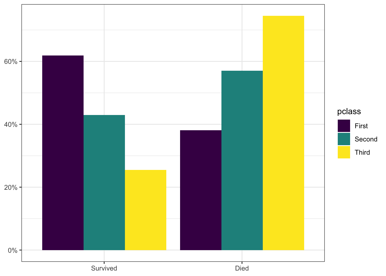
Figure C.5: A comparative barplot showing the distribution of survival on the Titanic conditional on passenger class. The technique here is to use faceting to create multiple panels.
By color
The alternative approach is to use a single panel, but have multiple bars for each group distinguished by color.
Instead of group=1 we group by the other variable and we also apply a fill (fill color) aesthetic based on that group.
2
If you don’t add position="dodge" as an argument, the bars will stack on top of each other, which will not look right.
3
Here I am using the built in scale_fill_viridis_d to get a nice color palette.
Figure C.6: A comparative barplot showing the distribution of survival on the Titanic conditional on passenger class. The technique here is to use faceting to create multiple panels.
Comparative Boxplots
Comparative boxplots are used to compare the distribution of a quantitative variable across the categories of a categorical variable.
The big change from a univariate boxplot is that we add the categorical variable as the x aesthetic. In general, its a good idea to reorder the categories of that categorical variable from highest median to lowest, as I do with the reorder command.
2
The coord_flip command is not always required but is useful if the category labels of your x-axis are running into one another.
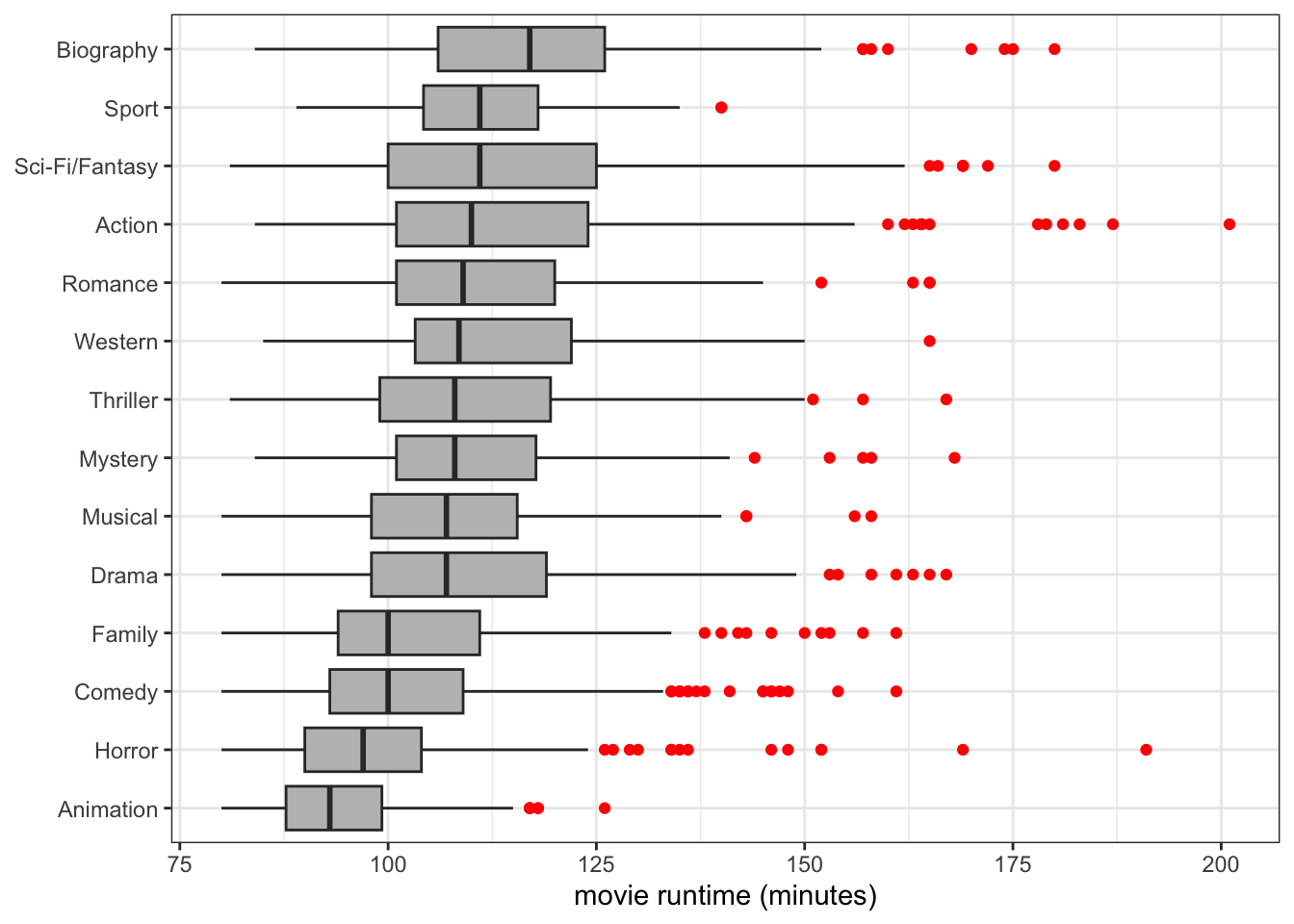
A comparative boxplot showing differences in movie runtime by genre. Note that I order the categories from highest median to lowest.
Scatterplots
Scatterplots are used to examine the relationship between two quantitative variables.
1ggplot(crimes, aes(x=unemploy_rate, y=property_rate))+2geom_point()+labs(x="unemployment rate",y="property crimes per 100,000 population")+theme_bw()
1
We specify the independent variable with the x aesthetic and the dependent variable with the y aesthetic.
2
The geom we want is geom_point.
Figure C.7: Scatterplot of the relationship between the unemployment rate and the property crime rate across US states.
Semi-transparency
With large datasets, a scatterplot can have a lot of overplotting with similar points next to each other or on top of each other which makes it difficult to see the density of points. One way to address this is to add semi-transparency to geom_point.
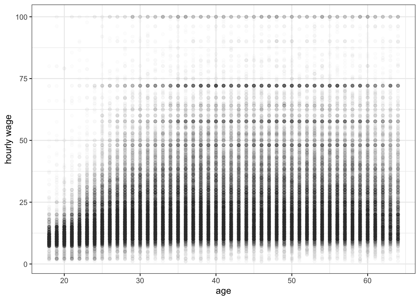
Figure C.8: Scatterplot of the relationship between age and hourly wage among US workers. Here I am using semi-transparency to see where the density of points is located.
Jittering
Another option to help with overplotting problems is to replace geom_point with geom_jitter that adds a little bit of random noise to each point. Often jittering and semi-transparency work well together.
Figure C.9: Scatterplot of the relationship between age and hourly wage among US workers. By jittering the points and making them semi-transparent, I can better see the “ridge” of values that rises slightly in younger age groups before leveling off.
Adding lines
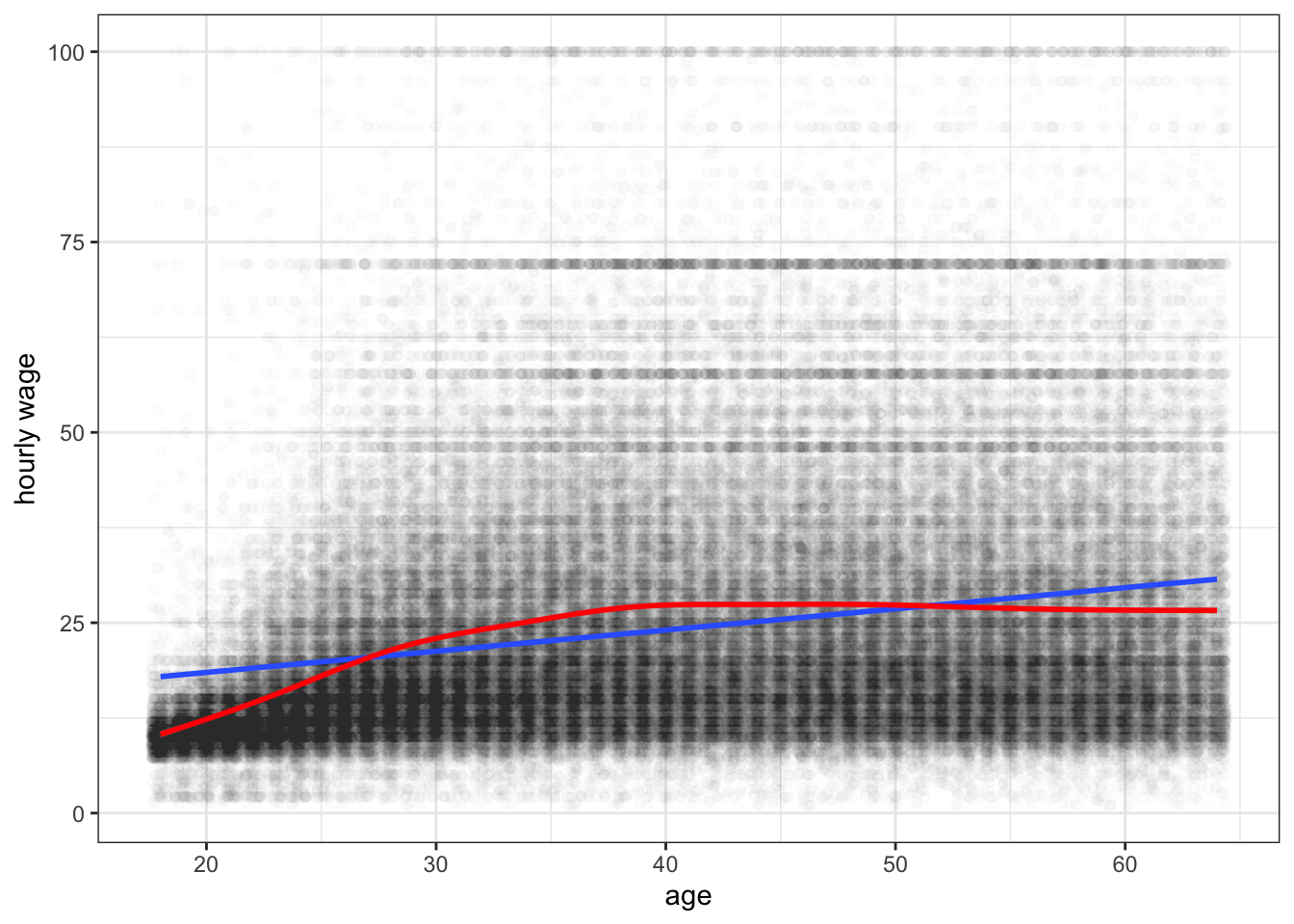
I can also add a line to the plot with the geom_smooth command. If I specify method="lm", I will get a straight line. Otherwise the line will be allowed to bend to accomodate non-linearity.
Figure C.10: Scatterplot of the relationship between age and hourly wage among US workers. The blue line is the best fitting OLS regression line. The red line is from a smoothing function. Its clear that the relationship is nonlinear, with age providing diminishing returns to wages as people get older.