5 Building Models
Up to this point, we have learned the elementary components of a good statistical analysis. However, the typical social scientist doesn’t spend that much time with these elementary components. Instead, most social scientific analysis depends on building statistical models. A statistical model is a formal mathematical representation of how we think variables might be related to one another. By building models, we can better understand the relationships between variables and how these relationships are affected by other variables. We will focus on model building in some form or another for all the remaining chapters of this course.
We will begin with the simplest kind of model: fitting a straight line through a set of points on a scatterplot. Although this approach may not seem very sophisticated, it forms the basis for more advanced modeling techniques we will learn later. After understanding this basic model we will move on to a variety of techniques we can use to build more complicated models that are both more realistic and more informative.
Throughout this chapter, we will focus primarily on issues of interpretation. We are now starting to learn the techniques that you will see presented in real world social science research. Being able to interpret and understand this work is a key objective of this course.
Slides for this chapter can be found here.
The OLS Regression Line
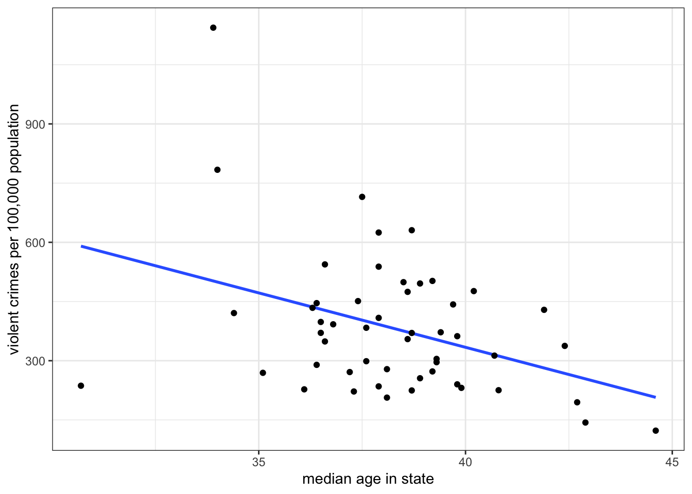
Figure 5.1 shows a scatterplot of the relationship between median age and violent crime rates:
I also plotted a line through those points. When you were trying to determine the direction of the relationship between these two variables, you might have been imagining a line just like this to help guide your understanding. Of course, if we all just tried to “eyeball” the best line, we would get many different results because it would depend on differences in human perception and judgement. The line I have graphed above, however, is the best fitting line, according to a set of standard statistical criteria. Specifically, it minimizes the total vertical distance from each point to the line (the “error” or “residual”). This line is often called the ordinary least squares regression line (or OLS regression line, for short). This fairly simple concept of fitting the best line to a set of points on a scatterplot is the workhorse of social science statistics and is the basis for all of the models that we will explore in this chapter.
The formula for a line
Do you remember the basic formula for a line in two-dimensional space? In algebra, you probably learned something like this:
\[y=a+bx\]
The two numbers that relate \(x\) to \(y\) are \(a\) and \(b\). The number \(a\) gives the y-intercept. This is the value of \(y\) when \(x\) is zero. The number \(b\) gives the slope of the line, sometimes referred to as the “rise over the run.” The slope indicates the change in \(y\) for a one-unit increase in \(x\).
The OLS regression line above also has a slope and a y-intercept. But we use a slightly different syntax to describe this line than the equation above. The equation for an OLS regression line is:
\[\hat{y}_i=b_0+b_1x_i\]
On the right-hand side, we have a linear equation (or function) into which we feed a particular value of \(x\) (\(x_i\)). On the left-hand side, we get not the actual value of \(y\) for the \(i\)th observation, but rather a predicted value of \(y\). The little symbol above the \(y\) is called a “hat” and it indicates the “predicted value of \(y\).” We use this terminology to distinguish the actual value of \(y\) (\(y_i\)) from the value predicted by the OLS regression line (\(\hat{y}_i\)).
The y-intercept is given by the symbol \(b_0\). The y-intercept tells us the predicted value of \(y\) when \(x\) is zero. The slope is given by the symbol \(b_1\). The slope tells us the predicted change in \(y\) for a one-unit increase in \(x\). In practice, the slope is the more important number because it tells us about the association between \(x\) and \(y\). In this regard, the slope is similar to the correlation coefficient we learned in Chapter 3 - in fact, the two measures are mathematically connected, as we will see below. However, unlike the correlation coefficient, the slope is not a unitless measure of association. We get an estimate of how much we expect \(y\) to change in terms of its actual units for a one-unit increase in \(x\).
For the scatterplot in Figure 5.1 above, the slope is -27.6 and the y-intercept is 1436.5. We could therefore write the equation like so:
\[\hat{\texttt{crime rate}_i}=1436.5-25.6(\texttt{median age}_i)\]
We would interpret our numbers as follows:
- Slope
- The model predicts that a one-year increase in age within a state is associated with 27.6 fewer violent crimes per 100,000 population, on average.
- Intercept
- The model predicts that in a state where the median age is zero, the violent crime rate will be 1436.5 crimes per 100,000 population, on average.
There is a lot to digest in these interpretations and I will to return to them in detail, but first I want to address a more basic question. How did I know that these are the right numbers for the best-fitting line? How do we actually calculate the intercept and slope for the best-fitting line?
Calculating the best-fitting line
The slope and intercept of the OLS regression line are determined based on addressing one simple criteria: minimize the vertical distance between the actual points and the line. More formally, we choose the slope and intercept that produce the minimum sum of squared residuals (SSR).
A residual is the vertical distance between an actual value of \(y\) for an observation and its predicted value:
\[residual_i=y_i-\hat{y}_i\]
These residuals are also sometimes called error terms, because the larger they are in absolute value, the worse our prediction. Take a look at Figure 5.2 below which shows the residuals graphically as vertical distances between the actual point and the line.
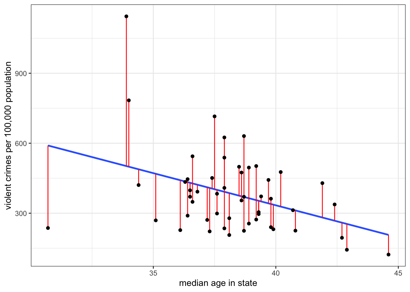
Unless the points all fall along an exact straight line (highly unlikely!), I cannot eliminate these residuals altogether, but some lines will produce higher residuals than others. What I am aiming to do is minimize the sum of squared residuals which is given by:
\[SSR = \sum_{i=1}^n(y_i-\hat{y}_i)^2\]
I square each residual and then sum them up. By squaring, I eliminate the problem of some residuals being negative and some being positive. You can think of this measure \(SSR\) as a golf score - the higher it is, the worse my line is at predicting the outcome variable.
To see how this all works, you can play around with the interactive example below which allows you to guess slope and intercept for a scatterplot and then see how well you did in minimizing the sum of squared residuals.
Fortunately, we don’t have to figure out the best slope and intercept by trial and error, as in the exercise above. Instead, we have straightforward formulas for calculating the slope and intercept. They are:
\[b_1=r\frac{s_y}{s_x}\]
\[b_0=\bar{y}-b_1*\bar{x}\]
The r in the first equation is the correlation coefficient. This equation reveals the fundamental connection between the correlation coefficient and slope. The slope is really just a re-scaled version of the correlation coefficient in which we have added back in the unit-scale variable.1 We can calculate this for the example above like so:
slope <- cor(crimes$median_age, crimes$violent_rate)*
  sd(crimes$violent_rate)/sd(crimes$median_age)
slope
[1] -27.56435I can then use that slope value to get the y-intercept:
mean(crimes$violent_rate)-slope*mean(crimes$median_age)[1] 1436.532While this code will work to calculate the slope and intercept, it is quite cumbersome. In the next section, I introduce the lm command, which will make estimating linear models much easier and more flexible.
Why is it called the OLS regression line?
The term “Ordinary Least Squares regression line” is quite a mouthful. Where did it come from? Mostly, this name is a result of a historical serendipity rather than precise scientific labeling. The “least squares” bit is the easier to explain it is a shorthand for the line the minimizes the sum of squared residuals. Why is it ordinary, though? Well, we call it “ordinary” because more advanced techniques exist. Most importantly, people sometimes weight the residuals so that some residuals count more than others to the total sum of squares leading to various forms of “weighted least squares.” We will cover some of these techniques in more advanced chapters of this book.
Perhaps the most mysterious but also most widely known term is “regression.” In fact, this term is so widely known that people will often just say things like “run a regression” instead of “estimate a linear model.” People even sometimes use it as a verb and say things like “regress x on y.” You, however, should do none of these things because this term is a leftover historical artifact which is not helpful for our understanding.
The term regression comes from the phenomenon of “regression to the mean.” The classic example of this phenomenon is when a person takes two different tests that are thought to capture the same underlying skill or knowledge. If a person performs very well on the first test relative to the mean, they are likely to perform less well on the subsequent test and instead “regress to the mean.” The same thing happens at the other end of the spectrum - people who perform very poorly on the first test are more likely to regress *upward” to the mean. Another classic example of this is the “sophomore slump” of professional baseball hitters who have a very good rookie year.
Is this phenomenon about some deep psychological processes where people either get too cocky or more motivated? Not at all. Its a mechanical process driven by probability. Your performance on a test is governed both by your underlying skill and ability (which is constant from test to test) and a host of context-specific situational factors that are specific to a test (e.g. you ate a good breakfast; you had a fight with your partner before the test, you got a good/poor night’s rest). When you score very high on a test, its likely in part because you hit the jackpot on this situational factors - every lined up just right (or vice versa, if you did poorly). The next time you take the test, its unlikely the stars will align in exactly the same way, so you will lose that extra edge and perform closer to the average. Unless the correlation between ability and test score is perfect (highly unlikely!), you will always observe regression to the mean in such cases.
Some of the earliest uses of the OLS regression line were in psychometrics which was very interested in the test-retest concept, and so the term “regression line” or “regression model” sort of stuck. However, for most of the use cases we care about in sociology today, and in many other disciplines, this phenomenon isn’t really relevant or interesting. So as a general purpose name, its a poor one that has unfortunately not been supplanted by something more general. I want you to be aware of this terminology so that you recognize it when other people use it, but I won’t generally refer to the models we use in this class as “regression models.” Rather, I will refer to them as “linear models.”
Using the lm command to calculate OLS regression lines
The lm command stands for “linear model” and can be used to run a variety of linear models that we will learn including the basic one we are estimating currently.
In order to run the lm command, you need to input a formula. The structure of this formula looks like dependent~independent where dependent and independent should be replaced by your specific variables. The tilde (~) sign indicates the relationship. So, if we wanted to use lm to calculate the OLS regression line between violent crime rates (the dependent variable) and median age (the independent variable), I would do the following:
model1 <- lm(crimes$violent_rate~crimes$median_age)Please keep in mind that the dependent variable always goes on the left-hand side of this equation. You will get very different answers if you reverse the ordering.
Which one is the dependent variable again?
The terms “dependent” and “independent” variable may not be very intuitive, and some would argue that they also smack too strongly of causal language. Nonetheless, they are the most common way that researchers refer to variables in linear models, so its good to understand what they mean.
The dependent variable is the \(y\) variable in the linear model equation above. This is the outcome variable that you care about and you are trying to predict it by another “independent” or “explanatory” variable. You are conceiving of the values of the \(y\) variable as being dependent on the values of the \(x\) variable.
In this case, my interest is in understanding why violent crime rates vary across US states. The theoretical model in my head is that older people are less likely to commit crime, so in states with older populations (as measured by the median age), I would generally expect lower crime rates. I could be wrong about this causal relationship or its direction2, but my theoretical frame and research interest is governing which variable I treat as the dependent variable in this analysis.
Always remember that you will only ever have one dependent \(y\) variable. This variable will always be on the left-hand side of the ~ in our formula. On the other hand, as we will see later in this chapter, we can have multiple independent variable, and these variables will always go on the right hand side of the ~ in our formula, separated by + signs.
In this case, I have entered in the variable names using the data$variable syntax, but lm also offers you a more streamlined way of specifying variables, by including a data option separately so that you only have to put the variable names in the formula, like so:
model1 <- lm(violent_rate~median_age, data=crimes)Because I have specified data=crimes, R knows that the variables violent_rate and median_age refer to variables within this dataset. The result will be the same as the previous command, but this approach makes it easier to read the formula itself.
I have saved the output of the lm command into a new object that I have called “model1”. You can call this object whatever you like. This is out first real example of the “object-oriented” nature of R. I can apply a variety of functions to this object in order to extract information about the relationship. If I want to get the most information, I can run a summary on this model.
summary(model1)
Call:
lm(formula = violent_rate ~ median_age, data = crimes)

Residuals:
   Min     1Q Median     3Q    Max
-353.7 -103.4  -29.9  101.2  641.8

Coefficients:
            Estimate Std. Error t value Pr(>|t|)
(Intercept) 1436.532    369.018   3.893  0.00030 ***
median_age   -27.564      9.632  -2.862  0.00618 **
---
Signif. codes:  0 '***' 0.001 '**' 0.01 '*' 0.05 '.' 0.1 ' ' 1

Residual standard error: 166.2 on 49 degrees of freedom
Multiple R-squared:  0.1432,    Adjusted R-squared:  0.1257
F-statistic:  8.19 on 1 and 49 DF,  p-value: 0.006177
The summary contains a lot information here and we actually don’t know what most of it means yet. All we want is the intercept and slope. These numbers are given by the two numbers in the “Estimate” column of the “Coefficients” section. The intercept is 1436.532 and the slope is -27.564. Note that while the intercept is labeled as the intercept, the slope is not labeled as the slope. Instead, is is labeled by the name of the independent variable. The reason for this should become clear when we add more variables to the model in subsequent sections of this chapter.
What is a coefficient?
Throughout this chapter, you will hear the term “coefficient” thrown about quite a bit. What do I (and R) mean by this term? The simple answer is that the coefficients refer to the intercept and slope(s) from our linear model equation, i.e. all the \(b\)’s.
The longer answer is that a coefficient is a multiplier of another variable. So, if I give you the algebraic formula \(3x\), 3 is the coefficient of \(x\). In the case of linear models, we think of coefficients as all of the \(b\) values that we multiply the \(x\) variables by to get a predicted value of \(y\).
For a more compact display, we could also run the coef command which will give us just the slope and intercept of the model.
coef(model1)(Intercept) median_age
1436.53197 -27.56435
Adding an OLS regression line to a scatterplot
You can easily add an OLS regression line to a scatterplot in ggplot, as shown in Figure 5.3.
ggplot(crimes, aes(x=median_age, y=violent_rate))+
1  geom_smooth(method="lm", se=TRUE)+
  geom_point()+
  labs(x="median age in state", y="violent crimes per 100,000 population")+
theme_bw()- 1
-
You can add the line with the
geom_smoothfunction. To get a straight line, you must specify themethod="lm"argument. Additionally, if you leavese=TRUE, you will get a grey “confidence” band around your line that represents a 95% confidence interval of uncertainty. You can remove this by specifyingse=FALSEinstead. Note also that the order you add geoms to your plot matters. Here, I addgeom_smoothbeforegeom_pointso that the points get drawn over the line.
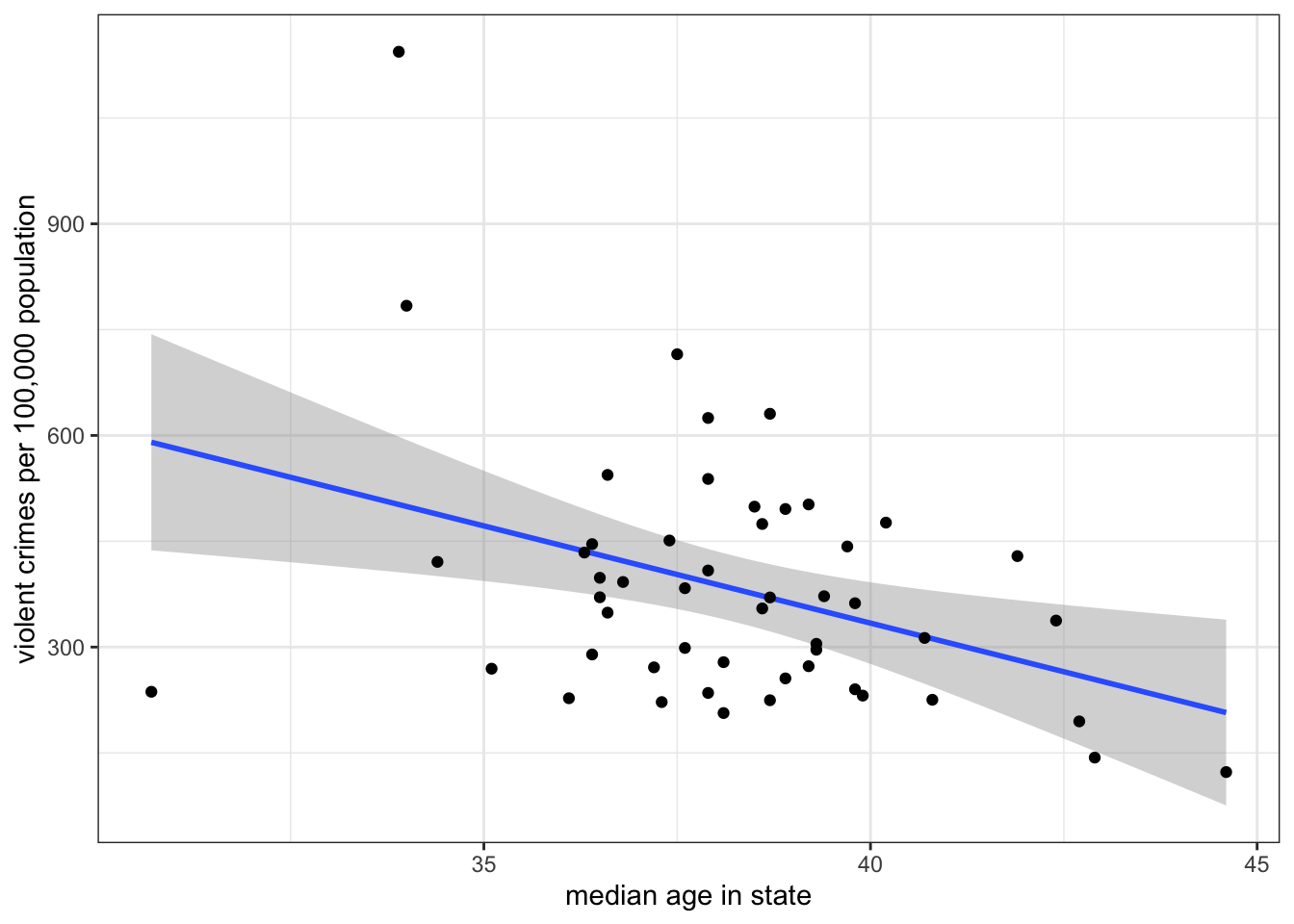
geom_smooth to plot an OLS regression line with or without a confidence interval band.
The OLS regression line as a model
The lm command itself stands for “linear model.” What does the term “model” mean in this context? When we talk about “models” in statistics, we are talking about modeling the relationship between two or more variables in a formal mathematical way. In the case of the OLS regression line, we are predicting the dependent variable (\(y\)) as a linear function of the independent variable (\(x\)).
Just as the general term “model” is used to describe something that is not realistic but rather an idealized representation (e.g. a model train set), the same is true of our statistical models. We certainly don’t believe that our linear function provides a correct interpretation of the exact relationship between our two variables. Instead we are trying to abstract from the details and fuzziness of the relationship to get a “big picture” of what the relationship looks like.
However, we always have to consider that our model is not a very good representation of the relationship. The most obvious potential problem is if the relationship is non-linear and yet we fit the relationship by a linear model, but there can be other problems as well. I will discuss these more below and the next few sections of this chapter will give us techniques for building better models. However, we first need to focus on how to interpret the results we just calculated.
Interpeting slopes and intercepts
Learning to properly interpret slopes and intercepts (especially slopes) is the most important thing you will learn in this chapter, because of how common the use of linear models is in social science statistics. Caclulation is easy, but correct interpretation is much more difficult. So take the time to be careful and thoughtful when interpreting the numbers from linear models.
Interpreting slopes
In abstract terms, the slope is always the predicted change in \(y\) for a one unit increase in \(x\). However, this abstract definition will simply not do when you are dealing with specific cases. You need to think about the units of \(x\) and \(y\) and interpret the slope in concrete terms. There are also a few other caveats to consider.
Take the interpretation I used above for the -27.6 slope of median age as a predictor of violent crime rates. My interpretation was:
The model predicts that a one year increase in age within a state is associated with 27.6 fewer violent crimes per 100,000 population, on average.
There are multiple things going on in this sentence that need to be addressed.
- “The model predicts….”
- When we fit a line to a set of points to predict \(x\) by \(y\), we are applying a model to the data. In this case, we are applying a model that relates \(y\) to \(x\) by a simple linear function. All of our conclusions are dependent on this being a good model. Prefacing your interpretation with “the model predicts…” highlights this point.
- “a one year increase in age”
- This phrase indicates the concrete meaning of a one unit increase in \(x\) in this case. Never literally say a “one unit increase in \(x\).” Think about the units of \(x\) and describe the change in \(x\) in these real terms.
- “is associated with”
- This phrase is intentionally passive, because we want to avoid implied causal language when we describe the relationship. Saying something like “when \(x\) increases by one \(y\) goes up by \(b_1\)” may sound more intuitive, but it also implies causation. The use of “is associated with” here indicates that the two variables are related without implying that one causes the other. Using causal language is the most common mistake in describing the slope.
- “27.6 fewer violent crimes per 100,000 population”
- This phrase indicates the expected change in \(y\). Again, you always have to consider the unit scale of your variables. In this case, \(y\) is measured as the number of crimes per 100,000 population, so a decrease of 27.6 means 27.6 fewer violent crimes per 100,000 population.
- “on average”
- This phrase should always be in your interpretations, because we know that our points don’t fall on a straight line. Therefore, we don’t expect a *deterministic” relationship between median age and violent crime where we can perfectly predict the crime rates for a state perfectly from its median age. Rather, we think that if we were to take a group of states that had one year higher median age than another group of states, the average difference between the two groups would be -27.6.
Avoid causal and deterministic interpretations
The two biggest problems with interpretations that students provide are that they often make causal and deterministic claims.
Causal claims happen when you imply that manipulating one variable will produce change in the other variable. The classic example of this is something like “when \(x\) goes up by one unit, \(y\) goes up by…” The implication here is that \(x\) causes \(y\). We can never be sure of that simply because of the observed slope between the variables, so it is critically important to avoid causal language that may not be deserved. My use of the term “associated with” is intended as a mechanism to avoid making implicitly causal claims in your interpretations.
Deterministic claims happen when you imply perfect predictive power between \(x\) and \(y\). This often comes paired with a causal claim. A classic example is something like “when \(x\) increases by one unit, \(y\) will go up by 0.5 units.” This statement also implies causality, but the use of the term “will” without an “on average” clause also suggests that this is the exact change we will observe every time \(x\) goes up by one unit. We don’t think this is the case. Rather if we were to observe that one unit difference in \(x\) across a bunch of different pairs of data, we would expect that the average difference in \(y\) would be about 0.5. That “on average” clause is doing important work to recognize that our model is far from a perfect prediction.
Lets try a couple of other examples to see how this works.First, lets look at the association between age and sexual frequency.
coef(lm(sexf~educ, data=sex))(Intercept) educ
56.3527549 -0.6708207 The slope here is -0.67. Education is measured in years and sexual frequency is measured as the number of sexual encounters per year. So, the interpretation of the slope should be:
The model predicts that a one year increase in education is associated with 0.67 fewer sexual encounters per year, on average.
This indicates a negative, but small, association in real terms. The expected difference in sexual frequency between a college graduate (16 years of education) and a high school graduate (12 years of education) is about 2.68 sexual encounters per year (-0.67*4).
Now, lets take the relationship between movie runtimes and metascore ratings:
coef(lm(metascore~runtime, data=movies))(Intercept) runtime
21.2322270 0.2950461 The slope is 0.295. Runtime is measured in minutes. The metascore is an abstract rating system between 0 and 100, so we can just refer to its units as “points.”
The model predicts that a one minute increase in movie runtime length is associated with a 0.295 point increase in the movie’s metascore rating, on average.
Longer movies tend to have higher ratings. We may rightfully question the assumption of linearity for this relationship, however. It seems likely that really long movies may suffer from viewer fatigue, so its possible the relationship may be non-linear. We will discuss this problem more at the end of this section.
Interpreting Intercepts
Intercepts give the predicted value of \(y\) when \(x\) is zero. Again you should never interpret an intercept in these abstract terms but rather in concrete terms based on the unit scale of the variables involved. What does it mean to be zero on the \(x\) variable?
In our example of the relationship of median age to violent crime rates, the intercept was 1436.5 Our independent variable is median age and the dependent variable is violent crime rates, so:
The model predicts that in a state where the median age is zero, the violent crime rate would be 1436.5 crimes per 100,000 population, on average.
Note that I use the same “model predicts” and “on average” prefix and suffix for the intercept as I used for the slope. Beyond that I am just stating the predicted value of \(y\) (crime rates) when \(x\) is zero in the concrete units of those variables.
Is it realistic to have a state with a median age of zero? No, its not. You will never observe a US state with a median age of zero. This is a common situation that often confuses students. In cases when zero falls outside the range of the independent variable, the intercept is not a particularly useful number because it does not tell us about a realistic situation. However, mathematically-speaking, the intercept is not required to do so. The intercept’s only “job” is to give a number that allows the line to go through the points on the scatterplot at the right level. You can see this in the interactive exercise above if you select the correct slope and then vary the intercept.
In general making predictions for values of \(x\) that fall outside the range of \(x\) in the observed data is problematic. This approach often leads to intercepts which don’t make a lot of sense. This problem with zero being outside the range of data is also evident in the other two examples of slopes from the previous section. When looking at the relationship between education and sexual frequency, no respondents are actually at zero years of education and no movies are at zero minutes of runtime.
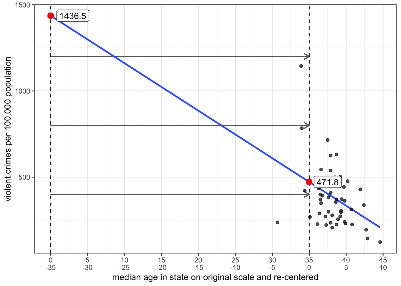
To fit the line correctly, we only need the slope and one point along the line. By default, we are conveniently choose the point where \(x=0\), but there is no reason why we could not choose a different point. It is actually quite easy to calculate a different predicted value along the line by re-centering the independent variable.
To re-center the independent variable \(x\), we just need to to subtract some constant value \(a\) from all the values of \(x\), like so:
\[x^*=x-a\] The zero value on our new variable \(x^*\) will indicates that we are at the value of \(a\) on the original variable \(x\). If we then use \(x^*\) in the linear model rather than \(x\), the intercept will give us the predicted value of \(y\) when \(x\) is equal to \(a\) rather than zero.
Lets try this out on the model predicting violent crimes by median age. We will create a new variable where we subtract 35 from the median age variable and use that in the linear model.
crimes$median_age_recenter <- crimes$median_age-35
coef(lm(violent_rate~median_age_recenter, data=crimes))
(Intercept) median_age_recenter
471.77960 -27.56435 The intercept now gives me the predicted violent crime rate in a state with a median age of 35. In effect, I have moved my y-intercept from zero to thirty-five as is shown in Figure 5.4 below.
Its also possible to re-center an independent variable in the lm command without creating a whole new variable. If you use the I() function within the formula, R will interpret the result of whatever is inside the I() function as a new variable. Here is an example based on the previous example:
coef(lm(violent_rate~I(median_age-35), data=crimes)) (Intercept) I(median_age - 35)
471.77960 -27.56435 This is the preferred way to re-center variables in our models, because we don’t need to clutter our dataset with new variables.
How good is \(x\) as a predictor of \(y\)?
If I selected a random observation from the dataset and asked you to predict the value of \(y\) for this observation, what value would you guess? Your best guess would be the mean of \(y\) because this is the case where your average error would be smallest. This error is defined by the distance between the mean of \(y\) and the selected value, \(y_i-\bar{y}\).
Now, lets say instead of making you guess randomly I first told you the value of another variable \(x\) and gave you the slope and intercept predicting \(y\) from \(x\). What is your best guess now? You should guess the predicted value of \(\hat{y}_i\) from the model because now you have some additional information. There is no way that having this information could make your guess worse than just guessing the mean. The question is how much better do you do than guessing the mean? Answering this question will give us some idea of how good \(x\) is as a predictor of \(y\).
We can do this by separating, or partitioning the total possible error in our first case when we guessed the mean, into the part accounted for by \(x\) and the part that is unaccounted for by \(x\).
I demonstrate this partitioning for one observation in our crime data (the state of Alaska) with the scatterplot in Figure 5.5 below.

The distance in red is the total distance between the observed violent crime rate in the state of Alaska and the mean violent crime rate across all states (given by the dotted line). If I were instead to use the linear model predicting the violent crime rate by median age, I would predict a higher violent crime rate than average for Alaska because of its relatively low median age, but I would still predict a crime rate that is too low relative to the actual crime rate. The red line can be partitioned into the gold line which is the improvement in my estimate and the green line which is the error that remains in my prediction from the model. If I could then repeat this process for all of the states, I could calculate the percentage of the total red lines that the gold lines cover. This would give me an estimate of how much I reduce the error in my prediction by using the linear model prediction rather than the mean to guess a state’s violent crime rate.
In practice, we actually need to square those vertical distances because some are negative and some are positive and then we can sum them up over all the observations. So we get the following formulas:
- Total variation: \(SSY=\sum_{i=1}^n (y_i-\bar{y})^2\)
- Explained by model: \(SSM=\sum_{i=1}^n (\hat{y}_i-\bar{y})^2\)
- Unexplained by model: \(SSR=\sum_{i=1}^n (y_i-\hat{y}_i)^2\)
The proportion of the variation in \(y\) that is explainable or accountable by variation in \(x\) is given by \(SSM/SSY\).
This looks like a kind of nasty calculation, but it turns out there is a much simpler way to calculate this proportion. If we just take our correlation coefficient \(r\) and square it, we will get this proportion. This measure is often called r-squared and can be interpreted as the proportion of the variation in \(y\) that is explainable or accountable by variation in \(x\).
In the example above, we can calculate R squared:
cor(crimes$median_age, crimes$violent_rate)^2[1] 0.1432127About 14.3% of the variation in violent crime rates across states can be accounted for by variation in the median age across states.
Inference for linear models
When working with sample data, our usual issues of statistical inference apply to linear models. In this case, our primary concern is the estimate of the slope because the slope measures the relationship between \(x\) and \(y\). We can think of an underlying linear model in the population:
\[\hat{y}_i=\beta_0+\beta_1x_i\]
We use Greek “beta” values because we are describing unobserved parameters in the population. The null hypothesis in this case would be that the slope is zero indicating no relationship between \(x\) and \(y\):
\[H_0:\beta_1=0\]
In our sample, we have a sample slope \(b_1\) that is an estimate of \(\beta_1\). We can apply the same logic of hypothesis testing and ask whether our \(b_1\) is different enough from zero to reject the null hypothesis. We just need to find the standard error for this sample slope and the degrees of freedom to use for the test and we can do this manually.
However, I have good news for you! You don’t have to do any of this by hand because the lm function does it for you automatically. Lets look at the full output of the model predicting violent crime rates from median age again, using the summary command:
model <- lm(violent_rate~median_age, data=crimes)
summary(model)
Call:
lm(formula = violent_rate ~ median_age, data = crimes)

Residuals:
   Min     1Q Median     3Q    Max
-353.7 -103.4  -29.9  101.2  641.8

Coefficients:
            Estimate Std. Error t value Pr(>|t|)
(Intercept) 1436.532    369.018   3.893  0.00030 ***
median_age   -27.564      9.632  -2.862  0.00618 **
---
Signif. codes:  0 '***' 0.001 '**' 0.01 '*' 0.05 '.' 0.1 ' ' 1

Residual standard error: 166.2 on 49 degrees of freedom
Multiple R-squared:  0.1432,    Adjusted R-squared:  0.1257
F-statistic:  8.19 on 1 and 49 DF,  p-value: 0.006177
The “Coefficients” table in the middle gives us all the information we need. The first column gives us the sample slope of -27.564. The second column gives us the standard error for this slope of 9.632. The third column gives us the t-statistic derived by dividing the first column by the second column. The final column gives us the p-value for the hypothesis test. In this case, there is about a 0.6% chance of getting a sample slope this large on a sample of 51 cases if the true value in the population is zero. Of course, in this case its nonsensical because we don’t have a sample, but the numbers here will be valuable in cases with real sample data.
Linear model cautions
Linear models can be very useful for understanding relationships, but they do have some important limitations that you should be aware of when you are doing statistical analysis.
There are three major limitations/cautions to be aware of when using linear models:
- Linear models only works for linear relationships.
- Outliers can sometimes exert heavy influence on estimates of the relationship
- Don’t extrapolate beyond the scope of the data.
Linearity
By definition, an OLS regression line is a straight line. If the underlying relationship between \(x\) and \(y\) is non-linear, then the OLS regression line will do a poor job of measuring that relationship.
One common case of non-linearity is the case of diminishing returns in which the slope gets weaker at higher values of \(x\). Figure 5.6 demonstrates a classic case of non-linearity in the relationship between a country’s life expectancy and GDP per capita.

The relationship is clearly a strongly positive one, but also one of diminishing returns where the positive relationship seems to “plateau” at higher levels of GDP per capita. This shape makes sense because a certain absolute increase in poor countries at low levels of life expectancy can be used to reduce the incidence of well-understood infectious and parasitic diseases, whereas the same absolute increase in wealthier countries at high levels of life expectancy has to reduce the risk of less understood diseases like cancer. You get more bang for your buck when life expectancy is low.
Figure 5.7 shows what happens if we try to fit a line to this data.
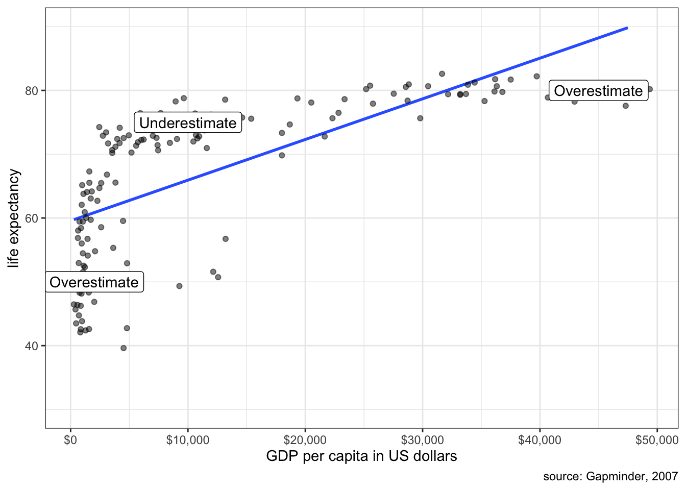
Clearly a straight line is a poor fit. We systematically overestimate life expectancy at low and high GDP per capita and underestimate life expectancy in the middle.
It is possible, in some circumstances, to correct for this problem of non-linearity, which we will explore in later chapters. For now, its just important to be aware of the problem and if you see clear non-linearity then you should question the use of a linear model.
Detecting non-linearity
In the example above, the non-linear relationship was very strong and obvious. However, in much of the data that we analyze the relationship is not so visually clear and can be difficult to simply “eyeball.” In such cases, its often useful to use smoothing functions to get a sense of potential non-linearity. Smoothing functions fit a line to a set of points, but this line need not be straight and can go up and down.
Later chapters will go into more detail about how smoothing functions work, but for now you can use them with the same geom_smooth function that we used to get a straight line, except this time you leave out the method. For example, earlier we questioned whether the relationship between movie runtime and metascore ratings is linear. Lets add a smoother to that scatterplot to see what it looks like:
ggplot(movies, aes(x=runtime, y=metascore))+
  geom_point(alpha=0.2)+
  geom_smooth(se=FALSE)+
  labs(x="movie runtime in minutes", y="metascore rating")+
  theme_bw()
If you look closely at the blue line you will see that it bends slightly, producing a slightly weaker slope at higher movie runtime. This result suggests that there may be slight diminishing returns to movie runtime. However, that bend is not very strong and a linear model would seem to fit this pretty decently. So, somewhat surprisingly, we do not see strong non-linearity in this case. It could be the case that audiences do just prefer longer movies. Another possibility is that only movies that have a strong chance of being good (e.g. well known director, all star cast) are greenlit to be longer.
Outliers and influential points
An outlier is an influential point if removing that observation from the dataset substantially changes the slope of the OLS regression line. You can try the interactive exercise below to see how removing points changes the slope of your line (click on a point a second time to add it back). Can you identify any influential points?
For the case of median age, Utah and Washington DC both have fairly strong influences on the shape of the line. Removing Washington DC makes the relationship weaker, while removing Utah makes the relationship stronger. Outliers will tend to have the strongest influence when their placement is inconsistent with the general pattern. In this case, Utah is very inconsistent with the overall negative effect because it has both low median age and low crime rates.
Lets say that you have identified an influential point. What then? In truth there is only so much you can do. You cannot remove a valid data point just because it is an influential point. There are two cases where it would be legitimate to exclude the point. First, if you have reason to believe that the observation is an outlier because of a data error, then it would be acceptable to remove it. Second, if you have a strong argument that the observation does not belong with the rest of the cases, because it is logically different, then it might be OK to remove it.
In our case, there is no legitimate reason to remove Utah, but there probably is a legitimate reason to remove Washington DC. Washington DC is really a city and the rest of our observations are states that contain a mix of urban and rural population. Because crime rates are higher in urban areas, DC’s crime rates look very exaggerated compared to states. Because of this “apples and oranges” problem, it is probably better to remove Washington DC. If our unit of analysis was cities, on the other hand, then Washington DC should remain.
In large datasets (1000+ observations), its unusual that a single point or even a small cluster of points will exert much influence on the shape of the line. The concern about influential points is mostly a concern in small datasets like the crime dataset.
Thou doth extrapolate too much
Its dangerous enough to assume that a linear relationship holds for your data. Its doubly dangerous to assume that this linear relationship holds beyond the scope of your data. Lets take the relationship between sexual frequency and age. We saw in previous chapters that the slope is -0.83 and the intercept is 88.3. The intercept itself is outside the scope of the data because we only have data on the population 18 years and older. It would be problematic to make predictions about the sexual frequency of 12 year olds, let alone zero-year olds.
Another trivial example would be to look at the growth rate of children 5-15 years of age by correlating age with height. It would be acceptable to use this model to predict the height of a 14 year old, but not a 40 year old. We expect that this growth will eventually end sometime outside the range of our data when individuals reach their final adult height. If we extrapolated the data, we would predict that 40 year olds would be very tall.
The Power of Controlling for Other Variables
What factors predict how many Oscar awards a movie will receive. Lets try a simple model that predicts Oscar awards from movie runtime.
coef(lm(awards~I(runtime-mean(runtime)), data=movies)) (Intercept) I(runtime - mean(runtime))
0.08726687 0.00752626 Note that I am re-centering runtime on its mean, so that the intercept is more meaningful, but my real interest is in the slope. This model predicts that a one minute increase in movie runtime is associated with an increase of 0.0075 Oscar awards, on average. This may seem like a very small positive association, but remember that most movies earn no Oscar awards and so that the average Oscar awards per movie in the dataset are 0.087. So, even small increases such as this slope can be meaningful.
It may seem odd that runtime itself increases a movie’s chances at an Oscar. Certainly, we may worry about the implied incentive for Hollywood producers to make their movies longer! We already know that runtime is associated with a movie getting better reviews, so we may wonder whether this association that we are observing between runtime and Oscar awards is simply the indirect result of longer movies being more likely to be better movies and better movies being more likely to get Oscars.
To put this in formal terms, we are concerned that the relationship between runtime and Oscar awards might be spurious. In general, spuriousness is the idea that the observed association between two variables is driven by an underlying third variable for which we have not accounted. This is a common problem in research using observational data. Association does not necessarily mean causation precisely because of the potential for other variables to account for our observed association (and because of the possibility of reverse causation). We refer to such variables as lurking or confounding variables.
In this case, the potentially confounding variable that we want to consider is the movie’s quality, which we will operationalize by the rating_imdb variable. Lets look at the association between this variable and each of our other variables (runtime and Oscar awards).
cor(movies$awards, movies$rating_imdb)[1] 0.2658742cor(movies$runtime, movies$box_office)[1] 0.3291571These two positive correlations suggest a spurious reason why we might observe a positive association between runtime and Oscar awards. More well-received movies are longer and more well-received movies receive more Oscar awards. Thus, when we look at the relationship between runtime and Oscar awards, we see a positive association but that positive association is at least in part indirectly driven by these indirect associations.
How can we examine whether this potential spurious explanation is accurate? It turns out that we can add more than one independent variable to a linear model at the same time. The mathematical structure of such a model would be:
\[\hat{awards}_i=b_0+b_1(runtime_i)+b_2(rating_i)\]
We now have two different “slopes”, \(b_1\) and \(b_2\). These two slopes give the association of runtime and IMDB ratings, respectively, on number of Oscar awards, while controlling for the other independent variable. We now have what is called a multivariate linear model.
This “controlling” concept is a key point that I will return to below, but first I want to try to think graphically about what this model is doing. In the case of a bivariate linear model, we thought of fitting a line to a scatterplot in two-dimensional space. We are doing something similar here, but since we now have three variables, our scatterplot is in three dimensions. Figure 5.9 shows an interactive three-dimensional plot of the three variables.
The dependent variable is shown on the vertical (z) axis and the two independent variables are shown on the “width” and “depth” axes (x and y). The flat plane intersecting the points is defined by the linear model equation above. So, rather than fitting a straight line through the data, I am fitting a plane. Note however that if you rotate the 3d scatterplot to hide the IMDB ratings “depth” dimension, it will then look like a two-dimensional scatterplot between runtime and Oscar awards. In this case, the edge of the plane would indicate the slope between runtime and Oscar awards. Similarly, I could rotate it the other way to look at the relationship between IMDB ratings and Oscar awards.
How do I know what are the best values for \(b_0\), \(b_1\), and \(b_2\) that define my plane? The logic is the same as for a bivariate linear model: I choose values that minimize the sum of squared residuals (\(SSR\)):
\[SSR=\sum_{i=1}^n (\hat{y}_i-y_i)^2\]
\(SSR\) is a measure of how far the predicted values of the dependent variable are from the actual values, so we want the intercept and slopes that minimizes this error. Unlike the bivariate case, however, there is no simple formula that I can give you for the slope and intercept, without some knowledge of matrix algebra.3 However, R can calculate the correct numbers for you easily. I am not concerned with your technical ability to calculate these numbers by hand, but I do want you to understand why those are the “best” numbers. They are the best numbers because they minimize the sum of the squared residuals for the model.
We can calculate this model in R just by adding another variable to our model in the lm command, connected by a “+” sign:
model <- lm(awards~I(runtime-mean(runtime))+I(rating_imdb-mean(rating_imdb)),
            data=movies)
coef(model)
(Intercept) I(runtime - mean(runtime))
0.087266866 0.004898359
I(rating_imdb - mean(rating_imdb))
0.109322281 Note that I am mean-centering both independent variables to get a more meaningful intercept, but that does not affect our slopes. In equation form, our model will look like:
\[\hat{awards}_i=0.0873+0.0049(runtime_i-\bar{runtime}_i)+0.1093(rating_i-\bar{rating}_i)\]
Interpreting results in a multivariate linear models
How do we interpret the results?
- Intercept
- The model predicts that movies with mean runtime and mean IMDB rating earn 0.0873 Oscar awards, on average.
- Runtime Slope
- The model predicts that, holding IMDB rating constant, an additional minute of runtime is associated with 0.0049 more Oscar awards, on average.
- IMDB Rating Slope
- The model predicts that, holding runtime constant, an additional point on the IMDB rating scale is associated with 0.1093 more Oscar awards, on average.
The intercept is now the predicted value when all independent variables are zero. My interpretation of the slopes is almost identical to the bivariate case, except for one very important addition. I am now estimating the effect of each independent variable on the dependent variable while holding constant all other independent variables. You could also say “controlling for all other independent variables.”
What does it mean to “hold other variables constant?” It means that when we look at the effect of one independent variable, we are looking at how the predicted value of the dependent variable changes while keeping all the other variables the same. For instance, the runtime effect above is the effect of a one minute increase in runtime among movies of the same IMDB rating. Because we are looking at the effect of runtime among movies of the same IMDB rating, IMDB rating should no longer have a confounding effect on our estimate of the effect of runtime. Thus holding constant/controlling for other variables helps to remove the potential spurious effect of those variables as confounders.
Note that the slope of runtime on Oscar awards decreased from 0.0075 to 0.0049 once I included IMDB ratings as a control variable. This result indicates that about a third of the total effect of runtime was indirectly coming through the association of runtime with higher IMDB ratings. Nonetheless, even after I control for IMDB ratings, I am still noting a positive association between runtime and Oscar awards, so it seemes that runtime still exerts some independent influence.4
Why did the intercept equal the mean of \(y\)
You might have noticed something interesting about the intercept of the previous two models::
coef(lm(awards~I(runtime-mean(runtime)), data=movies)) (Intercept) I(runtime - mean(runtime))
0.08726687 0.00752626 coef(lm(awards~I(runtime-mean(runtime))+
I(rating_imdb-mean(rating_imdb)),
data=movies)) (Intercept) I(runtime - mean(runtime))
0.087266866 0.004898359
I(rating_imdb - mean(rating_imdb))
0.109322281 mean(movies$awards)[1] 0.08726687In both cases, the intercept is equal to the mean of the dependent variable. This happens because I mean-centered all of the independent variables in the model. The bivariate OLS regression line always goes through the point \((\bar{x}, \bar{y})\), and the same is true in a multidimensional sense for the multivariate case. So, If I set the “zero” value for all independent variables to be the mean of those variables, the intercept will always equal the mean of the dependent variable.
Crime example
Lets use a linear model to predict the property crime rate in a state by the percent of adults in the state without a high school diploma and the median age of the state’s residents.
summary(lm(property_rate~percent_lhs+median_age, data=crimes))
Call:
lm(formula = property_rate ~ percent_lhs + median_age, data = crimes)

Residuals:
    Min      1Q  Median      3Q     Max
-1008.0  -439.5  -105.7   398.4  1725.3

Coefficients:
            Estimate Std. Error t value Pr(>|t|)
(Intercept)  6613.51    1315.75   5.026 7.37e-06 ***
percent_lhs    59.50      28.43   2.093 0.041667 *
median_age   -125.32      32.54  -3.851 0.000348 ***
---
Signif. codes:  0 '***' 0.001 '**' 0.01 '*' 0.05 '.' 0.1 ' ' 1

Residual standard error: 558.1 on 48 degrees of freedom
Multiple R-squared:  0.3065,    Adjusted R-squared:  0.2776
F-statistic: 10.61 on 2 and 48 DF,  p-value: 0.0001531
Note that I am giving you the full output of summary now, but we can find the slopes and intercept by looking at the Estimate column of the “Coefficients” table.
The model is:
\[\hat{\texttt{crime}}_i=6614+60(\texttt{pct less hs}_i)-125(\texttt{median age}_i)\]
The model predicts that, comparing two states with the same median age of residents, a one percent increase in the percent of the state with less than a high school diploma is associated with an increase of 60 property crimes per 100,000, on average. The model predicts that, comparing two states with the same percentage of adults without a high school diploma, a one year increase in the median age of a state’s residents is associated with a decrease of 125 property crimes per 100,000, on average.
Note that we also get the \(R^2\) value from the summary command (where is says “Multiple R-Squared”). In multivariate models, the \(R^2\) value always tells you the proportion of the variation in the dependent variable that is accountable for by variation in all of the independent variables combined. In this case \(R^2\) is 0.3065. About 25% of the variation in property crime rates across states is accountable for by variation in the percent of adults without a high school diploma and the median age of residents across states.
Including more than two independent variables
If we can include two independent variables in a linear model, why stop there? Why not include three or four or more? The number of independent variables you can include is only limited by the sample size. You can never have more independent variables than the sample size minus one, although in practice we generally stop well short of this limit for pragmatic reasons.
Lets take the model above predicting property crime rates by percent of adults with less than a high school diploma and the median age of residents. Lets add the poverty rate as another predictor:
summary(lm(property_rate~percent_lhs+median_age+poverty_rate, data=crimes))
Call:
lm(formula = property_rate ~ percent_lhs + median_age + poverty_rate,
    data = crimes)

Residuals:
     Min       1Q   Median       3Q      Max
-1117.87  -324.67    13.59   289.90  1077.96

Coefficients:
             Estimate Std. Error t value Pr(>|t|)
(Intercept)   6015.99    1171.93   5.133 5.35e-06 ***
percent_lhs    -78.81      44.05  -1.789 0.080031 .
median_age    -116.56      28.82  -4.045 0.000194 ***
poverty_rate   182.88      47.86   3.821 0.000389 ***
---
Signif. codes:  0 '***' 0.001 '**' 0.01 '*' 0.05 '.' 0.1 ' ' 1

Residual standard error: 492.7 on 47 degrees of freedom
Multiple R-squared:  0.4709,    Adjusted R-squared:  0.4371
F-statistic: 13.94 on 3 and 47 DF,  p-value: 1.243e-06
The model predicts:
- A one percent increase in the percent of adults in a state without a high school diploma is associated with 79 fewer property crimes per 100,000, on average, holding constant the median age of residents and the poverty rate in a state. Note that this result completely reversed direction from the previous model.
- A one year increase in the median age of a state’s residents is associated with 117 fewer property crimes per 100,000, on average, holding constant the percent of adults without a high school diploma and the poverty rate in a state.
- A one percent increase in a state’s poverty rate is associated with 183 more crimes per 100,000, on average, holding constant the percent of adults without a high school diploma and the median age of residents in a state.
- 47% of the variation in property crime rates across states can be accounted for by variation in the percent of adults without a high school diploma, residents’ median age, and the poverty rates across states.
When I interpret the models now, I am holding constant the other two variables when I estimate the effect of each. Note that controlling for the poverty rate has a huge effect on the education variable whose effect goes from a substantial positive effect to a substantial negative effect. What does this tell us? Poverty rates and high school non-completion rates are positively correlated and so when you don’t control for poverty rates, it looks like the high school non-completion rate predicts crime because states with high high school non-completion rates have high poverty rates and high poverty rates predict high property crime rates. Once you control for the poverty rate, you see that it is economic deprivation not educational deprivation that is driving the crime rate.
In general, the form of the multivariate linear model is:
\[\hat{y}_i=b_0+b_1x_{i1}+b_2x_{i2}+b_3x_{i3}+\ldots+b_px_{ip}\]
The intercept is given by \(b_0\). This is the predicted value of \(y\) when all of the independent variables are zero. The remaining \(b\)’s give the slopes for all of the variables up through the \(p\)th variable. Each of these gives the predicted change in \(y\) for a unit increase in that independent variable, holding all other independent variables constant.
How to read a table of model results
In academic journal articles and books, the results of linear models are represented in a fairly standard way. In order to understand how to read these articles, you need to understand this presentation style. Its not immediately intuitive for everyone. Table 5.1 below shows the typical style. In this table, I am reporting three linear models with the property crime rates as the dependent variable and three different independent variables.
| Model 1 | Model 2 | Model 3 | |
|---|---|---|---|
| Intercept | 1693.3*** | 6613.5*** | 6016.0*** |
| (356.0) | (1315.8) | (1171.9) | |
| Percent less than HS | 71.4* | 59.5* | -78.8 |
| (32.0) | (28.4) | (44.0) | |
| Median age | -125.3*** | -116.6*** | |
| (32.5) | (28.8) | ||
| Poverty rate | 182.9*** | ||
| (47.9) | |||
| N | 51 | 51 | 51 |
| R-squared | 0.092 | 0.307 | 0.471 |
| * p < 0.05, ** p < 0.01, *** p < 0.001 | |||
| Standard errors in parenthesis. | |||
When reading this table and others like it, keep the following issues in mind:
- The first question you should ask is “what is the dependent variable?” This is the outcome that we are trying to predict. Typically, the dependent variable will be listed in the title of the table. In this case, the title tells you that the dependent variable is property crime rates and the unit of analysis is US states.
- The independent variables are listed on the rows of the table. In this case, I have independent variables of percent less than HS, median age, and the poverty rate. As I will explain below, just because an independent variable is listed here does not mean that it is actually included in all models.
- Models are listed in each column of the table. If numbers are listed for the row of a particular independent variable then that variable is included in that particular model. In this case, I have three different models. The first model only has numbers listed for Percent less than HS, so that is the only independent variable in the first model. The second model has numbers listed for Percent less than HS and Median Age, so both of these variables are included in the model. The third model includes all three variables in the model. Remember that in each case the dependent variable is the property crime rate.
- Within each cell with numbers listed there is a lot going on. We are primarily interested in the main number listed at the top. This number is the slope (or intercept in the case of the “Constant” row). The number in parenthesis is the standard error for each slope in the model. You could use this standard error and the slope estimate above it to calculate t-statistics and p-values exactly. However, the asterisks give you an easy visual short cut to determine the rough size of the p-value. These asterisks indicate if the p-value is below a certain level, as shown in the notes at the bottom. The cut-offs of 0.05, 0.01, and 0.001 used here are pretty standard for the discipline. So an asterisks generally means that the result is “statistically significant.” However, its important to keep in mind as noted above that these cut-offs are ultimately arbitrary and should never be confused with the substantive size of the effect itself.
- At the bottom, you typically get a number of summary measures of the model. The only two we care about are the number of observations and the \(R^2\) of the model.
The advantage of organizing the table in this fashion is that we can easily see how the relationship between a given independent variable and the dependent variable changes as we add in other control variables by just looking at the numbers across a row. For example, we can see from Model 1 that the percent of the population with less than a high school diploma is initially pretty strongly positively related to violent crime rates. A one percentage point increase in this variable is associated with 71.41 more violent crimes per 100,000 population, on average. Controlling for the median age of the population in Model 2 reduces this effect slightly but we still see a strong relationship. However, once we control for the poverty rate in a state the percent less than high school diploma effect reverses direction. The poverty rate, on the other hand, has a big positive association with violent crime rates.
Including Categorical Variables as Predictors
To this point, we only know how to include quantitative variables into linear models. However, it turns out you can use a fairly easy trick to include categorical variables as independent variables in linear models. By including categorical variables as independent variables, we expand considerably the range of things that we can do with linear models. The most difficult part of this trick is correctly interpreting your results.
Indicator variables
As an example, I am going to look at the relationship between religious affiliation and sexual frequency. To keep this example simple I am going to dichotomize the religious affiliation variable, which means I am going to collapse it into two categories, rather than the six categories in the dataset. I will use a simply dichotomy of “Not Religious/Religious.” In R, I can create this variable like so:
sex$norelig <- sex$relig=="None"This is technically a boolean variable, which means it takes a TRUE or FALSE value. For our purposes, TRUE is a non-religious person.
Making boolean variables
In the example above, I create a new variable that takes the values TRUE or FALSE. These TRUE/FALSE values are special values known as “boolean” values in computer language-speak. The variable is thus a “boolean variable” and I create it by making a “boolean statement.”
The boolean statement in this case is sex$relig=="None". The double equals operator here (==) is an equality statement. This statement will return a TRUE in cases where the relig variable is “None” and FALSE otherwise.
There are other operators that one can use to make boolean statements as well. Here are the most common boolean operators:
| Operator | Meaning |
|---|---|
| == | Equal to |
| != | Not equal to |
| > | Greater than |
| >= | Greater than or equal to |
| < | Less than |
| <= | Less than or equal to |
So, for example you could create a new variable on the education variable in the sex dataset for whether someone has 12 or more years of education:
gss$hs_or_more <- gss$educ>=12You can also combine multiple boolean statements together with AND (&) and OR (|) statements, but that is a topic covered only in the advanced R stats lab.
We already know how to look at the relationship between sexual frequency and this dichotomized religious affiliation variable. We can look at the mean differences in sexual frequency across our two categories:
tapply(sex$sexf, sex$norelig, mean) FALSE TRUE
45.64889 50.87262 50.87262-45.64889[1] 5.22373The non-religious have sex 5.22 more times per year than the religious, on average. Hallelujah?
We can represent this same mean difference in a linear model framework by using an indicator variable.5 An indicator variable is a variable that only takes a value of zero or one. It takes a value of one when the observation is in the indicated category and a zero otherwise. Mathematically, we would say:
\[nonrelig_i=\begin{cases} 1 & \text{if non-religious}\\ 0 & \text{otherwise} \end{cases}\]
The indicated category is the category which gets a one on the indicator variable. In this case the indicated category is non-religious. The reference category is the category that gets no indicator variable. In this case, the reference category is the religious group. You can think of the indicator variable as an on/off switch where 1 indicates that it is “on” (i.e. the observation belongs to the indicated category) and 0 indicates that it is “off” (i.e. the observation does not belong to the indicated category).
What would happen if we put this indicator variable into a linear model predicting sexual frequency like so:
\[\hat{frequency}_i=b_0+b_1(nonrelig_i)\]
How would we interpret the slope and intercept for such a model? Figure 5.10 shows a scatterplot of this relationship.
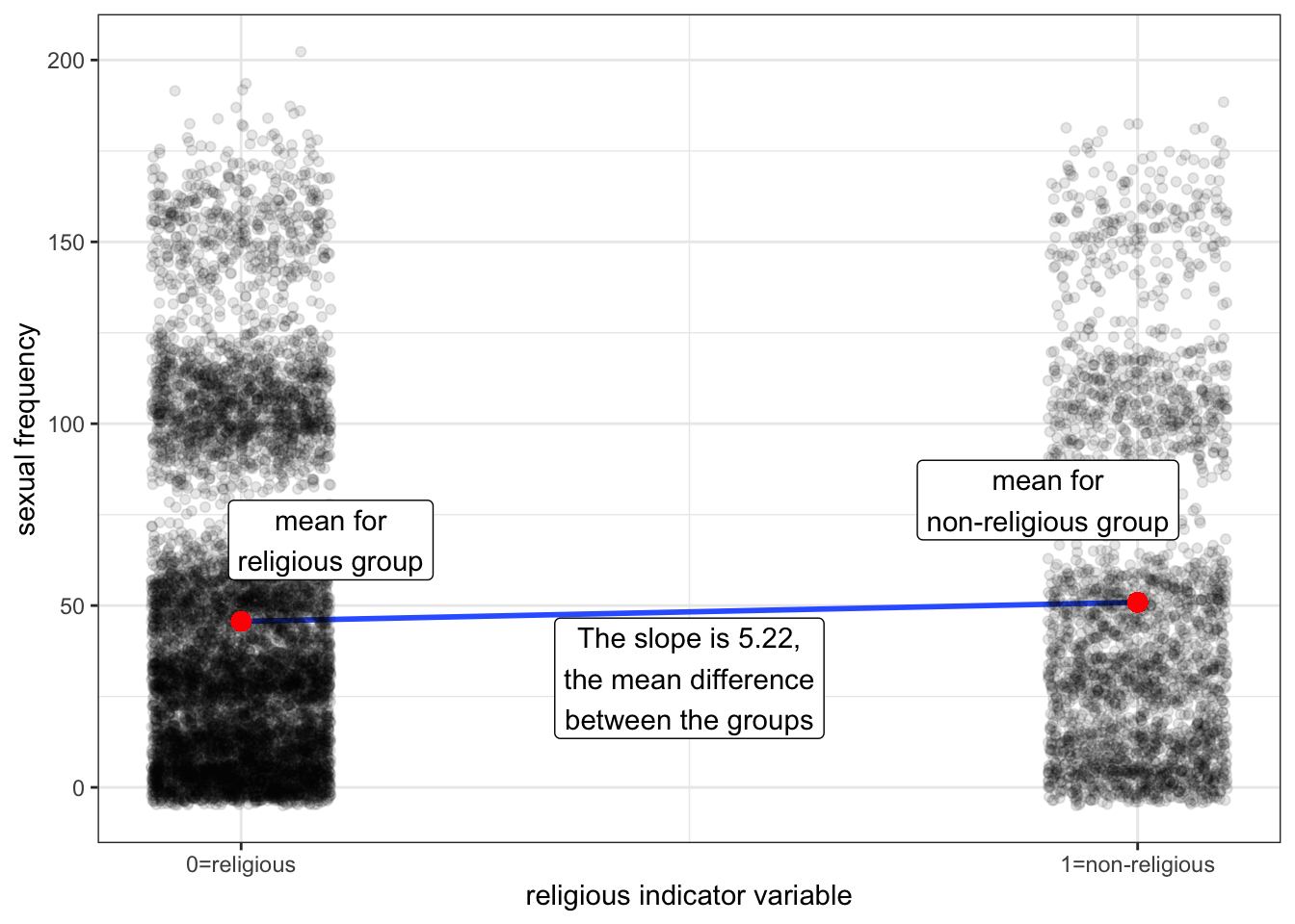
Notice that all of the points align vertically either at 0 or 1 on the x-axis. This is because the indicator variable can only take these two values. I have jittered points slightly to avoid overplotting. I have also plotted the means of the two groups in red dots and the OLS regression line for the scatterplot in blue. It turns out, that in order to be the best-fitting line, this OLS regression line must connect the two dots that represent the mean of each group.
What will the slope of this line be? If we go up “one unit” on the non-religious indicator variable we have gone from a religious person to a non-religious person and the change in predicted sexual frequency is equal to the mean difference of 5.22 between the groups. The intercept is given by the value at zero which is just given by the mean sexual frequency among the religious of 45.65. So, the OLS regression line should look like:
\[\hat{frequency}_i=45.65+5.22(nonrelig_i)\] I can calculate these same numbers in R with the lm command:
coef(lm(sexf~norelig, data=sex))(Intercept) noreligTRUE
45.648887 5.223738 The numbers are the same. More important than the numbers, however, is the interpretation of the numbers. The intercept is the mean of the dependent variable for the reference category. The slope is the mean difference between the reference category and the indicated category. In this case, I would say:
- Religious individuals have sex 45.65 times per year, on average.
- Non-religious individuals have sex 5.22 times more per year than non-religious individuals, on average.
Note that I can derive the sexual frequency of the non-religious from these two numbers by taking the value for the non-religious and adding the mean difference to find out that non-religious individuals have sex 50.87 times per year, on average.
Reversing the indicator variable
What if I switched my indicator variable so that the religious were indicated and the non-religious were the reference category?
\[relig_i=\begin{cases} 1 & \text{if religious}\\ 0 & \text{otherwise} \end{cases}\]
Lets try it out in R and see (the != below is computer lingo for “not equal to”):
sex$religious <- sex$relig!="None"
coef(lm(sexf~religious, data=sex))
(Intercept) religiousTRUE
50.872625 -5.223738 Lets compare the two models:
\[\hat{frequency}_i=45.65+5.22(nonrelig_i)\] \[\hat{frequency}_i=50.87-5.22(relig_i)\]
Both models give me the exact same information, but from the perspective of a different reference group. The first model tells me the mean sexual frequency of the religious (45.65) and how much more sex the non-religious have on average (5.22). The second model tells me the mean sexual frequency of the non-religious (50.87) and how much less sex the religious have (-5.22). I can easily derive one model from the other, without actually having to calculate it in R. Therefore, which category you set as the reference category is really a matter of taste, rather than one of consequence. The results are the same either way.
Categorical variables with more than two categories
What if I have a categorical variable that has more than two categories? Lets expand the religious variable that I dichotomized back to its original scale. There are six different categories: Fundamentalist Protestant, Mainline Protestant, Catholic, Jewish, Other, and None:
summary(sex$relig)Evangelical Protestant Mainline Protestant Catholic
2463 3170 2597
Jewish Other None
209 504 2842 Lets look at the mean sexual frequency for each of these groups.
round(tapply(sex$sexf, sex$relig, mean),2)Evangelical Protestant Mainline Protestant Catholic
46.82 43.81 46.98
Jewish Other None
39.07 47.34 50.87 Figure 5.11 plots these means on a number line to get a visual display of the differences:

Nones clearly have much higher mean sexual frequency than the remaining religious groups and Jews have much lower mean sexual frequency. The three Christian groups are in the middle, although mainline protestants have a lower mean sexual frequency than the other two.
This plot also shows the mean differences between the groups, with Evangelical Protestants set as the reference category. The vertical distances from the dotted red line (the mean of Evangelical Protestants) give the mean differences between each religious group and Evangelical Protestants. So we can see that “Nones” have sex 4.05 more times per year than Evangelical Protestants, on average, and Mainline Protestants have sex 3.01 fewer times per year, on average, than Evangelical Protestants.
We can use the same logic of indicator variables we developed above to represent the mean differences between groups observed here in a linear model framework. However, because we now have six categories, we will need five indicator variables. You always need one less indicator variable than the number of categories. The category which doesn’t get an indicator variable is your reference category. As per the graph above, I will make Evangelical Protestants my reference category. Therefore, I need one indicator variable for each of the other five categories:
\[main_i=\begin{cases} 1 & \text{if main}\\ 0 & \text{otherwise} \end{cases}\]
\[catholic_i=\begin{cases} 1 & \text{if catholic}\\ 0 & \text{otherwise} \end{cases}\]
\[jewish_i=\begin{cases} 1 & \text{if jewish}\\ 0 & \text{otherwise} \end{cases}\]
\[other_i=\begin{cases} 1 & \text{if other religion}\\ 0 & \text{otherwise} \end{cases}\]
\[none_i=\begin{cases} 1 & \text{if no religion}\\ 0 & \text{otherwise} \end{cases}\]
Now lets put these variables into a linear model:
\[\hat{frequency}_i=b_0+b_1(main_i)+b_2(catholic_i)+b_3(jewish_i)+b_4(other_i)+b_5(none_i)\]
We can figure out how all this works by getting the predicted value for the member of a specific group. That respondent should get a 1 for the variable where they are a member and a zero on all other variables. For example, a Evangelical Protestant should get a zero on all of these variables:
\[\hat{frequency}_i=b_0+b_1(0)+b_2(0)+b_3(0)+b_4(0)+b_5(0)=b_0\]
So, the intercept is the predicted value for Evangelical Protestants. Similarly we could calculate the predicted value for Mainline Protestants:
\[\hat{frequency}_i=b_0+b_1(1)+b_2(0)+b_3(0)+b_4(0)+b_5(0)=b_0+b_1\]
The difference between the two is \(b_1\), so this “slope” gives the mean difference between Mainline and Evangelical Protestants. We could do the same thing for Catholics:
\[\hat{frequency}_i=b_0+b_1(0)+b_2(1)+b_3(0)+b_4(0)+b_5(0)=b_0+b_2\]
The mean difference between Catholics and Evangelical Protestants is given by \(b_2\).
In general, each of the “slopes” is the mean difference between the indicated category and the reference category. In this case, the reference category is Evangelical Protestants so each of the slopes gives the mean difference between that religious category and Evangelical Protestant, just like the graph above.
R is fairly intelligent about handling all of these indicator variables and you don’t actually have to create these five different variables. If you put a categorical variable into your linear formula, R will know to treat it as a set of indicator categories. The only catch is that R will already have a default category set as the reference. It just so happens that in our GSS data, Evangelical Protestants are already set as the reference. So I can run this model by:
model <- lm(sexf~relig, data=sex)
coef(model)
(Intercept) religMainline Protestant religCatholic
46.8209501 -3.0102245 0.1621073
religJewish religOther religNone
-7.7539644 0.5163515 4.0516749 You can tell which category is the reference by which category is left out here. Note how the coefficients (given by the estimates column) match the mean differences I calculated above in the graph. We are simply reproducing these mean differences in a linear model framework.
Categorical and quantitative variables combined in a single model
If all we are doing is reproducing mean differences between categories, what good is this method? After all, we already know how to do that. The major advantage of putting these mean differences into a linear model framework is that we can control for other potentially confounding variables.
These sexual frequency differences by religious affiliation are a prime example. Lets take a look at the age differences between religious affiliations:
round(tapply(sex$age, sex$relig, mean), 1)Evangelical Protestant Mainline Protestant Catholic
52.6 53.2 51.2
Jewish Other None
56.8 45.1 44.1 Notice how closely these age differences mirror the differences in sexual frequency. Others and Nones are the youngest, while Jews are the oldest. Among Christians, mainline Protestants are older than Evangelical Protestants and Catholics. We also know from prior examples that age has a negative effect on sexual frequency. This should make us suspicious that some (or all) of the observed differences in sexual frequency between religious groups simply reflect age differences between those groups.
We can easily address this issue by simply including age as a control variable in our model:
model <- lm(sexf~relig+age, data=sex)
coef(model)
(Intercept) religMainline Protestant religCatholic
90.7869266 -2.5359047 -1.0362699
religJewish religOther religNone
-4.2960623 -5.7952734 -3.1130316
age
-0.8353637 We now interpret those slopes as the mean difference in sexual frequency between Evangelical Protestants and the indicated category, among individuals of the same age. So for example, we would interpret the -3.11 on “None” as:
The model predicts that, among individuals of the same age, those with no religious preference have sex 3.11 fewer times per year than Evangelical Protestants, on average.
We would also interpret the age effect controlling for religious affiliation like so:
The model predicts, that holding religious affiliation constant, a one year increase in age is associated with 0.84 fewer instances of sex per year, on average.
Interpretations are different for categorical variables
Immediately above, you will see two different kinds of interpretations for a slope. In the first case, I am interpreting the slope for an indicator variable (in this case, those with no religious preference). In the second case, I am interpreting the slope for a quantitative variable (in this case, age). The interpretation of age should look familar as we have learned this interpretation already.
Using the interpretation of slopes we have learned for quantitative variables won’t work very well for categorical variables as they are more like “steps” than “slopes.” For example, lets use a model to look at the wage gap between men and women, while controlling for age:
coef(lm(wages~gender+age, data=earnings)) (Intercept) genderFemale age
14.804836 -4.020515 0.280066 We have an indicator variable for being female (vs. male) and a “slope” of -4.02 for that variable. So lets try our traditional method of interpreting a quantitative variable:
The model predicts that, holding age constant, an increase of one unit of … being female (?) … is associated with a decrease in hourly wages of $4.02, on average.
That doesn’t exactly roll off the tongue, does it? An indicator variable is like a light switch, you are either in the category or not - it makes no sense to talk about a one unit increase in that variable. So, in the case of categorical variables we need to shift our language. The language we want is the difference in means between the indicated category (in this case, women) and the reference category (in this case, men). Lets try the interpretation again, with that in mind:
The model predicts that, holding constant age, women make $4.02 less in hourly wage than men, on average.
That interpretation makes much more sense. You must be flexible enough to shift your interpretations between traditional rise-over-run slopes in the case of quantitative variables and differences in mean slopes in the case of categorical variables.
Table 5.2 below helps to highlight the change in the effects once age is controlled.
| Model 1 | Model 2 | |
|---|---|---|
| Intercept | 46.82*** | 90.79*** |
| (0.90) | (1.46) | |
| Mainline Protestant | -3.01* | -2.54* |
| (1.20) | (1.13) | |
| Catholic | 0.16 | -1.04 |
| (1.25) | (1.19) | |
| Jewish | -7.75* | -4.30 |
| (3.21) | (3.04) | |
| Other | 0.52 | -5.80** |
| (2.18) | (2.07) | |
| None | 4.05*** | -3.11** |
| (1.23) | (1.18) | |
| Age | -0.84*** | |
| (0.02) | ||
| N | 11785 | 11785 |
| R-squared | 0.004 | 0.107 |
| * p < 0.05, ** p < 0.01, *** p < 0.001 | ||
| Standard errors in parenthesis. Reference category for religion is Evangelical Protestant. | ||
Why don’t I see an Evangelical Protestant line?
Remember that one of the categories of the categorical variable has to get left out in the linear model framework because it is the reference category. When looking at a table like one above, you can always tell what the reference category is by which category is missing from the table. In this case, the Evangelical Protestant category is missing which tells us that all of the regression coefficients for religion are in reference to that category.
In model 2, the large advantage of the Nones and, to a lesser extent, Others has disappeared and they now have a lower sexual frequency than Evangelical Protestants (while holding constant age). The slightly higher frequency of Catholics also disappears and the much lower frequency for Jewish respondents becomes less severe (and neither result is statistically distinguishable from those for Evangelical Protestants). Age makes a huge difference in our interpretation of which religious affiliation is having sex more frequently. Once we “handicap” the results for age differences across groups, the religious affiliation with the highest sexual frequency is Evangelical Protestants.
Interaction Terms
By definition, a linear model is an additive model. As you increase or decrease the value of one independent variable you increase or decrease the predicted value of the dependent variable by a set amount, regardless of the other values of the independent variables in the model. This is an assumption built into the linear model by its additive form, and it may misrepresent some relationships where independent variables interact with one another to produce more complicated relationships. In particular, in this section, we want to know whether the effect (i.e. the slope) of one independent variable varies by the value of another independent variable.
The nature of additive models
As an example for this section, I am going to look at the relationship between movie genre, runtime, and metascore ratings. To simplify things, I am going to only look at these relationships for two genres: action and comedy. I can limit my movies dataset to these two genres with the following command:
movies.short <- subset(movies, genre=="Comedy" | genre=="Action")Now lets look at a simple model where genre and runtime both predict metascore ratings.
round(coef(lm(metascore~genre+runtime, data=movies.short)),2)(Intercept) genreComedy runtime
14.28 3.16 0.32 Genre is a categorical variable and action movies are set as the reference category. In equation form, the model looks like:
\[\hat{metascore}_i=14.28+3.16(comedy_i)+0.32(time_i)\]
I can interpret my slopes as follows:
- The model predicts that, when comparing movies of the same runtime, comedies have metascore ratings 3.16 points higher than action movies, on average.
- The model predicts that, comparing movies of the same genre, a one minute increase in movie runtime is associated with a 0.32 point increase in the metascore rating, on average.
This is an additive model. If we move from an action movie to a comedy of the same runtime, our predicted metascore rating goes up by 3.16, regardless of the actual value of runtime. If we increase movie runtime by one minute while keeping genre the same, our predicted metascore rating goes up by 0.31, regardless of whether that genre is action or comedy.
It may help to graphically visualize the nature of this additive relationship. We can do this by plotting lines showing the relationship between runtime and Tomato Meter ratings separately for our two different genres of action and comedy. The line for action movies is given by:
\[\hat{metascore}_i=14.28+3.16(0)+0.32(time_i)=14.28+0.32(time_i)\]
The line for comedy movies is given by:
\[\hat{metascore}_i=14.28+3.16(1)+0.32(time_i)=17.44+0.32(time_i)\]
Each line has an intercept and a slope. Notice that the intercepts are different but the slopes are the same. That means we have two parallel lines at different levels. Figure 5.12 overlays these two parallel lines on top of a scatterplot of movie runtime by metascore rating for these two genres.

The parallel lines are an assumption of the linear model structure we have used. There are two consequences of this assumption. First, At every single level of runtime, the predicted metascore difference between comedy and action movies is exactly 3.16. This can be seen in Figure 5.12 by the consistent gap between the two lines. Second, the effect of runtime on the metascore rating is assumed to be the same for action and comedy movies. This can be seen by the fact that both lines have the exact same slope.
Although these may seem like two different issues, they are really the same issue from two different perspectives. If we were to allow the slopes of the two lines to be different, then the gap between them would not be static. The questions is how can we allow the slopes of the two lines to be different? This is where the concept of the interaction term comes in.
The interaction term
An interaction term is a variable that is constructed from two other variables by multiplying those two variables together. In our case, we can easily construct an interaction term as follows:
movies.short$comedy <- movies.short$genre=="Comedy"
movies.short$interaction <- movies.short$runtime*movies.short$comedy
In this case, I had to create a real indicator variable for comedy before I could multiply them, but then I just multiply this indicator variable by movie runtime. Now lets add this interaction term to the model:
model <- lm(metascore~runtime+comedy+interaction, data=movies.short)
round(coef(model), 2)
(Intercept) runtime comedyTRUE interaction
6.14 0.40 17.55 -0.13 We now have an additional “slope” for the interaction term. Lets write this model out in equation form to try to figure out what is going on here.
\[\hat{metascore}_i=6.14+17.55(comedy_i)+0.40(time_i)-0.13(time_i*comedy_i)\] Remember that the interaction term is just a literal multiplication of the two other variables. To figure out how this all works, lets once again separate this into two lines predicting Tomato Meter by runtime, for comedies and action movies separately.
For action movies, the equation is:
\[\begin{aligned} \hat{metascore}_i &= 6.14+17.55(0)+0.40(time_i)-0.13(time_i*0) \\ &=6.14+0.40(time_i) \end{aligned}\]For comedy movies, the equation is:
\[\begin{aligned} \hat{metascore}_i &= 6.14+17.55(1)+0.40(time_i)-0.13(time_i*1) \\ &=23.69+0.27(time_i) \end{aligned}\]We now have two lines with different intercept and different slopes. The interaction term has allowed the effect of runtime on the metascore rating to vary by type of genre. In this case, the interaction term tells us how much smaller the slope is for comedy movies than for action movies. We can also just plot the lines to see how it looks, as I have done in Figure 5.13.

The pattern here is fairly clear. Short comedies get better ratings than short action movies, while long comedies get worse ratings than long action movies. Put another way, comedies get less “return” in terms of their ratings when increasing their length than do action movies. This can be seen by the much steeper slope for action movies.
Adding non-parallel lines to plots
You can also easily add non-parallel lines to your scatterplots, as I did in Figure 5.13. You do this by adding a color aesthetic. Lets try it out with an example from the popularity data.
1ggplot(popularity, aes(x=nsports, y=nominations, color=gender))+
  geom_jitter(alpha=0.1)+
2  geom_smooth(method="lm", se=FALSE)+
3  scale_color_viridis_d(end=0.75)+
  labs(x="number of sports played", y="friend nominations")+
theme_bw()- 1
-
I add color as an aesthetic value to my
aescommand and assign a categorical variable to it. - 2
-
I add
geom_smoothwith the usualmethod="lm". This geom will pick up th global aesthetics defined at the top and create differently colored lines for each gender. - 3
-
I use
scale_color_viridis_dto change the color palette. This is not strictly necessary but I like this color scheme.

You can see in this case that the slope for women, the slope of the line is steeper and both are positive. This indicates that women get more “return” on popularity for playing an additional sport than men, which many may find surprising.
Interpreting interaction terms
Interpreting interaction terms can be tricky, because the inclusion of an interaction term also changes the meaning of other slopes in the model. The slopes for the two variables that make up the interaction term are called the main effects. In our example, those two variables are runtime and the comedy indicator variable and the main effects of these variables are 0.40 and 17.55, respectively. The most important rule to remember is that when an interaction term is in a model, the main effects are only the expected effects when the other variable involved in the interaction is zero.6 This is because the interaction implies that the effects of the two variables are not constant but rather change depending on the value of the other variable in the interaction term. Therefore, we can only interpret effects at a particular value of the other variable. So I would interpret these main effects as follows:
- The model predicts that among action movies, a one minute increase in movie runtime is associated with a 0.40 point increase in the metascore rating, on average.
- The model predicts that among movies with zero minutes of runtime (outside the scope of data of course), comedies are predicted to have metascore ratings 17.55 points higher than action movies, on average.
Notice that I did not have to say I was controlling for the other variable. I am doing more than controlling when I include an interaction term. I am conditioning the effect of one variable on the value of another. That is why I instead use the phrase “among observations that are zero on the other variable.” Note that you could also include other non-interacted variables in this model as well, like maturity rating, in which case you would also need to indicate that you controlled for those variables.
Interpreting interaction terms themselves can also be tricky because they are the difference in the effect of one variable depending on the value of another. One approach is to interpret this difference in effect directly. In this case, we would say:
- The model predicts that the average increase in metascore ratings for a one minute increase in movie runtime is 0.13 points smaller for comedy movies than for action movies, on average.
You have to be careful with this type of interpretation. In this case, both slopes were still positive so I can talk about how the increase was smaller, but still an increase. However, in some cases, the slopes may end up in different directions entirely which would require a somewhat different interpretation.
Another approach is to actually calculate the slope for the indicated category (comedies) and interpret it directly. We already did that calculation above to come up with a runtime slope of 0.27 for comedy movies, so:
- The model predicts that among comedy movies, a one minute increase in movie runtime is associated with a 0.27 increase in the metascore rating, on average (which is lower than for action movies).
In short, you have to be careful and thoughtful when thinking about how to interpret interaction terms.
Interaction terms in R
In the example above, I created the interaction term manually, but I didn’t actually need to do this. R has a shortcut method for calculating interaction terms:
model <- lm(metascore~runtime*genre, data=movies.short)
round(coef(model),2)
(Intercept) runtime genreComedy runtime:genreComedy
6.14 0.40 17.55 -0.13 The results are exactly the same as before. To include an interaction term between two variables I just have to connect them with a * rather than a + in the lm formula. By default, R will include each variable separately as well as their interaction.
Re-centering for ease of main effect interpretations
Because we always interpret the main effect of each variable when at zero on the other variable, you can get odd cases similar to the intercept where the zero value does not make a lot of sense. Thats what happened above for the main effect of comedy movies, which is estimated when movie runtime is zero. Mathematically, it works but is not very helpful for our understanding.
We can solve this problem in the same way we do for intercepts, by re-centering around a more reasonable number. Lets just use the mean of movie runtime:
model <- lm(metascore~I(runtime-mean(runtime))*genre, data=movies.short)
round(coef(model),2)
(Intercept) I(runtime - mean(runtime))
47.57 0.40
genreComedy I(runtime - mean(runtime)):genreComedy
3.65 -0.13 The main effect of the comedy variable is now 3.65 instead of the very large 17.55. I can interpret this result as:
The model predicts that among movies of mean runtime, comedy movies score 3.65 points higher on the metascore rating than action movies, on average.
Interaction terms with multiple categories
I only used two categories above to keep things easy but we can do these sorts of models even when there are many categories of the categorical variable. Looking at all fourteen genres would still be a lot though, so lets instead look at the interaction between runtime and maturity rating.
model <- lm(metascore~I(runtime-mean(runtime))*maturity_rating,
            data=movies)
round(coef(model),2)
(Intercept)
61.90
I(runtime - mean(runtime))
0.52
maturity_ratingPG
-10.45
maturity_ratingPG-13
-13.32
maturity_ratingR
-5.91
I(runtime - mean(runtime)):maturity_ratingPG
-0.28
I(runtime - mean(runtime)):maturity_ratingPG-13
-0.14
I(runtime - mean(runtime)):maturity_ratingR
-0.25 Even with only five categories, this model leads to quite a few numbers! The first thing to establish is what the reference category is for maturity rating. To do that, we look for the missing category. In this case, the reference category is G-rated movies. From this, we can now interpret the main effect of the runtime variable:
The model predicts that, among G-rated movies, a one minute increase in runtime is associated with a 0.52 point increase in metascore rating, on average.
Because I mean-centered movie runtime, I can also easily interpret each of the main effects for maturity rating. For example, I can interpret the -10.45 on PG rating as:
The model predicts that among movies at the mean runtime, PG-rated movies have metascore ratings 10.45 points lower, on average, than the metascore ratings of G-rated movies.
The interaction terms themselves are telling me how much different the runtime slope is for each of the other maturity ratings relative to G-rated movies. Remember, that these numbers are not themselves the runtime slopes for these categories. Rather, they are the difference in the runtime slope from the main effect of 0.52. To get the runtime slope for any one of them, I have to add together the main effect and the interaction term.
So, for example, for PG-rated movies, the slope of runtime is 0.52-0.28=0.24. So, I could say:
The model predicts that, among PG-rated movies, a one minute increase in runtime is associated with a 0.24 point increase in metascore rating, on average.
Alternatively, I could interpret the interaction term directly as:
The model predicts that a one minute increase in runtime is associated with a 0.28 smaller increase in metascore rating for PG-rated movies than for G-rated movies, on average.
I can also graphically examine these differences in slope with a plot.
ggplot(movies,
       aes(x=runtime, y=metascore, color=maturity_rating))+
  geom_point(alpha=0.1)+
  geom_smooth(method="lm", se=FALSE)+
  labs(x="runtime in minutes", y="metascore")+
  scale_color_viridis_d()+
  theme_bw()
We can clearly see from Figure 5.15 that the biggest return for a minute increase in runtime is for G-rated movies which is confirmed by the negative values on all of the interaction terms in the model.
Interaction terms with two categorical variables
The examples so far have involved interacting a quantitative variable with a categorical variable which gives you a different line for each category of your categorical variable. However, we can also create an interaction term between two categorical variables.
As an example, lets look at differences in wages in the earnings dataset by race and education. To simplify things, I am going to dichotimize race into white/non-white and education into less than Bachelor’s degree/Bachelor’s degree or more, as follows:
earnings$nwhite <- earnings$race!="White"
earnings$college <- as.numeric(earnings$education)>3
Lets look at mean wages across these combination of categories:
tapply(earnings$wages, earnings[,c("nwhite","college")], mean) college
nwhite FALSE TRUE
FALSE 19.99246 33.91417
TRUE 16.74181 31.82208White college graduates make $33.91 per hour, on average, while non-white college graduates make $31.82 per hour, on average. Whites without a college degree make $19.99, on average, while non-whites without a college degree make $16.74, on average. If we put this in a table, I can show that there are four different ways to make comparisons between these numbers.
| Race | HS Diploma or less | College or more | Difference |
|---|---|---|---|
| White | 19.99 | 33.91 | 13.92 |
| Non-white | 16.74 | 31.82 | 15.08 |
| Difference | -3.25 | -2.09 | 1.16 |
If we look at the two differences along the far-right column, we are seeing the “returns” in terms of wages for a college degree separately for whites and non-whites. The return for whites is $13.92 per hour and the return for non-whites is higher at $15.08. If we look at the differences along the bottom row, we are seeing the racial inequality in wages separately for those with no degree and those with a college degree. Among those with no college degree, non-whites make $3.25 less per hour than whites. Among those with a college degree, non-whites make $2.09 less per hour than whites. The racial gap in wages gets smaller among those who have completed a college degree.
Now lets look at the difference in the differences. For the racial gap in wages this is given by -3.25-(-2.09)=1.16. For the returns to a college degree this is given by 15.08-13.92=1.16. The difference in the differences is the same! This is because we are looking at the same relationship in two different ways. If non-whites get a better return to college than whites, then the racial gap in wages must get smaller among the college-educated. Similarly, if the racial gap in wages gets smaller at the college level, it tells us that non-whites must get a better return on their college education.
This 1.16 number is basically an interaction term. We can interpret the number as the difference in returns to wages from a college degree between whites and non-whites. Alternatively, we can interpret the number as the difference in the racial wage gap between those with no degree and those with a college degree. Either way, we have the same information, with the same finding: greater educational attainment reduces racial inequality because minorities get a greater return on their college degrees. Lets try modeling this relationship with a linear model. First lets try a model without interaction terms:
model <- lm(wages~nwhite+college, data=earnings)
coef(model)
(Intercept) nwhiteTRUE collegeTRUE
19.850655 -2.866436 14.263698 Lets put this into an equation framework:
\[\hat{wages}_i=19.85-2.87(nwhite_i)+14.26(college_i)\]
We can use this equation to fill in the predicted valued of the same table we calculated by hand above:
| Race | No degree | Bachelor's degree | Difference |
|---|---|---|---|
| White | 19.85 | 19.85+14.26=34.11 | 14.26 |
| Non-white | 19.85-2.87=16.98 | 19.85-2.87+14.26=31.24 | 14.26 |
| Difference | -2.87 | -2.87 | 0 |
The predicted values do not match the exact values above. More importantly, if you look at the differences, you can see that the returns to education are assumed to be identical for whites and non-whites ($14.26) and the racial gap is assumed to be the same for those with no degree and those with a college degree (-$2.87). This is the limitation of the additive model. We assume that the effects of race and college completion are not affected by each other. If we want to determine whether returns to college are different by race, we need to model the interaction term, as follows:
model <- lm(wages~nwhite*college, data=earnings)
coef(model)
(Intercept) nwhiteTRUE collegeTRUE
19.992457 -3.250648 13.921709
nwhiteTRUE:collegeTRUE
1.158565 In equation form:
\[\hat{income}_i=19.99-3.25(nwhite_i)+13.92(college_i)+1.16(nwhite_i*college_i)\]
Lets use this model to get predicted values in our table:
| Race | No degree | Bachelor's degree | Difference |
|---|---|---|---|
| White | 19.99 | 19.99+13.92=33.91 | 13.92 |
| Non-white | 19.99-3.25=16.74 | 19.99-3.25+13.92+1.16=31.82 | 15.08 |
| Difference | -3.25 | -2.09 | 1.16 |
Our model now fits the data exactly and the differences are allowed to vary by the other category, so that we can see the differences in returns to college by race and the differences in the racial gap by education level. The interaction term itself of 1.16 is the same to what we calculated by hand.
If we were to interpret the intercept and slopes from the model above, we would say:
- Whites with no college degree had mean wages of $19.99 per hour.
- Among those with no college degree, non-whites earn $3.25 less per hour than whites, on average.
- Among whites, those with a college degree have wages $13.92 per hour higher on average than those without a college degree.
- The returns to wages from a college degree are $1.16 larger for non-whites than they are for whites, on average.
Alternatively, we could think of the correlation coefficient as a re-scaled version of the slope where we have removed the unit scale.↩︎
Although, it would take a very creative argument to convince me that crime rates are making states older or younger!↩︎
We will cover the matrix algebra estimation in more detail in later chapters↩︎
Of course that remaining influence might also be accounted for by other lurking variables we have not yet added to the model.↩︎
Indicator variables are also often called dummy variables.↩︎
for categorical variables, this means “at the reference category.”↩︎