tapply(sex$sexf, sex$marital, mean)Never married Married Divorced Widowed
53.45574 46.44548 47.87926 25.88266 Now that we have the basics of examining data down, we turn to another issue that we can address with statistical analysis. Howe confident are we that the the results from the data represent the larger population from which the data are drawn? This issue only applies to cases where the data we use constitutes a sample from a larger population. However, many of the datasets that we work with in the social sciences are of this type, so this is typically an important issue. We don’t want to to reach an incorrect conclusion that \(x\) is associated with \(y\) in cases when that association in our sample is basically a result of random chance.
In many introductory statistics courses, statistical inference would take up the majority of the course and you would learn a variety of cookbook formulas for conducting “tests.” We won’t do much of that here. Instead I will focus on the logic of the two most common procedures in statistical inference: the confidence interval and the hypothesis test. Once you understand the logic behind these procedures, it turns out that all of the various “tests” are just iterations on the same basic theme. Nonetheless, we will have to use some formulas in this module with associated number crunching. This is the most math heavy module of the course, so be prepared.
Slides for this module can be found here.
So far, we have only been looking at measurements from our actual datasets. We examined both univariate statistics like the mean, median, and standard deviation, as well as measures of association like the mean difference, correlation coefficient and OLS regression line slope. We can use this measures to draw conclusions about our data.
In many cases, the dataset that we are working is only a sample from some larger population. Importantly, we don’t just want to know something about the sample, but rather we want to know something about the population from which the sample was drawn. For example, when polling organizations like Gallup conduct political polls of 500 people, they are not drawing conclusions about just those 500 people, but rather about the whole population from which those 500 people were sampled.
To take another example from our General Social Survey (GSS) data on sexual frequency. We can calculate the mean sexual frequency by marital status:
tapply(sex$sexf, sex$marital, mean)Never married Married Divorced Widowed
53.45574 46.44548 47.87926 25.88266 Married respondents had sex 7.01 (46.45-53.46) fewer times per year than never married individuals in this sample. We don’t want to draw this conclusion just for our sample, though. Rather, we want to know what the relationship is between marital status and sexual frequency in the US population as a whole. In other words, we want to infer from our sample to the population. Figure 4.1 shows this process graphically.

The large blue rectangle is the population that we want to know about. Within this population, there is some value that we want to know. In this case, that value is the mean difference in sexual frequency between married and never married individuals. We refer to this unknown value in the population as a parameter. You will also notice that there are some funny-looking Greek letters in that box. We always use Greek symbols to represent values in the population. In this case, \(\mu_1\) is the population mean of sexual frequency for married individuals and \(\mu_2\) is the population mean of sexual frequency for never married individuals. Thus, \(\mu_1-\mu_2\) is the population mean difference in sexual frequency between married and never married individuals.
We typically don’t have data on the entire population, which is why we need to draw a sample in the first place. Therefore, these population parameters are unknown. To estimate what they are, we draw a sample as shown by the smaller yellow square. In this sample, we can calculate the sample mean difference in sexual frequency between married and never married individuals, \(\bar{x}_1-\bar{x}_2\). We refer to a measurement in the sample as a statistic. We represent these statistics with roman letters to distinguish them from the corresponding value in the population.
The statistic is always an estimate of the parameter. In this case, \(\bar{x}_1-\bar{x}_2\) is an estimate of \(\mu_1-\mu_2\). We can infer from the sample to the population and conclude that our best guess as to the true mean difference in the population is the value we measured in the sample.
The sample mean difference may be our best guess as to the true value in the population, but how confident are we in that guess? Intuitively, if I only had a sample of 10 people I would be much less confident than if I had a sample of 10,000 people. To formalize this intuition, we use statistical inference. Statistical inference is the technique of quantifying our uncertainty in our sample estimate. If you have ever read the results of a political poll, you will be familiar with the term “margin of error.” This is a measure of statistical inference.
Why might our sample produce inaccurate results? There are two sources of bias that could result in our sample statistic being different from the true population parameter. The first form of bias is systematic bias. Systematic bias occurs when something about the procedure for generating the sample produces a systematic difference between the sample and the population. Sometimes, systematic bias results from the way the sample is drawn. For example, if I sample my friends and colleagues on their voting behavior, I will likely introduce very large systematic bias in my estimate of who will win an election because my friends and colleagues are more likely than the general population to hold views similar to my own. Systematic bias can also result from the way questions are worded, the characteristics of interviewers, the time of day interviews are conducted, etc. Systematic bias can often be minimized in well-designed and executed scientific surveys. Statistical inference cannot do anything to account for systematic bias.
The second form of bias is random bias. Random bias occurs when the sample statistic is different from the population parameter just by random chance. In other words, even if there is no systematic bias in my survey design, I can get a bad estimate simply due to the bad luck of drawing a really unusual sample. Imagine that I am interested in estimating mean wealth in the United States and I happen to draw Bill Gates in my sample. I will dramatically overestimate mean wealth in the US.
In practice, the sample statistic is extremely unlikely to be exactly equal to the population parameter, so some degree of random bias is always present in every sample. However, this random bias will become less important as the sample size increases. In the previous example, Bill Gates is going to bias my results much more if I draw a sample of 10 people, than if I draw a sample of 100,000 people. Our goal with statistical inference is to more precisely quantify how bad that random bias could be in our sample.
Notice the word “could” in the previous sentence. The tricky part about statistical inference is that while we know that random bias could be causing our sample statistic to be very different from the population parameter, we never know for sure whether random bias had a big effect or a small effect in our particular sample, because we don’t have the population parameter with which we could compare it. Keep this issue in mind in the next sections, as it plays a key role in how we understand our procedures of statistical inference.
It is also important to keep in mind that statistical inference only works when you are actually drawing a sample from a larger population that you want to draw conclusions about. In some cases, our data either constitute a unique event, as in the Titanic case, that cannot be properly considered a sample of something larger or the data actually constitute the entire population of interest, as is the case in our dataset on movies and crime rates. Although you will occasionally still see people use inferential measures on such data, it is technically inappropriate because there is no larger population to make inferences about.
Lets say that you want to know the mean years of education of US adults. You implement a well-designed representative survey that samples 100 respondents from the USA. You ask people the simple question “how many years of education do you have?” You then calculate the mean years of education in your sample.
This simple example involves three different kinds of distributions. Understanding the difference between these three different distributions is the key to unlocking how statistical inference works.
The sampling distribution is much more abstract than the other two distributions, but is key to understanding statistical inference. When we draw a sample and calculate a sample statistic from this sample, we are in effect reaching into the sampling distribution and pulling out a value. Therefore, the sampling distribution give us information about how variable our sample statistic might be as a result of randomness in the sampling process.
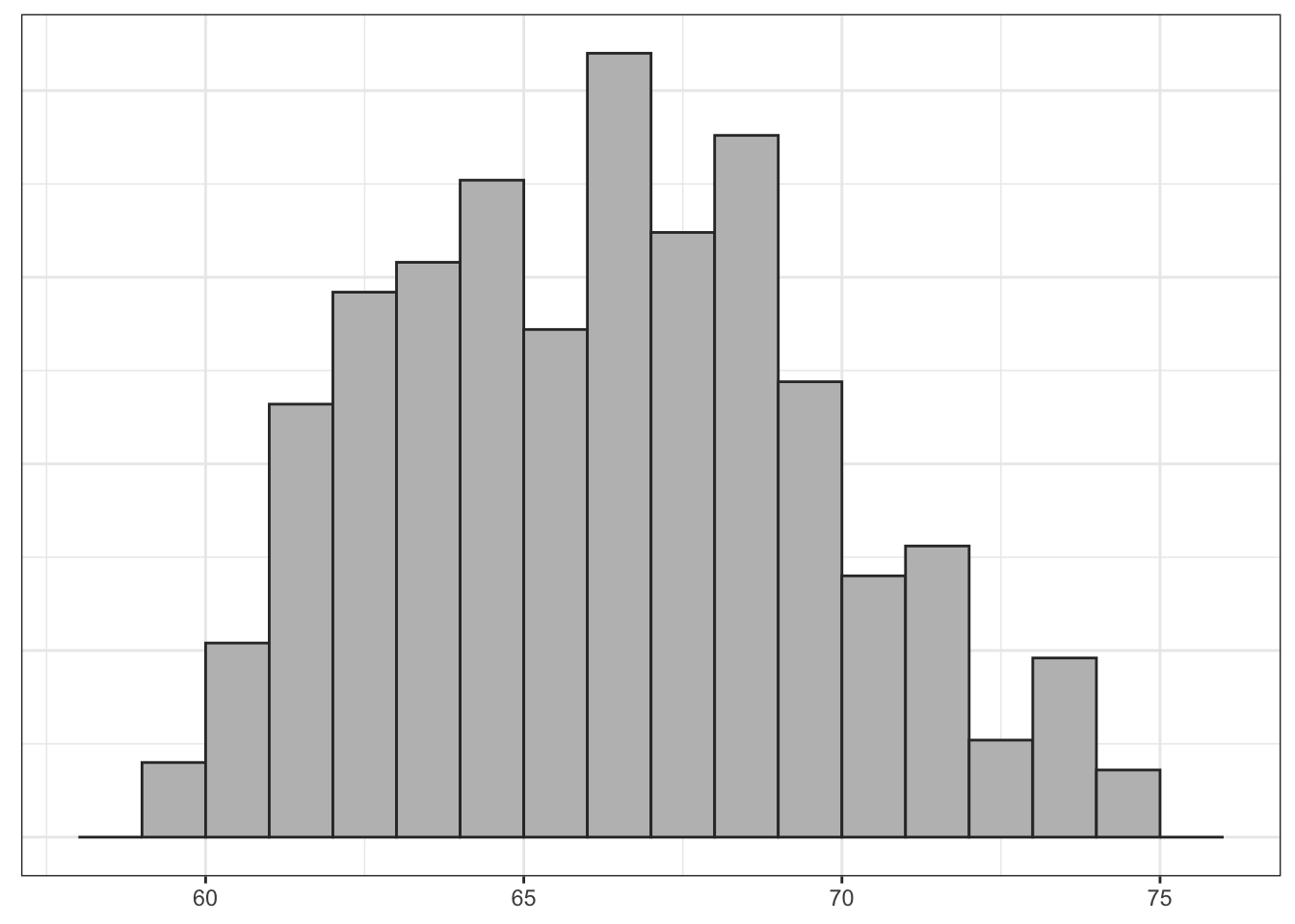
As an example, lets use some data on a recent class that took this course. I will treat this class of 42 students as a population that I would like to know something about. In this case, I would like to know the mean height of the class. In most cases, the population distribution is unknown but in this case, I know the height of all 42 students because of surveys they all took at the beginning of the term. Figure 4.2 shows the population distribution of height in the class:

The population distribution of height is somewhat bimodal which is typical, because we are mixing the heights of men and women. The population mean of height (\(\mu\)) is 66.517 inches.
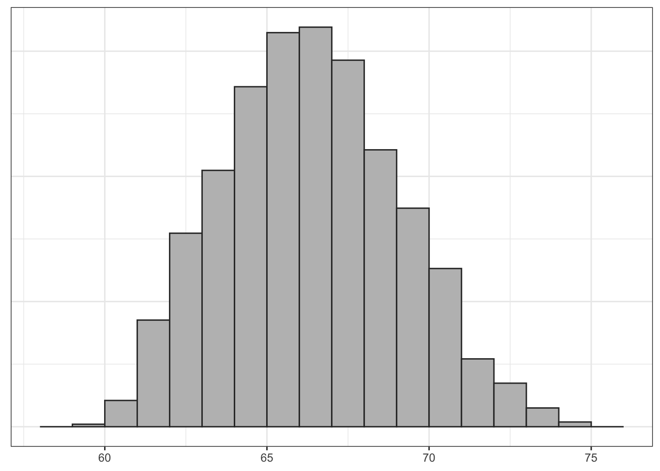
Lets say I lost the results of this student census and I wanted to know the mean height of the class. I could take a random sample of two students in order to calculate the mean height. Lets say I drew a sample of two people who were 68 and 74 inches respectively in height. I would estimate a sample mean of 71 inches, which in this case would be far too high. Lets say I took another sample of two students and ended up with a mean height of 66 which would be pretty close, but a little low. Lets say I repeat this procedure until I had sampled all possible combinations of two students out of the fourty-two in the class.
How many samples would this be? On the first draw from the population of 42 students there are 42 possible results. On the second draw, there are 41 possible results, because I won’t re-sample the student I selected the first time. This gives me 42*41=1722 possible combinations of 42 students in two draws. However, half of these draws are just mirror images of the other draws where I swap who is drawn first and second. Since I don’t care about the order of the sampling, I actually have 1722/2=861 possible samples.
I have used a computer routine to actually calculate the sample means in all 861 of those possible samples. The distribution of these sample means then gives us the sampling distribution of mean height for samples of size 2. Figure 4.3 shows a histogram of that distribution.

When I randomly draw one sample of size 2 and calculate its mean, I am effectively reaching into this distribution and pulling out one of these values. Note that many of the means are clustered around the true population mean of 66.5 inches, but in a few cases I can get extreme overestimates or extreme underestimates.
What if I were to increase the sample size? I have used the same computer routine to calculate the sampling distribution for samples of size 3, 4, and 5. Figure 4.4 shows the results.

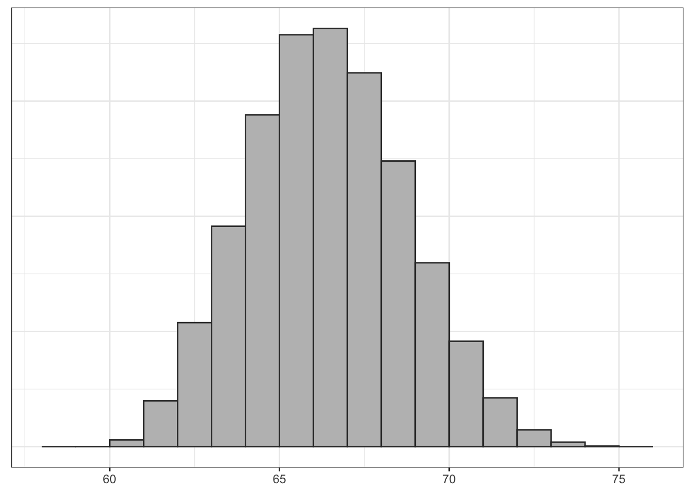
Clearly, the shape of these distributions is changing. Another way to visualize this would be to draw density graphs which basically fit a curve to the histograms. We can then then overlap these density curves on the same graph. Figure 4.5 shows this graph.

There are three thing to note here. First, each sampling distribution seems to have most of the sample means clustered (where the peak is) around the true population mean of 66.5. In fact, the mean of each of these sampling distributions is exactly the true population parameter, as I will show below. Second, the spread of the distributions is shrinking as the sample size increases. You can see that when the sample size increases, the tails of the distribution are “pulled in” and more of the sample means are closer to the center. This indicates that we are less likely to draw a sample mean that is extremely different from the population mean in larger samples. Third, the shape of the distribution at larger sample sizes is becoming more symmetric and “bell-shaped.”
Table 4.1 shows the means and standard deviations of these sampling distributions.
| Distribution | Mean | SD |
|---|---|---|
| Population Distribution | 66.517 | 4.870 |
| Sampling Distribution (n=2) | 66.517 | 3.363 |
| Sampling Distribution (n=3) | 66.517 | 2.710 |
| Sampling Distribution (n=4) | 66.517 | 2.316 |
| Sampling Distribution (n=5) | 66.517 | 2.044 |
Note that the mean of each sampling distribution is identical to the true population mean. This is not a coincidence. The mean of the sampling distribution of sample means is always itself equal to the population mean. In statistical terminology, this is the definition of an unbiased statistic. Given that we are trying to estimate the true population mean, it is reassuring that the “average” sample mean we should get is the true population mean.
Also note that the standard deviation of the sampling distributions gets smaller with increasing sample size. This is mathematical confirmation of the shrinking of the spread that we observed graphically. In larger sample sizes, we are less likely to draw a sample mean far away from the true population mean.
The patterns we are seeing here are well known to statisticians. In fact, they are patterns that are predicted by the most important theorem in statistics, the central limit theorem. We won’t delve into the technical details of this theorem, but we can generally interpret the central limit theorem to say:
As the sample size increases, the sampling distribution of a sample mean becomes a normal distribution. This normal distribution will be centered on the true population mean \(\mu\) and with a standard deviation equal to \(\sigma/\sqrt{n}\), where \(\sigma\) is the population standard deviation.
What is this “normal” distribution? The name is somewhat misleading because there is nothing particularly normal about the normal distribution. Most real-world distributions don’t look normal, but the normal distribution is central to statistical inference because of the central limit theorem. The normal distribution is a bell-shaped, unimodal, and symmetric distribution. It has two characteristics that define its exact shape. The mean of the normal distribution define its center and the standard deviation defines its spread.
Lets look at the normal sampling distribution of the mean to become familiar with it.
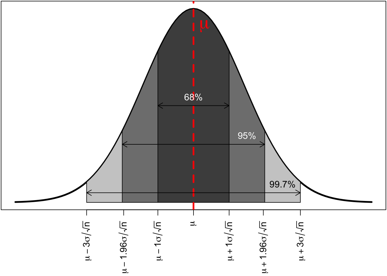
The distribution is symmetric and bell shaped. The center of the distribution is shown by the red dotted line. This center will always be at the true population mean, \(\mu\). The area of the normal distribution also has a regularity that is sometimes referred to as the “68%,95%,99.7%” rule. Regardless of the actual variable, 68% of all the sample means will be within 68% of the true population mean, 95% of all the sample means will be within 95% of the true population mean, and 99.7% of all the sample means will be within three standard deviations of the mean. This regularity will become very helpful later on for making statistical inferences.
It is easy to get confused by the number of standard deviations being thrown around in this section. There are three standard deviations we need to keep track of to properly understand what is going on here. Each of these standard deviations is associated with one of the types of distributions I introduced at the beginning of this section.
In the example here, I have focused on the sample mean as the sample statistic of interest. However, the logic of the central limit theorem applies to several other important sample statistics of interest to us. In particular, the sampling distributions of:
all become normal as the sample size increases. Thus, this normal distribution is critically important in making statistical inferences for a wide variety of statistics.
Note that the standard error formula \(\sigma/\sqrt{n}\) only applies to the sampling distribution of sample means. Other sample statistics use different formulas for their standard errors, which I will introduce in the next section.
Now that we know the sampling distribution of the sample mean should be normally distributed, what can we do with that information? The sampling distribution gives us information about how we would expect the sample means to be distributed. This seems like it should be helpful in figuring out whether we got a value close to the center or not. However, there is a catch. We don’t know either \(\mu\), the center of this distribution or \(\sigma\) which we need to calculate its standard deviation. Thus, we know theoretically what it should look like but we have no concrete numbers to determine its actual shape.
We can fix the problem with not knowing \(\sigma\) fairly easily. We don’t know \(\sigma\) but we do have an estimate of it in \(s\), the sample standard deviation. In practice, we us this value to calculate an estimated standard error of \(s/\sqrt{n}\). However, this substitution has consequences. Because we are using a sample statistic subject to random bias to estimate the standard error, this creates greater uncertainty in our estimation. I will come back to this issue in the next section.
We still have the more fundamental problem that we don’t know where the center of the sampling distribution should be. In order to make statistical inferences, we are going to employ two different methods that make use of what we do know about the sampling distribution:
I will discuss these two different methods in the next two sections.
As Figure 4.7 shows, 95% of all the possible sample means will be within 1.96 standard errors of the true population mean \(\mu\).
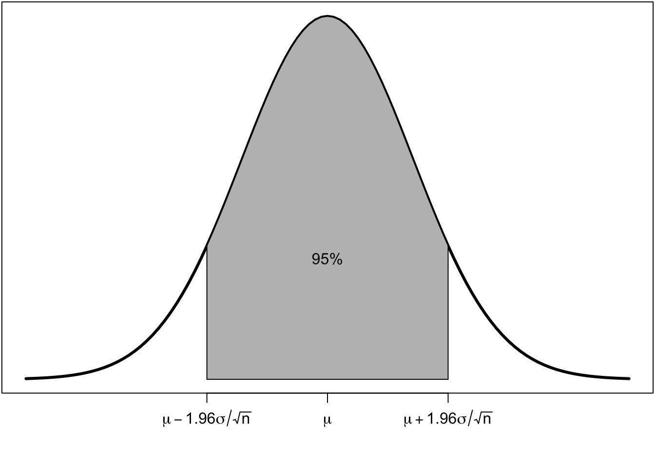
Lets say I were to construct the following interval for every possible sample:
\[\bar{x}\pm1.96(\sigma/\sqrt{n})\]
It follows from the statement above that for 95% of all samples, this interval would contain the true population mean, \(\mu\).
To see how this works graphically, imagine constructing this interval for twenty different samples from the same population. Figure 4.8 shows the mean and interval for each of these twenty samples, relative to the true population mean.

You can see that these sample means fluctuate around the true population mean due to random sampling error. The lines give the interval outlined above. In 19 out of the 20 cases, this interval contains the true population mean (as you can see by the fact that the interval crosses the blue line). The one sample where this is not true is shown in red. On average, 95% of samples will contain the true population mean in the interval, so 5% or 1 in 20 will not.
We refer to this interval as the 95% confidence interval. Of course, in practice, we only construct one interval on the sample that we have. We use this interval to give a range of values that we feel “confident” will contain the true population mean.
The term “confident” is a little ambiguous. Given my statements above, it might be tempting to interpret the 95% confidence interval to mean that there is a 95% probability that the true population mean is within the interval. This interpretation seems intuitive and straightforward, but that interpretation is incorrect according to the classic approach to inference. The problem here is subtle, but from the classical viewpoint, probability is an objective phenomenon that relates to the outcomes of future processes over the long run. From this viewpoint, we cannot express our subjective uncertainties about numbers in terms of probabilities.The population mean is a single static number. This leads us to a sort of yoda-like statement: The population mean is either in your interval or it is not. There is no probability.
This is why we use a more neutral term like “confidence.” If we want to be long-winded about it, we might say that we are 95% confident because “in 95% of all the possible samples I could have drawn, the true population mean would be in the interval. I don’t know if I have one of those 95% or the unlucky 5%, but nonetheless, there it is.”
If this all seems a bit confusing, you are perfectly normal. As I said, this is the classic view of probability. Intuitively, people often think of uncertainty in probabilistic terms (e.g. what are the odds your team will win the game?). Many contemporary statisticians would in fact agree that it is perfectly okay to express subjective uncertainty as a probability. But, I still need to let you know that from the classic approach, interpreting your confidence interval as a probability statement is a no-no.
Okay, lets try calculating a confidence interval for age in the politics dataset. The formula is:
\[\bar{x}\pm1.96(\sigma/\sqrt{n})\]
Oh wait, we can’t do it because we don’t know the value of the population standard deviation \(\sigma\)! As I explained in the last section, we are going to have to do a little “fudging” here. Instead of \(\sigma\), we can use our sample standard deviation \(s\). However, doing so will have consequences. Here is our new formula:
\[\bar{x} \pm t*(s\sqrt{n})\]
As you can see, I have replaced the 1.96 with some number \(t\), referred to as the t-statistic. Basically to adjust for the greater uncertainty in using a sample statistic in my calculation of the standard error, I need to increase the number here slightly from 1.96. How much I increase it will depend on the degrees of freedom which are given by the sample size minus one (\(n-1\)). To figure out the correct t-statistic, I can use the qt command in R.
qt(0.975, nrow(politics)-1)[1] 1.960524The first command to qt is the confidence you want. This is a little bit tricky because for a 95% confidence interval, we actually want to input 0.975. This is because we are basically asking for only the upper tail of that normal distribution shown at the beginning of this section. This area contains only 2.5% of the area outside, with the other 2.5% being in the lower tail. The second number is the degrees of freedom which equals \(n-1\). In this case, we have such a large sample, that the t-statistic we need is very close to 1.96.
In smaller samples, using the t-statistic rather than 1.96 can make a bigger difference. Its not a proper sample, but lets take the case of the crime data. Here there are only 51 observations, so the t-statistic is:
qt(0.975, 51-1)[1] 2.008559The difference from 1.96 is a little more noticeable.
Lets return to the politics data. We now have all the information we need to calculate the 95% confidence interval:
xbar <- mean(politics$age)
sdx <- sd(politics$age)
n <- nrow(politics)
se <- sdx/sqrt(n)
t <- qt(0.975,n-1)
xbar+t*se
[1] 50.02422xbar-t*se[1] 48.96516We are 95% confident that the mean age among all US adults is between 48.97 and 50.02 years of age. As you can see, the large sample of nearly 6,000 respondents produces a very tight confidence interval.
As noted in the previous section, the sampling distribution of other sample statistics such as proportions, proportion differences, and mean differences is also normally distributed in large enough samples. This means that we can use the same approach to construct confidence intervals for other sample statistics. The general form of the confidence interval is:
\[\texttt{(sample statistic)} \pm t*\texttt{(standard error)}\]
In order to do this for any of the above sample statistics, we only need to know how to calculate that sample statistic’s standard error and the degrees of freedom used to look up the t-statistic for that sample statistic. Table 4.2 provides a useful cheat sheet of those formulas:
| Type | SE | df for \(t\) |
|---|---|---|
| Mean | \(s/\sqrt{n}\) | \(n-1\) |
| Proportion | \(\sqrt\frac{\hat{p}*(1-\hat{p})}{n}\) | \(n-1\) |
| Mean Difference | \(\sqrt{\frac{s_1^2}{n_1}+\frac{s_2^2}{n_2}}\) | min(\(n_1-1\),\(n_2-1\)) |
| Proportion Difference | \(\sqrt{\frac{\hat{p}_1*(1-\hat{p}_1)}{n_1}+\frac{\hat{p}_2*(1-\hat{p}_2)}{n_2}}\) | min(\(n_1-1\),\(n_2-1\)) |
| Correlation Coefficient | \(\sqrt{\frac{1-r^2}{n-2}}\) | \(n-2\) |
I know some of that math might look intimidating but I will go through an example of each case below to show you how each formula works.
As an example, lets use the proportion of respondents who do not believe in anthropogenic climate change. In our politics sample, we get:
table(politics$globalwarm)
  No  Yes
1183 3054
n <- 1183+3054
p_hat <- 1183/n
n[1] 4237p_hat[1] 0.279207About 27.9% of the respondents in our sample are climate change deniers. What can we conclude about the proportion in the US population? First, lets figure out the t-statistic. We use the same \(n-1\) for degrees of freedom:
# calculate-tstat-prop
t_stat <- qt(0.975, n-1)
t_stat
[1] 1.960524Our sample is large enough that we are basically using 1.96. Now we need to calculate the standard error. The formula from above is:
\[\sqrt{\frac{\hat{p}*(1-\hat{p})}{n}}\]
The term \(\hat{p}\) is the standard way to represent the sample proportion, which in this case is 0.279. So, our formula is:
\[\sqrt{\frac{0.279*(1-0.279)}{4237}}\]
We can calculate this in R:
se <- sqrt(p_hat*(1-p_hat)/n)
se
[1] 0.006891904We now have all the pieces to construct the confidence interval:
p_hat+t_stat*se[1] 0.2927187p_hat-t_stat*se[1] 0.2656952We are 95% confident that the true percentage of climate change deniers in the the US population is between 26.6% and 29.3%.
Using the popularity data, what is the mean difference in number of friend nominations between frequent smokers and those who do not smoke frequently?
tapply(popularity$nominations, popularity$smoker, mean)Non-smoker Smoker
4.509383 4.781109 mean_diff <- 4.781109 - 4.509383
mean_diff[1] 0.271726In our sample data, frequent smokers had 0.272 more friends on average than those who did not smoke frequently. What is the confidence interval for that value in the population? We start by calculating the t-statistic for this confidence interval. We use the size of the smaller group minus one for the degrees of freedom.
table(popularity$smoker)
Non-smoker     Smoker
      3730        667
n1 <- 3730
n2 <- 667
t_stat <- qt(.975, n2-1)
t_stat[1] 1.963532Now we need to calculate the standard error. The formula is:
\[\sqrt{\frac{s_1^2}{n_1}+\frac{s_2^2}{n_2}}\]
We already have \(n_1\) and \(n_2\), so we just need to get the standard deviation of friend nominations for the two groups to get \(s_1\) and \(s_2\). We can do this with another tapply command, but changing from mean to sd in the third argument.
tapply(popularity$nominations, popularity$smoker, sd)Non-smoker Smoker
3.655234 3.885764 s1 <- 3.655234
s2 <- 3.885764
se <- sqrt(s1^2/n1+s2^2/n2)
se[1] 0.161924Now we have all the pieces to put together the confidence interval:
mean_diff - t_stat*se[1] -0.04621706mean_diff + t_stat*se[1] 0.5896691We are 95% confident that in the population of US adolescents, those who smoke frequently have between 0.05 fewer to 0.59 more friend nominations, on average, than those who do not smoke frequently. Note that because our confidence interval contains both negative and positive values, we cannot be confident about whether smoking is truly associated with having more or less friends. The direction of the relationship between the two variables is uncertain.
Lets continue to use the popularity data. Do we observe a gender difference in smoking behavior in our sample?
prop.table(table(popularity$smoker, popularity$gender), 2)
                Female      Male
  Non-smoker 0.8530559 0.8430622
  Smoker     0.1469441 0.1569378
p_hat_f <- 0.1469441
p_hat_m <- 0.1569378
p_hat_diff <- p_hat_m-p_hat_f
p_hat_diff[1] 0.0099937In our sample, about 14.7% of girls were frequent smokers and about 15.7% of boys were frequent smokers. The percentage of boys who smoke is about 1% higher than the percentage of girls. Do we think this moderate difference in the sample is true in the population?
Lets start again by calculating the appropriate t-statistic for our confidence interval. We use the same procedure as for mean differences above, choosing the size of the smaller group for the degrees of freedom. However, its important to note that our groups are now boys and girls, not smokers and non-smokers.
table(popularity$gender)
Female   Male
  2307   2090
n_f <- 2307
n_m <- 2090
t_stat <- qt(.975, n_m-1)
t_stat[1] 1.9611Now we can calculate the standard error. The formula is:
\[\sqrt{\frac{\hat{p}_1*(1-\hat{p}_1)}{n_1}+\frac{\hat{p}_2*(1-\hat{p}_2)}{n_2}}\]
That looks like a lot, but we just have to focus on plugging in the right values in R:
se <- sqrt((p_hat_f*(1-p_hat_f)/n_f)+(p_hat_m*(1-p_hat_m)/n_m))
se
[1] 0.01084623Now we have all the parts to calculate the confidence interval:
p_hat_diff - t_stat*se[1] -0.01127685p_hat_diff + t_stat*se[1] 0.03126425We are 95% confident that in the population of US adolescents, between 1.1% fewer to 3.1% more boys smoke frequently than girls. As above, because our confidence interval includes both negative and positive values, we are not very confident at all about whether boys or girls smoke more frequently.
Lets stick with the popularity data. What is the correlation between GPA and the number of friend nominations that a student receives?
r <- cor(popularity$pseudo_gpa, popularity$nominations)
r
[1] 0.1538346In our sample, there is a moderately positive correlation between a student’s GPA and the number of friend nominations that a student receives. What is our confidence interval for the population?
For the t-statistic, we use \(n-2\) for the degrees of freedom:
n <- nrow(popularity)
t_stat <- qt(.975, n-2)
t_stat
[1] 1.960504For the standard error, the formula is:
\[\sqrt{\frac{1-r^2}{n-2}}\] This is straightforward to calculate in R:
se <- sqrt((1-r^2)/(n-2))
se
[1] 0.01490459Now we have all the parts we need to calculate the confidence interval:
r - t_stat*se[1] 0.1246141r + t_stat*se[1] 0.1830551We are 95% confident that the true correlation coefficient between GPA and friend nominations in the population of US adolescents is between 0.125 and 0.183. While there is some difference in the strength of that relationship, we are pretty confident that the correlation is moderately positive. Unlike in the previous two cases, we can be confident of its direction.
In social scientific practice, hypothesis testing is far more common than confidence intervals as a technique of statistical inference. Both techniques are fundamentally derived from the sampling distribution and produce similar results, but the methodology and interpretation of results is very different.
In hypothesis testing, we play a game of make believe. Remember that the fundamental issue we are trying to work around is that we don’t know the value of the true population parameter and thus we don’t know where the center is for the sampling distribution of the sample statistic. In hypothesis testing, we work around this issue by boldly asserting the value of the true population parameter. We then test whether the data that we got are reasonably consistent with that assertion.
Lets take a fairly straightforward example. Coca-Cola used to run promotions where a certain percentage of bottle caps were claimed to win you another free coke. In one such promotion, when I was in graduate school, Coca-Cola ran a promotion where they claimed that 1 in 12 bottles were winners. If this is true, then 8.3% (1/12=0.083) of all the coke bottles in every grocery store and mini mart should contain winning bottle caps.
Being a grad student who needed to stay up late writing a dissertation fueled by caffeine and “sugar,” I use to drink quite a few Cokes. After only receiving a few winners after numerous attempts, I began to get suspicious of the claim. I started collecting bottle caps to see if I could statistically find evidence of fraudulent behavior.
For the sake of this exercise, lets say I collected 100 Coke bottle caps (I never got this high in practice, but its a nice round number) and that I only got five winners. My winning percentage is 5% which is lower than Coke’s claim of 8.3%.
The critical question is whether it is likely or unlikely that I would get a winning percentage this different from the claim in a sample of 100 bottle caps. That is what a hypothesis test is all about. We are asking whether the data that we got are likely under some assumption about the true parameter. If they are unlikely, then we reject that assumption. if they are not unlikely, then we do not reject the assumption.
We call that assumption the null hypothesis, \(H_0\). The null hypothesis is a statement about what we think the true value of the parameter is. The null hypothesis is our “working assumption” until we can be proven to be wrong. In this case, the parameter of interest is the true proportion of winners among the population of all Coke bottles in the US. Coke claims that this proportion is 0.083, so this is my null hypothesis. In mathematical terms, we write:
\[H_0: \rho=0.083\]
I use the Greek letter \(\rho\) as a symbol for the population proportion. I will use \(\hat{p}\) to represent the sample proportion in my sample, which is 0.05.
Some standard statistical textbooks also claim that there is an “alternative hypothesis.” That alternative hypothesis is specified as “anything but the null hypothesis.” In my view, this is incorrect because vague statements about “anything else” do not constitute an actual hypothesis about the data. We are testing only whether the data are consistent with the null hypothesis. No other hypothesis is relevant.
My sample of 100 had a winning proportion of 0.05. Assuming the null hypothesis is true, what would the sampling distribution look like from which I pulled my 0.05? Note the part in bold above. We are now playing our game of make believe.
We know that on a sample of 100, the sample proportion should be normally distributed. It should also be centered on the true population proportion. Because we are assuming the null hypothesis is true, it should be centered on the value of 0.083. The standard error of this sampling distribution is given by:
\[\sqrt{\frac{0.083*(1-0.083)}{100}}=0.028\]
Therefore, we should have a sampling distribution that looks like:

The blue line shows the true population proportion assumed by the null hypothesis. The red line shows my actual sample proportion. The key question of hypothesis testing is whether the observed data (or more extreme data) are reasonably likely under the assumption of the null hypothesis. Practically speaking, I want to know how far my sample proportion is from the true proportion and whether this distance is far enough to consider it unlikely.
To calculate how far away I am on some standard scale, I divide the distance by the standard error of the sampling distribution to calculate how many standard errors my sample proportion is below the population parameter (assuming the null hypothesis is true).
\[\frac{0.05-0.083}{0.028}=\frac{-0.033}{0.028}=-1.18\]
My sample proportion is 1.18 standard errors below the center of the sampling distribution. This standardized measure of how far away from the center we are is sometimes called the test statistic for a given hypothesis test.
Is this an unlikely distance? To figure this out, we need to calculate the area in the lower tail of the sampling distribution past my red line. This number will tell us the proportion of all sample proportions that would be 0.05 or lower, assuming the null hypothesis is true.
Calculating this area is not a trivial exercise, but R provides a straightforward command called pt which is somewhat similar to the qt command above. We just need to feed in how many standard errors our estimate is away from the center (-1.18) and the degrees of freedom. These degrees of freedom are identical to the ones used in confidence intervals (in this case, the sample statistic is a proportion so we use \(n-1\), which equals 99).
pt(-1.18, 99)[1] 0.1204139There is one catch with this command. It always gives you the area in the lower tail, so if your sample statistic is above the center, you should still put in a negative value in the first command. We will see an example of this below.
Our output indicates that 12% of all samples would produce a sample proportion of 0.05 or less when the true population proportion is 0.083. Graphically it looks like this:

The grey area is the area in the lower tail. It would seem that we are almost ready to conclude our hypothesis test. However, there is a catch and its a tricky one. Remember that I was interested in the probability of getting a sample proportion this far or farther from the true population proportion. This is not the same as getting a sample proportion this low or lower. I need to consider the possibility that I would have been equally suspicious if I had got a sample proportion much higher than 8.3%. In mathematically terms, that means I need to take the area in the upper tail as well, where I am .033 above the true population proportion. This is called a two-tailed test. Luckily, because the normal distribution is symmetric, this area will be identical to the area in the lower tail and so I can just double this percent.
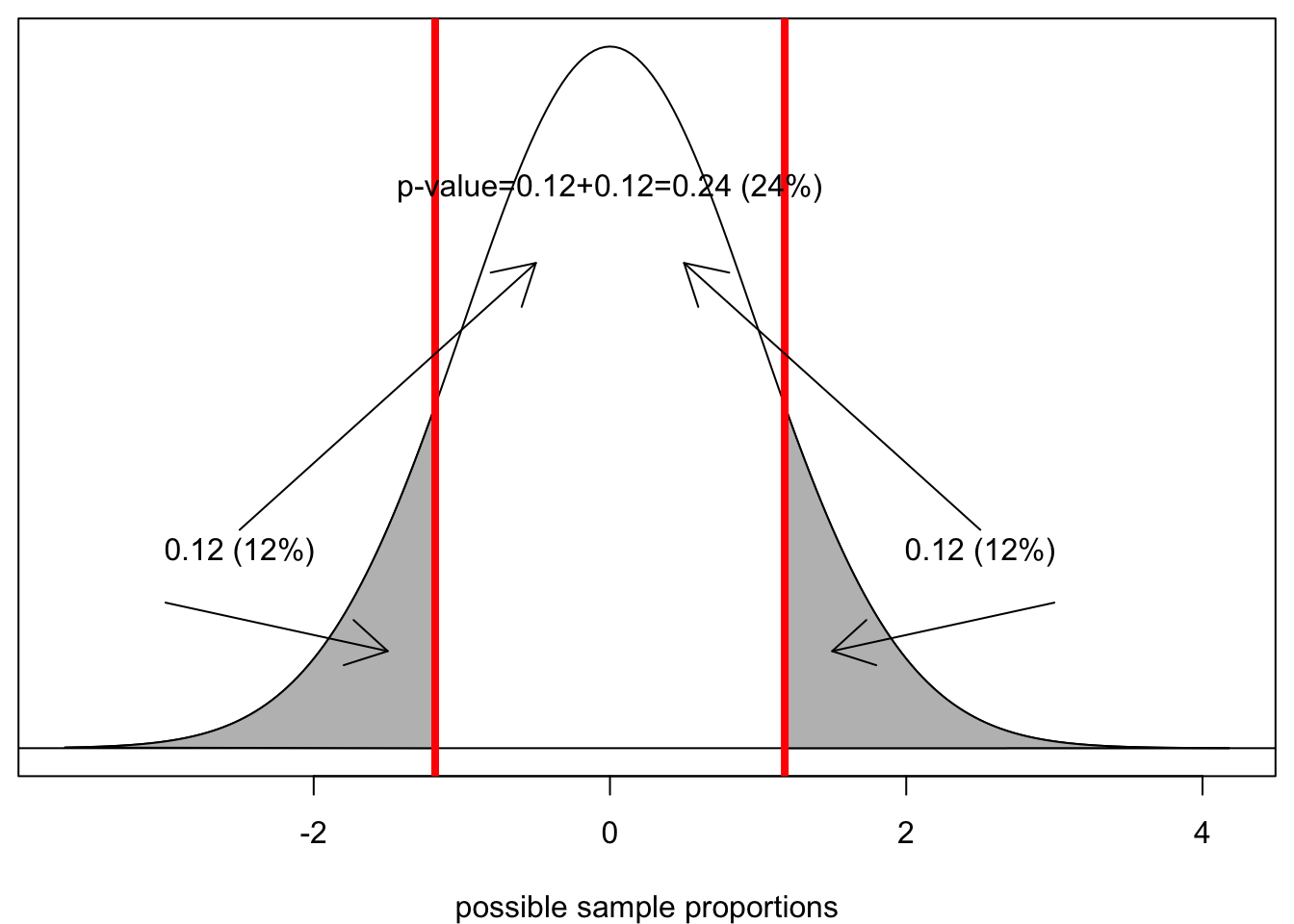
Assuming the null hypothesis is true, there is a 24% chance of getting a sample proportion this far from the true population proportion or farther, just by random chance. We call this probability the p-value. The p-value is the ultimate metric of the hypothesis test. All hypothesis tests produce a p-value and it is the p-value that we will use to make a decision about our test.
What should that decision be? We have only two choices. If the p-value is low enough, then it is unlikely that we would have gotten this data or data more extreme, assuming the null hypothesis is true. Therefore, we reject the null hypothesis. If the p-value is not low enough, then it is reasonable that we would have gotten this data or data more extreme, assuming the null hypothesis is true. Therefore, we fail to reject the null hypothesis. Note that we never accept or prove the null hypothesis. It is already our working assumption, so the best we can do is fail to reject it and thus continue to use it as our working assumption.
How low does the p-value need to be in order to reject it? There is no right answer here, because this is a subjective question. However, there is a generally agreed upon practice in the social sciences that we reject the null hypothesis when the p-value is at or below 0.05 (5%). While there is general consensus around this number, it is an arbitrary cutpoint. The practical difference between a p-value of 0.049 and 0.051 is negligible, but under this arbitrary standard, we would make different decisions in each case. Its good to know the standards, but don’t imbue them with a magical certainty. Its better to truly understand what a p-value represents and make your decisions accordingly.
No reasonable scientist, however, would reject the null hypothesis with a p-value of 24% as we have in this case. Nearly 1 in 4 samples of size 100 would produce a sample proportion this different from the assumed true proportion of 8.3% just by random chance. I therefore do not have sufficient evidence to reject the null hypothesis that Coke is telling the truth. Note that I have not proved that Coke is telling the truth. I have only failed to produce evidence that they are lying. I’ll get you next time, Coca-Cola!
The general procedure of hypothesis testing is as follows:
P-values are widely misunderstood in practice. Studies have been done of practicing researchers across different disciplines where these researchers were asked to interpret a p-value from a multiple choice question and the majority get it wrong. Therefore, don’t feel bad if you are having trouble understanding a p-value. You are in good company! Nonetheless, proper interpretation of a p-value is critically important for our understanding of what a hypothesis test does.
The reason many people get the interpretation of p-values wrong is that they want the p-value to express the probability of a hypothesis being correct or incorrect. People routinely misinterpret the p-value as a statement about the probability of the null hypothesis being correct. The p-value is NOT a statement about the probability of a hypothesis being correct or incorrect. For the same reason that we cannot call a confidence interval a probability statement, the classical approach dictates that we cannot characterize our subjective uncertainty about whether hypotheses are true or not by a probability statement. The hypothesis is either correct or it is not. There is no probability.
Correctly interpreted, the p-value is a probability statement about the data, not about the hypothesis. Specifically, we are asking what the probability is of observing data this extreme or more extreme, assuming the null hypothesis is true. We are not making a probability statement about hypotheses. Rather we are assuming a hypothesis and then asking about the probability of the data. This difference may seem subtle, but it is in fact quite substantial in interpretation.
Its best to understand the p-value is a conditional probability which is sometimes written generally as:
\[P(A|B)\]
Which means the probability that \(A\) happens given that \(B\) happened. In this case, the p-value can be expresses as the probability of getting the data you got given the null hypotheis is true, or mathematically:
\[P(data|H_0)\]
The reason why everyone (including you and me) struggles with this is that our brains want it to be the other way around (e.g. \(P(H_0|data)\)). Ultimately by rejecting or failing to reject we are making statements about whether we believe the hypothesis or not, but we are not doing that directly by a probability statement about the hypothesis but rather a probability statement about the likelihood of the data given the hypothesis.
The hypothesis tests that we care the most about in the sciences are hypothesis tests about relationships between variables. We want to know whether the association we observe in the sample is true in the population. In all of these cases, our null hypothesis is that there is no association, and we want to know whether the association we observe in the sample is strong enough to reject this null hypothesis of no association. We can do hypothesis tests of this nature for mean differences, proportion differences, and correlation coefficients.
Lets look at differences in mean income (measured in $1000) by religion in the politics dataset.
tapply(politics$income, politics$relig, mean) Mainline Protestant Evangelical Protestant Catholic
81.62389 58.20288 78.14887
Jewish Non-religious Other
115.98571 88.15901 59.34343 I want to look at the difference between Mainline Protestants and Catholics. The mean difference here is:
\[81.62389-78.14887=3.475\]
Mainline Protestants make $3,475 more than Catholics in my sample. Do I believe this difference is real in the population?
Let me set up a hypothesis test where the null hypothesis is that Mainline Protestants and Catholics have the same income in the population, or in other words, the mean difference in income is zero:
\[H_0: \mu_p-\mu_p=0\]
Where \(\mu_p\) is the population mean income of Mainline Protestants and \(\mu_c\) is the population mean income of Catholics. In order to figure out how far my sample mean difference of 3.475 is from 0, I need to find the standard error of the mean difference. The formula for this number is:
\[\sqrt{\frac{s_c^2}{n_c}+\frac{s_o^2}{n_o}}\]
I can calculate this in R:
tapply(politics$income, politics$relig, sd) Mainline Protestant Evangelical Protestant Catholic
63.16744 49.97264 66.60352
Jewish Non-religious Other
94.59226 71.46561 55.44147 table(politics$relig)
   Mainline Protestant Evangelical Protestant               Catholic
                   787                    902                   1021
                Jewish          Non-religious                  Other
                    70                    566                    891
se <- sqrt(63.16744^2/787+66.60352^2/1021)
3.475/se[1] 1.132527The t-statistic of 1.13 is not very large. I am only 1.13 standard errors above 0 on the sampling distribution, assuming the null hypothesis is true. Because I have not passed the critical 1.96 value, I know that my p-value is not going to be low enough. Lets go ahead and calculate the p-value exactly, though. Remember that I need to put in the negative version of this number to the pt command. I also need to use the smaller of the two sample sizes for my degrees of freedom:
2*pt(-1.132527, 787-1)[1] 0.2577583In a sample of this size, there is an 26% chance of observing a mean income difference of $3,475 or more between Mainline Protestants and Catholics, just by sampling error, assuming that there is no difference in income between these groups in the population. Therefore, I fail to reject the null hypothesis that Mainline Protestants and Catholics make the same income.
Lets look at the difference in smoking behavior between white and black students in the popularity data. Our null hypothesis is:
\[H_0: \rho_w-\rho_c=0\] In simple terms, our null hypothesis is that the same proportion of white and black adolescents smoke frequently. Lets look at the actual numbers from our sample:
prop.table(table(popularity$smoker, popularity$race),2)
                  White Black/African American     Latino
  Non-smoker 0.79505703             0.94686411 0.89135802
  Smoker     0.20494297             0.05313589 0.10864198

             Asian/Pacific Islander American Indian/Native American      Other
  Non-smoker             0.90123457                      0.80769231 0.92307692
  Smoker                 0.09876543                      0.19230769 0.07692308
p_w <- 0.20494297
p_b <- 0.05313589
p_diff <- p_w-p_b
p_diff[1] 0.1518071About 20.5% of white students smoked frequently, compared to only 5.3% of black students. The difference in proportion is a large 15.2% in the sample. This would seem to contradict our null hypothesis. However, we need to confirm that a difference this large in a sample of our size is unlikely to happen by random chance. To do that we need to calculate the standard error, just as we learned to do it for proportion differences in the confidence interval section:
table(popularity$race)
                          White          Black/African American
                           2630                            1148
                         Latino          Asian/Pacific Islander
                            405                             162
American Indian/Native American                           Other
                             26                              26
n_w <- 2630
n_b <- 1148
se <- sqrt((p_w*(1-p_w)/n_w)+(p_b*(1-p_b)/n_b))
se[1] 0.01028499Now many standard errors is our observed difference in proportion from zero?
t_stat <- p_diff/se
t_stat
[1] 14.76006Wow, thats a lot. We can be pretty confident already without the final step of the p-value, but lets calculate it anyway. Remember as always to take the negative version of the t-statistic you calculated:
2*pt(-14.76006, n_b-1)[1] 2.852712e-45The p-value is astronomically small. In a sample of this size, the probability of observing a difference in the proportion frequent smokers between white and black adolescents of 15.2% or larger if there is no difference in the population is less than 0.0000001%. Therefore, I reject the null hypothesis and conclude that white students are more likely to be frequent smokers than are black students.
When you calculate p-values, you will sometimes get p-values that are so small R expresses them in scientific notation as for the example above. The e-45 part of this results indicates that we multiple our value by \(10^{-45}\), which is equivalent to moving the decimal place over 45 spaces to the left. The resulting number is:
\[0.000000000000000000000000000000000000000000002852712\]
Thats a really small number! If you see output in terms of scientific notation, then you are dealing with a very small number and you can safely reject the null hypothesis. In those cases, rather than write out th exact probability, I just write “less than 0.0000001%.”
Lets look at the correlation between the parental income of a student and the number of friend nominations they receive. Our null hypothesis will be that there is no relationship between parental income and student popularity in the population of US adolescents. Lets look at the data in our sample:
r <- cor(popularity$parent_income, popularity$nominations)
r
[1] 0.119836In the sample we observe a moderately positive correlation between a student’s parental income and the number of friend nominations they receive. How confident are we that we wouldn’t observe such a large correlation coefficient in our sample by random chance if the null hypothesis is true?
First, we need to calculate the standard error:
n <- nrow(popularity)
se <- sqrt((1-r^2)/(n-2))
se
[1] 0.01497544How many standard errors are we away from the assumption of zero correlation?
r/se[1] 8.002166What is the probability of being that far away from zero for a sample of this size?
2*pt(-8.002166, n-2)[1] 1.551277e-15The probability is very small. In a sample of this size, the probability is less than 0.00000001% of observing a correlation coefficient between parental income and friend nominations received of an absolute magnitude of 0.12 or higher when the true correlation is zero in the population. Therefore, we reject the null hypothesis and conclude that there is a positive correlation between parental income and popularity among US adolescents.
When a researcher is able to reject the null hypothesis of “no association,” the result is said to be statistically significant. This is a somewhat unfortunate phrase that is sometimes loosely interpreted to indicate that the result is “important” in some vague scientific sense.
In practice, it is important to distinguish between substantive and statistical significance. In very large datasets, standard errors will be very small, and thus it is possible to observe associations that are very small in substantive size that are nonetheless statistically significant. On the flip side, in small datasets, standard errors will often be large, and thus it is possible to observe associations that are very large in substantive size but not statistically significant.
It is important to remember that “statistical significance” is a reference to statistical inference and not a direct measure of the actual magnitude of an association. I prefer the term “statistically distinguishable” to “statistically significant” because it more clearly indicates what is going on. In one of the previous examples, we found that the income difference in the politics sample between Mainline Protestants and Catholics was not statistically distinguishable from zero. Establishing whether an association is worthwhile in its substantive effect is a totally different exercise from establishing whether it is statistically distinguishable from zero.
It is also important to remember that a statistically insignificant finding is not evidence of no relationship because we never accept the null hypothesis. We have just failed to find sufficient evidence of a relationship. No evidence of an association is not evidence of no association.