model <- lm(wages~nchild*gender, data=earnings)
round(coef(model), 3)
(Intercept) nchild genderFemale nchild:genderFemale
24.720 1.779 -2.839 -1.335 In this chapter, we will expand our understanding of the linear model to address many issues that the practical researcher must face. We begin with a review and reformulation of the linear model. We then move on to discuss how to address violations of assumptions such as non-linearity and heteroskedasticity (yes, this is a real word), sample design and weighting, missing values, multicollinearity, and model selection. By the end of this chapter, you will be well-supplied with the tools for conducting a real-world analysis using the linear model framework.
Slides for this chapter can be found here.
Up until now, we have used the following equation to describe the linear model mathematically:
\[\hat{y}_i=\beta_0+\beta_1x_{i1}+\beta_2x_{i2}+\ldots+\beta_px_{ip}\] In this formulation, \(\hat{y}_i\) is the predicted value of the dependent variable for the \(i\)th observation and \(x_{i1}\), \(x_{i2}\). through \(x_{ip}\) are the values of \(p\) independent variables that predict \(\hat{y}_i\) by a linear function. \(\beta_0\) is the y-intercept which is the predicted value of dependent variable when all the independent variables are zero. \(\beta_1\) through \(\beta_p\) are the slopes giving the predicted change in the dependent variable for a one unit increase in a given independent variable holding all of the other variables constant.
This formulation is useful, but we can now expand and re-formulate it in a way that will help us understand some of the more advanced topics we will discuss in this and later chapters. The formula is above is only the “structural” part of the full linear model. The full linear model is given by:
\[y_i=\beta_0+\beta_1x_{i1}+\beta_2x_{i2}+\ldots+\beta_px_{ip}+\epsilon_i\]
I have changed two things in this new formula. On the left-hand side, we have the actual value of the dependent variable for the \(i\)th observation. In order to make things balance on the right-hand side of the equation, I have added \(\epsilon_i\) which is simply the residual or error term for the \(i\)th observation. We now have a full model that predicts the actual values of \(y\) from the actual values of \(x\).
If we compare this to the first formula, it should become clear that every term except the residual term can be substituted for by \(\hat{y}_i\). So, we can restate our linear model using two separate formulas as follows:
\[\hat{y}_i=\beta_0+\beta_1x_{i1}+\beta_2x_{i2}+\ldots+\beta_px_{ip}\]
\[y_i=\hat{y}_i+\epsilon_i\]
By dividing up the formula into two separate components, we can begin to think of our linear model as containing a structural component and a random (or stochastic) component. The structural component is the linear equation predicting \(\hat{y}_i\). This is the formal relationship we are trying to fit between the dependent and independent variables. The stochastic component on the other hand is given by the \(\epsilon_i\) term in the second formula. In order to get back to the actual values of the dependent variable, we have to add in the residual component that is not accounted for by the linear model.
From this perspective, we can rethink our entire linear model as a partition of the total variation in the dependent variable into the structural component that can be accounted for by our linear model and the residual component that is unaccounted for by the model. This is exactly as we envisioned things when we learned to calculate \(R^2\) in previous chapters.
The marginal effect of \(x\) on \(y\) gives the expected change in \(y\) for a one unit increase in \(x\) at a given value of \(x\). If that sounds familiar, its because this is very similar to the interpretation we give of the slope in a linear model. In a basic linear model with no interaction terms, the marginal effect of a given independent variable is in fact given by the slope.
The difference in interpretation is the little part about “at a given value of x.” In a basic linear model this addendum is irrelevant because the expected increase in \(y\) for a one unit increase in \(x\) is the same regardless of the current value of \(x\) – thats what it means for an effect to be linear. However, when we start delving into more complex model structures, such as interaction terms and some of the models we will discuss in this module, things get more complicated. The marginal effect can help us make sense of complicated models.
The marginal effect is calculated using calculus. I won’t delve too deeply into the details here, but the marginal effect is equal to the partial derivative of y with respect to x. This partial derivative gives us what is called the tangent line of a curve at any point of \(x\) which measures the instantenous rate of change in some mathematical function.
Lets take the case of a simple linear model with two predictor variables:
\[y_i=\beta_0+\beta_1x_{i1}+\beta_2x_{i2}+\epsilon_i\]
We can calculate the marginal effect of \(x_1\) and \(x_2\) by taking their partial derivatives. If you don’t know how to do that, its fine. But if you do know a little calculus, this is a simple calculation:
\[\frac{\partial y}{\partial x_1}=\beta_1\] \[\frac{\partial y}{\partial x_2}=\beta_2\]
As stated above, the marginal effects are just given by the slope for each variable, respectively.
Marginal effects really become useful when we have more complex models. Lets now try a model similar to the one above but with an interaction term:
\[y_i=\beta_0+\beta_1x_{i1}+\beta_2x_{i2}+\beta_3x_{i1}x_{i2}+\epsilon_i\]
The partial derivatives of this model turn out to be:
\[\frac{\partial y}{\partial x_1}=\beta_1+\beta_3x_{i2}\] \[\frac{\partial y}{\partial x_2}=\beta_2+\beta_3x_{i1}\]
The marginal effect of each independent variable on \(y\) now depends on the value of the other independent variable. Thats how interaction terms work, but now we can see that effect much more clearly in a mathematical sense. The slope of each independent variable is itself determined by a linear function rather than being a single constant value.
Lets try this with a concrete example. For this case, I will look at the effect on wages of the interaction between number of children in the household and gender:
model <- lm(wages~nchild*gender, data=earnings)
round(coef(model), 3) (Intercept) nchild genderFemale nchild:genderFemale
24.720 1.779 -2.839 -1.335 So, my full model is given by:
\[\hat{\text{wages}}_i=24.720+1.779(\text{nchildren}_i)-2.839(\text{female}_i)-1.335(\text{nchildren}_i)(\text{female}_i)\]
Following the formulas above, the marginal effect of number of children is given by:
\[1.779-1.335(\text{female}_i)\]
Note that this only takes two values because female is an indicator variable. When we have a man, the \(\text{female}\) variable will be zero and therefore the effect of an additional child will be 1.779. When we have a woman, \(\text{female}\) variable will be one, and the effect of an additional child will be \(1.779-1.335=0.444\).
The marginal effect for the gender gap will be given by:
\[-2.839-1.335(\text{nchildren}_i)\]
So the gender gap starts at 2.839 with no children in the household and grows by 1.335 for each additional child.
Figure 6.1 is a marginal effects graph that shows us how the gender gap changes by number of children in the household.
nchild <- 0:6
gender_gap <- -2.839-1.335*nchild
df <- data.frame(nchild, gender_gap)
ggplot(df, aes(x=nchild, y=gender_gap))+
  geom_line(linetype=2, color="grey")+
  geom_point()+
  labs(x="number of children in household",
       y="predicted gender gap in hourly wages")+
  scale_y_continuous(labels = scales::dollar)+
  theme_bw()
Two important assumptions underlie the linear model. The first assumption is the assumption of linearity. In short, we assume that the the relationship between the dependent and independent variables is best described by a linear function. In prior chapters, we have seen examples where this assumption of linearity was clearly violated. When we choose the wrong model for the given relationship, we have made a specification error. Fitting a linear model to a non-linear relationship is one of the most common forms of specification error. However, this assumption is not as deadly as it sounds. Provided that we correctly diagnose the problem, there are a variety of tools that we can use to fit a non-linear relationship within the linear model framework. We will cover this techniques in the next section.
The second assumption of linear models is that the residual or error terms \(\epsilon_i\) are independent of one another and identically distributed. This is often called the i.i.d. assumption, for short. This assumption is a little more subtle. In order to understand, we need to return to this equation from earlier:
\[y_i=\hat{y}_i+\epsilon_i\]
One way to think about what is going on here is that in order to get an actual value of \(y_i\) you feed in all of the independent variables into your linear model equation to get \(\hat{y}_i\) and then you reach into some distribution of numbers (or a bag of numbers if you need something more concrete to visualize) to pull out a random value of \(\epsilon_i\) which you add to the end of your predicted value to get the actual value. When we think about the equation this way, we are thinking about it as a data generating process in which we get \(y_i\) values from completing the equation on the right.
The i.i.d. assumption comes into play when we reach into that distribution (or bag) to draw out our random values. Independence assumes that what we drew previously won’t affect what we draw in the future. The most common violation of this assumption is in time series data in which peaks and valleys in the time series tend to come clustered in time, so that when you have a high (or low) error in one year, you are likely to have a similar error in the next year. Identically distributed means that you are drawn from the same distribution (or bag) each time you make a draw. One of the most common violation of this assumption is when error terms tend to get larger in absolute size as the predicted value grows in size.
In later sections of this chapter, we will cover the i.i.d. assumption in more detail including the consequences of violating it, diagnostics for detecting it, and some corrections for when it does occur.
Up until now, we have not discussed how R actually calculates all of the slopes and intercept for a linear model with multiple independent variables. We only know the equations for a linear model with one independent variable.
Even though we don’t know the math yet behind how linear model parameters are estimated, we do know the rationale for why they are selected. We choose the parameters that minimized the sum of squared residuals given by:
\[\sum_{i=1}^n (y_i-\hat{y}_i)^2\] In this section, we will learn the formal math that underlies how this estimation occurs, but first a warning: there is a lot of math ahead. In normal everyday practice, you don’t have to do any of this math, because R will do it for you. However, it is useful to know how linear model estimating works “under the hood” and it will help with some of the techniques we will learn later in the book.
In order to learn how to estimate linear model parameters, we will need to learn a little bit of matrix algebra. In matrix algebra we can collect numbers into vectors which are single dimension arrays of numbers and matrices which are two-dimensional arrays of numbers. We can use matrix algebra to represent our linear regression model equation using one-dimensional vectors and two-dimensional matrices. We can imagine \(y\) below as a vector of dimension 3x1 and \(\mathbf{X}\) as a matrix of dimension 3x3.
\[ \mathbf{y}=\begin{pmatrix} 4\\ 5\\ 3\\ \end{pmatrix} \mathbf{X}= \begin{pmatrix} 1 & 7 & 4\\ 1 & 3 & 2\\ 1 & 1 & 6\\ \end{pmatrix} \]
We can multiply vectors and matrices together by taking each element in the row of a matrix by the corresponding element in the vector and summing them up:
\[\begin{pmatrix} 1 & 7 & 4\\ 1 & 3 & 2\\ 1 & 1 & 6\\ \end{pmatrix} \begin{pmatrix} 4\\ 5\\ 3\\ \end{pmatrix}= \begin{pmatrix} 1*4+7*5+3*4\\ 1*4+3*5+2*3\\ 1*4+1*5+6*3\\ \end{pmatrix}= \begin{pmatrix} 51\\ 25\\ 27\\ \end{pmatrix}\]
You can also transpose a vector or matrix by flipping its rows and columns. My transposed version of \(\mathbf{X}\) is \(\mathbf{X}'\) which is:
\[\mathbf{X}= \begin{pmatrix} 1 & 1 & 1\\ 7 & 3 & 1\\ 4 & 2 & 6\\ \end{pmatrix}\]
You can also multiple matrices by each other using the same pattern as for multiplying vectors and matrices but now you start a new column each time you move down a row of the first matrix. So to “square” my matrix:
\[ \begin{eqnarray*} \mathbf{X}'\mathbf{X}&=& \begin{pmatrix} 1 & 1 & 1\\ 7 & 3 & 1\\ 4 & 2 & 6\\ \end{pmatrix} \begin{pmatrix} 1 & 7 & 4\\ 1 & 3 & 2\\ 1 & 1 & 6\\ \end{pmatrix}&\\ & =& \begin{pmatrix} 1*1+1*1+1*1 & 1*7+1*3+1*1 & 1*4+1*2+1*6\\ 7*1+3*1+1*1 & 7*7+3*3+1*1 & 7*4+3*2+1*6\\ 4*1+2*1+6*1 & 4*7+2*3+6*1 & 4*4+2*2+6*6\\ \end{pmatrix}\\ & =& \begin{pmatrix} 3 & 11 & 12\\ 11 & 59 & 40\\ 12 & 40 & 56\\ \end{pmatrix} \end{eqnarray*} \]
R can help us with these calculations. the t command will transpose a matrix or vector and the %*% operator will to matrix algebra multiplication.
y <- c(4,5,3)
X <- rbind(c(1,7,4),c(1,3,2),c(1,1,6))
X
[,1] [,2] [,3]
[1,] 1 7 4
[2,] 1 3 2
[3,] 1 1 6t(X) [,1] [,2] [,3]
[1,] 1 1 1
[2,] 7 3 1
[3,] 4 2 6X%*%y [,1]
[1,] 51
[2,] 25
[3,] 27t(X)%*%X [,1] [,2] [,3]
[1,] 3 11 12
[2,] 11 59 40
[3,] 12 40 56# a shortcut for squaring a matrix
crossprod(X) [,1] [,2] [,3]
[1,] 3 11 12
[2,] 11 59 40
[3,] 12 40 56We can also calculate the inverse of a matrix. The inverse of a matrix (\(\mathbf{X}^{-1}\)) is the matrix that when multiplied by the original matrix produces the identity matrix which is just a matrix of ones along the diagonal cells and zeroes elsewhere. Anything multiplied by the identity matrix is just itself, so the identity matrix is like 1 at the matrix algebra level. Calculating an inverse is a difficult calculation that I won’t go through here, but R can do it for us easily with the solve command:
inverse.X <- solve(X)
inverse.X
[,1] [,2] [,3]
[1,] -0.8 1.9 -0.1
[2,] 0.2 -0.1 -0.1
[3,] 0.1 -0.3 0.2round(inverse.X %*% X,0) [,1] [,2] [,3]
[1,] 1 0 0
[2,] 0 1 0
[3,] 0 0 1We now have enough matrix algebra under our belt that we can re-specify the linear model equation in matrix algebra format:
\[\mathbf{y}=\mathbf{X\beta+\epsilon}\]
\(\begin{gather*} \mathbf{y}=\begin{pmatrix} y_{1}\\ y_{2}\\ \vdots\\ y_{n}\\ \end{pmatrix} \end{gather*}\), \(\begin{gather*} \mathbf{X}= \begin{pmatrix} 1 & x_{11} & x_{12} & \ldots & x_{1p}\\ 1 & x_{21} & x_{22} & \ldots & x_{2p}\\ \vdots & \vdots & \ldots & \vdots\\ 1 & x_{n1} & x_{n2} & \ldots & x_{np}\\ \end{pmatrix} \end{gather*}\), \(\begin{gather*} \mathbf{\epsilon}=\begin{pmatrix} \epsilon_{1}\\ \epsilon_{2}\\ \vdots\\ \epsilon_{n}\\ \end{pmatrix} \end{gather*}\), \(\begin{gather*} \mathbf{\beta}=\begin{pmatrix} \beta_{1}\\ \beta_{2}\\ \vdots\\ \beta_{p}\\ \end{pmatrix} \end{gather*}\)
Where:
Note that we only know \(\mathbf{y}\) and \(\mathbf{X}\). We need to estimate a \(\mathbf{\beta}\) vector from these known quantities. Once we know the \(\mathbf{\beta}\) vector, we can calculate \(\mathbf{\epsilon}\) by just taking \(\mathbf{y-X\beta}\).
We want to estimate \(\mathbf{\beta}\) in order to minimize the sum of squared residuals. We can represent this sum of squared residuals in matrix algebra format as a function of \(\mathbf{\beta}\):
\[\begin{eqnarray*} SSR(\beta)&=&(\mathbf{y}-\mathbf{X\beta})'(\mathbf{y}-\mathbf{X\beta})\\ &=&\mathbf{y}'\mathbf{y}-2\mathbf{y}'\mathbf{X\beta}+\mathbf{\beta}'\mathbf{X'X\beta} \end{eqnarray*}\]
If you remember the old FOIL technique from high school algebra (first, outside, inside, last) that is exactly what we are doing here, in matrix algebra form.
We now have a function that defines our sum of squared residuals. We want to choose the values of \(\mathbf{\beta}\) that minimize the value of this function. In order to do that, I need to introduce a teensy bit of calculus. To find the minimum (or maximum) value of a function, you calculate the derivative of the function with respect to the variable you care about and then solve for zero. Technically, you also need to calculate second derivatives in order to determine if its a minimum or maximum, but since this function has no maximum value, we know that the result has to be a minimum. I don’t expect you to learn calculus for this course, so I will just mathemagically tell you that the derivative of \(SSR(\beta)\) with respect to \(\mathbf{\beta}\) is given by:
\[-2\mathbf{X'y}+2\mathbf{X'X\beta}\]
We can now set this to zero and solve for \(\mathbf{\beta}\):
\[\begin{eqnarray*} 0&=&-2\mathbf{X'y}+2\mathbf{X'X\beta}\\ -2\mathbf{X'X\beta}&=&-2\mathbf{X'y}\\ (\mathbf{X'X})^{-1}\mathbf{X'X\beta}&=&(\mathbf{X'X})^{-1}\mathbf{X'y}\\ \mathbf{\beta}&=&(\mathbf{X'X})^{-1}\mathbf{X'y}\\ \end{eqnarray*}\]
Ta-dah! We have arrived at the matrix algebra solution for the best fitting parameters for a linear model with any number of independent variables. Lets try this formula out in R:
X <- as.matrix(cbind(rep(1, nrow(movies)), movies[,c("runtime","box_office")]))
head(X)
rep(1, nrow(movies)) runtime box_office
[1,] 1 100 67.0
[2,] 1 103 37.2
[3,] 1 82 9.8
[4,] 1 114 0.1
[5,] 1 97 0.2
[6,] 1 116 15.5y <- movies$rating_imdb
beta <- solve(crossprod(X))%*%crossprod(X,y)
beta [,1]
rep(1, nrow(movies)) 3.902018673
runtime 0.021408088
box_office 0.001729038model <- lm(rating_imdb~runtime+box_office, data=movies)
coef(model)(Intercept) runtime box_office
3.902018673 0.021408088 0.001729038 It works!
We can also estimate standard errors using this matrix algebra format. To get the standard errors, we first need to calculate the covariance matrix.
\[\sigma^{2}(\mathbf{X'X})^{-1}\]
The \(\sigma^2\) here is the variance of our residuals. Technically, this is the variance of the residuals in the population but since we usually only have a sample we actually calculate:
\[s^2=\frac{\sum(y_i-\hat{y}_i)^2}{n-p-1}\]
based on the fitted values of \(\hat{y}_i\) from our linear model. \(p\) is the number of independent variables in our model.
The covariance matrix actually provides us with some interesting information about the correlation of our independent variables. For our purposes we just want the square root of the diagonal elements, which gives us the standard error for our model. Continuing with the example estimating tomato meter ratings by run time and box office returns in our movies dataset, lets calculate all the numbers we need for an inference test:
#get the predicted values of y
y.hat <- X%*%beta
df <- length(y)-ncol(X)
#calculate our sample variance of the residual terms
s.sq <- sum((y-y.hat)^2)/df
#calculate the covariance matrix
covar.matrix <- s.sq*solve(crossprod(X))
#extract SEs from the square root of the diagonal
se <- sqrt(diag(covar.matrix))
## calculate t-stats from our betas and SEs
t.stat <- beta/se
#calculate p-values from the t-stat
p.value <- 2*pt(-1*abs(t.stat), df)
data.frame(beta,se,t.stat,p.value)
beta se t.stat p.value
rep(1, nrow(movies)) 3.902018673 0.0884636198 44.108739 0.000000e+00
runtime 0.021408088 0.0008415703 25.438266 3.526216e-133
box_office 0.001729038 0.0001821120 9.494365 3.551703e-21#compare to the lm command
summary(model)$coef Estimate Std. Error t value Pr(>|t|)
(Intercept) 3.902018673 0.0884636198 44.108739 0.000000e+00
runtime 0.021408088 0.0008415703 25.438266 3.526216e-133
box_office 0.001729038 0.0001821120 9.494365 3.551703e-21And it all works. As I said at the beginning, this is a lot of math and not something you need to think about every day. I am not expecting all of this will stick the first time around, but I want it to be here for you as a handy reference for the future.
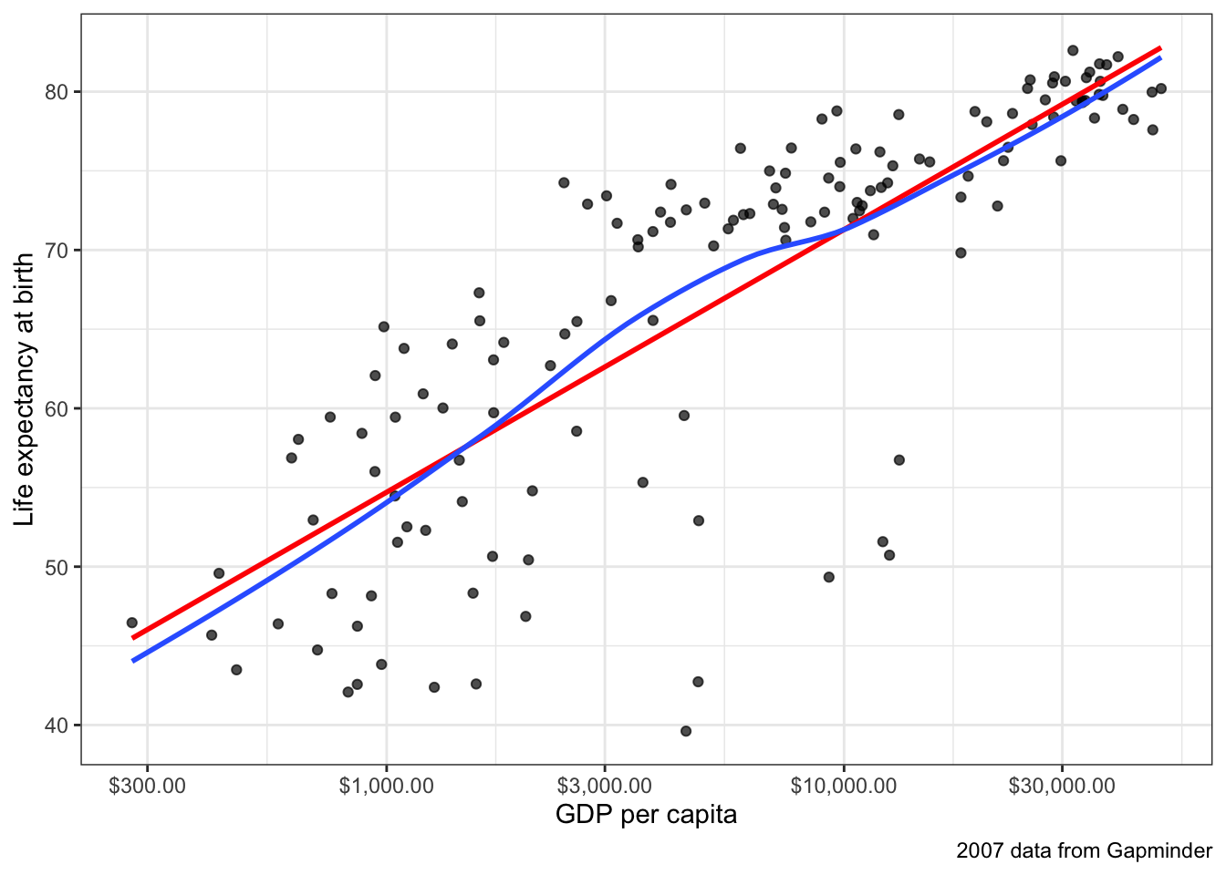
By definition, a linear model is only appropriate if the underlying relationship being modeled can accurately be described as linear. To begin, lets revisit a very clear example of non-linearity introduced in an earlier chapter. The example is the relationship between GDP per capita in a country and that country’s life expectancy. We use data from Gapminder to show this relationship with 2007 data.1
ggplot(subset(gapminder, year==2007), aes(x=gdpPercap, y=lifeExp))+
  geom_point(alpha=0.7)+
  geom_smooth(method="lm", se=FALSE)+
  geom_text_repel(data=subset(gapminder, year==2007 & gdpPercap>5000 & lifeExp<60),
                  aes(label=country), size=2)+
  labs(x="GDP per capita", y="Life expectancy at birth", subtitle = "2007 data from Gapminder")+
  scale_x_continuous(labels=scales::dollar)+
  theme_bw()
Figure 6.2 shows a scatterplot of this relationship. The relationship is so strong that its non-linearity is readily apparent. Although GDP per capita is positively related to life expectancy, the strength of this relationship diminishes substantial at higher levels of GDP. This is a particular form of non-linearity that is often called a “diminishing returns” relationship. The greater the level of GDP already, the less return you get on life expectancy for an additional dollar.
Figure 6.2 also shows the best fitting line for this scatterplot in blue. This line is added with the geom_smooth(method="lm") argument in ggplot2. We can see that this line does not represent the relationship very well. How could it really, given that the underlying relationship clearly curves in a way that a straight line cannot? Even more problematic, the linear fit will produce systematic patterns in the error terms for the linear model. for countries in the middle range of GDP per capita, the line will consistently underestimate life expectancy. At the low and high ends of GDP per capita, the line will consistently overestimate life expectancy. This identifiable pattern in the residuals is an important consequence of fitting a non-linear relationship with a linear model and is in fact one of the ways we will learn to diagnose non-linearity below.
Non-linearity is not always this obvious. One of the reasons that it is so clear in Figure 6.2 is that the relationship between GDP per capita and life expectancy is so strong. When the relationship is weaker, then points tend to be more dispersed and non-linearity might not be so easily diagnosed from the scatterplot. Figure 6.3 and Figure 6.4) show two examples that are a bit more difficult to diagnose.
ggplot(movies, aes(x=rating_imdb, y=box_office))+
  geom_jitter(alpha=0.2)+
  scale_y_continuous(labels = scales::dollar)+
  labs(x="IMDB rating", y="Box Office Returns (millions)")+
  theme_bw()
Figure 6.3 shows a scatterplot of the relationship between IMDB ratings and box office returns in the movies dataset. I have already made a few additions to this plot to help with the visual display. The IMDB rating only comes rounded to the first decimal place, so I use geom_jitter rather than geom_point to perturb the points slightly and reduce overplotting. I also use alpha=0.2 to set the point as semi-transparent. This is also helps with identifying areas of the scatterplot that are dense with points because they turn darker.
The linearity of this plot is hard to determine. This is partially because of the heavy right-skew of the box office returns. Many of the points are densely packed along the x-axis because the range of the y-axis is so large to include a few extreme values. Nonetheless, visually we might be seeing some evidence of an increasing slope as IMDG rating gets higher - this is an exponential relationship which is the inverse of the diminishing returns relationship we saw earlier. Still, its hard to know if we are really seeing it or not with the data in this form.
ggplot(earnings, aes(x=age, y=wages))+
  geom_jitter(alpha=0.01, width=1)+
  scale_y_continuous(labels = scales::dollar)+
  labs(x="age", y="hourly wages")+
  theme_bw()
Figure 6.4 shows the relationship between a respondent’s age and their hourly wages from the earnings data. There are so many observations here that I reduce alpha all the way to 0.01 to address overplotting. We also have a problem of a right-skewed dependent variable here. Nonetheless, you can make out a fairly clear dark band across the plot that seems to show a positive relationship. It also appears that this relationship may be of a diminishing returns type with a lower return to age after age 30 or so. However, with the wide dispersion of the data, it is difficult to feel very confident about the results.
The kind of uncertainty inherent in Figures Figure 6.3 and Figure 6.4 is far more common in practice than the clarity in Figure Figure 6.2. Scatterplots can be a first step to detecting non-linearity, but usually we need some additional diagnostics. In the next two sections, I will cover two diagnostic approaches to identifying non-linearity: smoothing and residual plots.
Smoothing is a technique for estimating the relationship in a scatterplot without the assumption that this relationship be linear. In order to understand what smoothing does, it will be first helpful to draw a non-smoothed line between all the points in a scatterplot, starting with the smallest value of the independent variable to the largest value. I do that in Figure 6.5. As you can see this produces a very jagged line that does not give us much sense of the relationship because it bounces around so much.
movies |>
  arrange(rating_imdb) |>
  ggplot(aes(x=rating_imdb, y=box_office))+
  geom_point(alpha=0.05)+
  geom_line()+
  scale_y_continuous(labels = scales::dollar)+
  labs(x="IMDB Rating", y="Box Office Returns (millions)")+
  theme_bw()
The basic idea of smoothing is to smooth out that jagged line. This is done by replacing each actual value of \(y\) with a predicted value \(\hat{y}\) that is determined by that point and its nearby neighbors. The simplest kind of smoother is often called a “running average.” In this type of smoother, you simply take \(k\) observations above and below the given point and calculate the mean or median. For example, lets say we wanted to smooth the box office return value for the movie Rush Hour 3. We want to do this by reaching out to the two neighbors above and below this movie in terms of the tomato rating. After sorting movies by tomato rating, here are the values for Rush Hour 3 and the two movies closest to it in either direction. Table 6.1 shows all five of these movies.2
| title | rating_imdb | box_office |
|---|---|---|
| Nobel Son | 6.2 | 0.5 |
| Resident Evil: Extinction | 6.2 | 50.6 |
| Rush Hour 3 | 6.2 | 140.1 |
| Spider-Man 3 | 6.2 | 336.5 |
| The Last Mimzy | 6.2 | 21.5 |
To smooth the value for Rush Hour 3, we can take either the median or the mean of the box office returns for these five values:
box_office <- c(0.5, 50.6, 140.1, 336.5, 21.5)
mean(box_office)
[1] 109.84median(box_office)[1] 50.6The mean smoother would give us a value of $109.84 million and the median smoother a value of $50.6 million. In either case, the value for Rush Hour 3 is pulled substantially away from its position at $140.1 million, bringing it closer to its neighbors’ values.
To get a smoothed line, we need to repeat this process for every point in the dataset. The runmed command will do this for us once we have the data sorted correctly by the independent variable. Figure 6.6 shows two different smoothed lines applied to the movie scatterplot, with different windows.
movies <- movies[order(movies$rating_imdb),]
movies$box_office_sm1 <- runmed(movies$box_office, 5)
movies$box_office_sm2 <- runmed(movies$box_office, 501)
ggplot(movies, aes(x=rating_imdb, y=box_office))+
  geom_point(alpha=0.2)+
  geom_line(col="grey", size=1, alpha=0.7)+
  geom_line(aes(y=box_office_sm1), col="blue", size=1, alpha=0.7)+
  geom_line(aes(y=box_office_sm2), col="red", size=1, alpha=0.7)+
  scale_y_continuous(labels = scales::dollar)+
  labs(x="IMDB Rating", y="Box Office Returns (millions)")+
  theme_bw()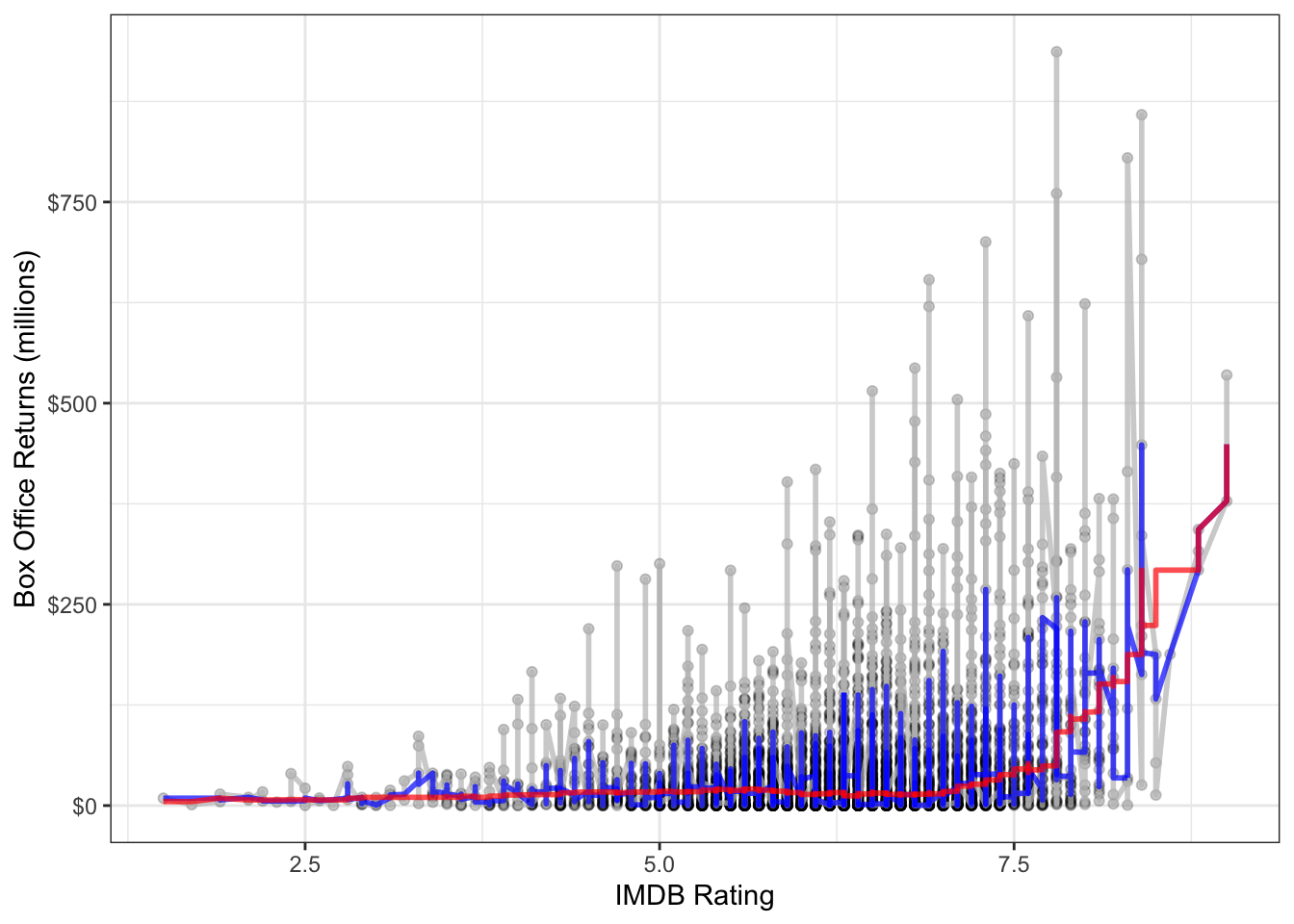
It is clear here that using two neighbors on each side is not sufficient in a dataset of this size. With 250 neighbors on each side, we get something much smoother. This second smoothing line also reveals a sharp uptick at the high end of the dataset, which suggests some possible non-linearity.
A more sophisticated smoothing procedure is available via the LOESS (locally estimated scatterplot smoothing) smoother. The LOESS smoother uses a linear model with polynomial terms (discussed below) on a local subset of the data to estimate a predicted value for each observation. The model also weights values so that observations closer to the index observation count more in the estimation. This technique tends to produce better results than median or mean smoothing.
You can easily fit a LOESS smoother to a scatterplot in ggplot2 by specifying method="loess" in the geom_smooth function. In fact, this is the default method for geom_smooth for datasets smaller than a thousand observations. Figure 6.7 plots this LOESS smoother as well as a linear fit for comparison.
ggplot(movies, aes(x=rating_imdb, y=box_office))+
  geom_jitter(alpha=0.2)+
  geom_smooth(method="lm", color="red", se=FALSE)+
  geom_smooth(se=FALSE, method="loess")+
  scale_y_continuous(labels = scales::dollar)+
  labs(x="IMDB Rating", y="Box Office Returns (millions)")+
  theme_bw()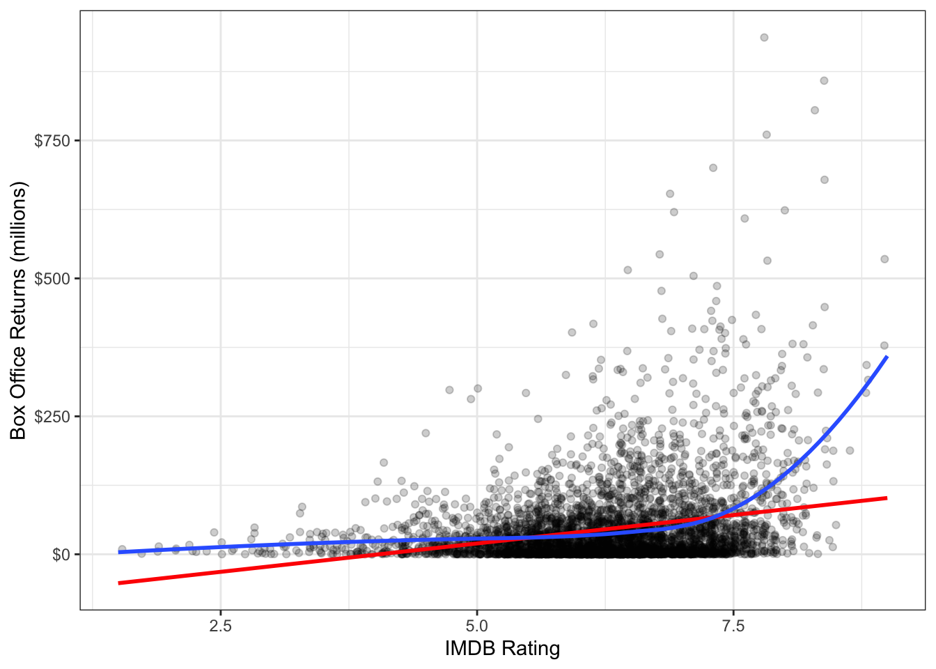
Again we see the exponential relationship in the LOESS smoother. The LOESS smoother is also much smoother than the median smoothers we calculated before.
By default the LOESS smoother in geom_smooth will use 75% of the full data in its subset for calculating the smoothed value of each point. This may seem like a lot, but remember that it weights values closer to the index point. You can adjust this percentage using the span argument in geom_smooth.
The main disadvantage of the LOESS smoother is that it becomes computationally inefficient as the number of observations increases. If I were to apply the LOESS smoother to the 145,647 observations in the earnings data, it would kill R before producing a result. For larger datasets like this one, another option for smoothing is the general additive model (GAM). This model is complex and I won’t go into the details here, but it provides the same kinds of smoothing as LOESS but is much less computationally expensive. GAM smoothing is the default in geom_smooth for datasets larger than a thousand observations, so you do not need to include a method. Figure 6.8 shows A GAM smoother applied to the relationship between wages and age. The non-linear diminishing returns relationship is clearly visible in the smoothed line.
ggplot(earnings, aes(x=age, y=wages))+
  geom_jitter(alpha=0.01, width=1)+
  geom_smooth(method="lm", color="red", se=FALSE)+
  geom_smooth(se=FALSE)+
  scale_y_continuous(labels = scales::dollar)+
  labs(x="age", y="hourly wages")+
  theme_bw()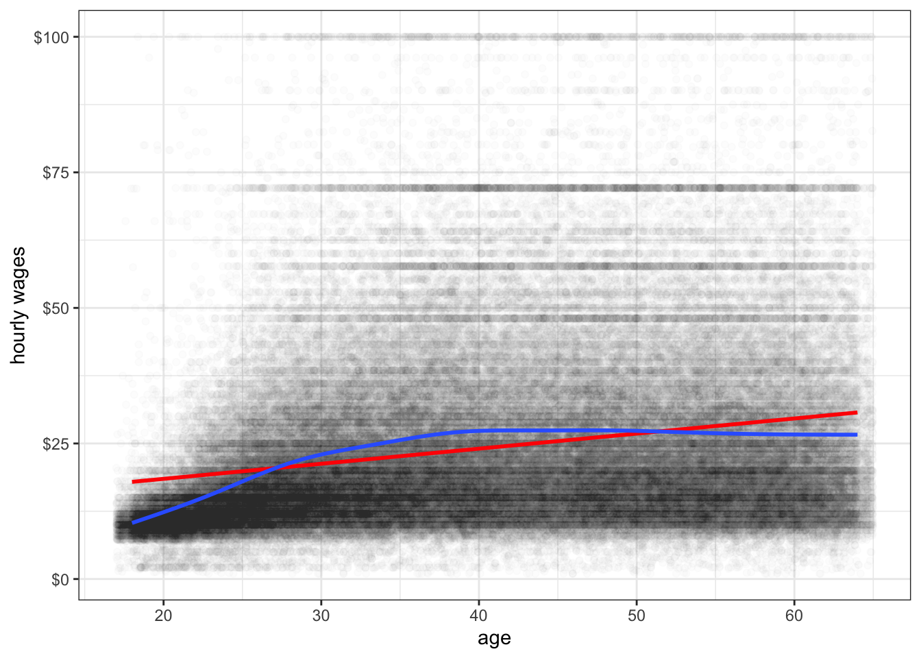
Another technique for detecting non-linearity is the to plot the fitted values of a model by the residuals. To demonstrate how this works, lets first calculate a model predicting life expectancy by GDP per capita from the gapminder data earlier.
model <- lm(lifeExp~gdpPercap, data=subset(gapminder, year==2007))If you type plot(model), you will get a series of model diagnostic plots in base R. The first of these plots is the residual vs. fitted values plot. We are going to make the same plot, but in ggplot. In order to do that, I need to introduce a new package called broom that has some nice features for summarizing results from your model. It is part of the Tidyverse set of packages. To install it type install.packages("broom"). You can then load it with library(broom). The broom package has three key commands:
tidy which shows the key results from the model including coefficients, standard errors and the like.augment which adds a variety of diagnostic information to the original data used to calculate the model. This includes residuals, cooks distance, fitted values, etc.glance which gives a summary of model level goodness of fit statistics.At the moment, we want to use the augment command. Here is what the it looks like:
augment(model)# A tibble: 142 × 8
lifeExp gdpPercap .fitted .resid .hat .sigma .cooksd .std.resid
<dbl> <dbl> <dbl> <dbl> <dbl> <dbl> <dbl> <dbl>
1 43.8 975. 60.2 -16.4 0.0120 8.82 0.0207 -1.85
2 76.4 5937. 63.3 13.1 0.00846 8.86 0.00928 1.48
3 72.3 6223. 63.5 8.77 0.00832 8.90 0.00411 0.990
4 42.7 4797. 62.6 -19.9 0.00907 8.77 0.0231 -2.25
5 75.3 12779. 67.7 7.61 0.00709 8.91 0.00263 0.858
6 81.2 34435. 81.5 -0.271 0.0292 8.93 0.0000144 -0.0309
7 79.8 36126. 82.6 -2.75 0.0327 8.93 0.00167 -0.315
8 75.6 29796. 78.5 -2.91 0.0211 8.93 0.00118 -0.331
9 64.1 1391. 60.5 3.61 0.0116 8.93 0.000975 0.408
10 79.4 33693. 81.0 -1.59 0.0278 8.93 0.000471 -0.181
# ℹ 132 more rowsWe can use the dataset returned here to build a plot of the fitted values (.fitted) by the residuals (.resid) like this:
ggplot(augment(model), aes(x=.fitted, y=.resid))+
  geom_point()+
  geom_hline(yintercept = 0, linetype=2)+
  geom_smooth(se=FALSE)+
  labs(x="fitted values of life expectancy", y="model residuals")+
  theme_bw()
If a linear model fitted the data well, then we would expect to see no evidence of a pattern in the scatterplot of Figure 6.9. We should just see a cloud of points centered around the value of zero. The smoothing line helps us see patterns, but in this case the non-linearity is so strong that we would be able to detect it even without the smoothing. This clear pattern indicates that we have non-linearity in our model and we should probably reconsider our approach.
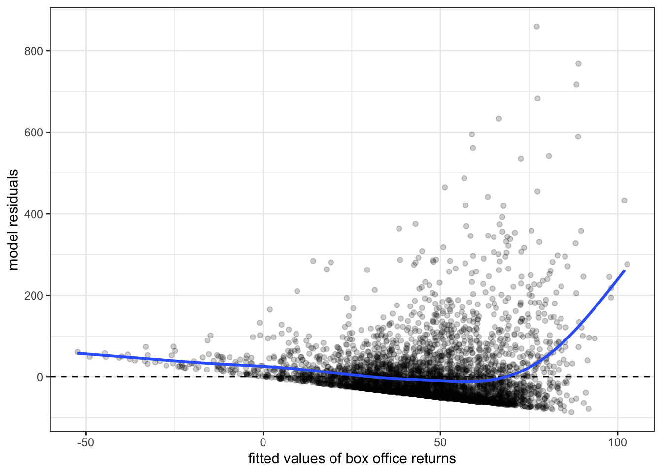
Figure 6.10 and Figure 6.11 show residual vs. fitted value plots for the two other cases of movie box office returns and wages that we have been examining. In these cases, the patterns are somewhat less apparent without the smoothing. The movie case does not appear particularly problematic although there is some argument for exponential increase at very high values of tomato rating. The results for wages suggest a similar diminishing returns type problem.3

Now that we have diagnosed the problem of non-linearity, what can we do about it? There are several ways that we can make adjustments to our models to allow for non-linearity. The most common technique is to use transformations to change the relationship between independent and dependent variables. Another approach is to include polynomial terms into the model that can simulate a parabola. A third, less common, option is to create a spline term that allows for non-linearity at specific points. I cover each of these techniques below.
You transform your data when you apply a mathematical function to a variable to transform its values into different values. There are a variety of different transformations that are commonly used in statistics, but we will focus on the one transformation that is most common in the social sciences: the log transformation.
Transformations can directly address issues of non-linearity. By definition if you transform the independent variable, the dependent variable, or both variables in your model, then the linear relationship assumed by the model between the transformed variables. On the original scale of the variables, the relationship is non-linear.
Transformations can also have additional side benefits besides fitting non-linear relationships. The log transformation, for example, will pull in extreme values and skewness in a distribution, reducing the potential for outliers to exert a strong influence on results. Take Figure 6.12 for example. This figure shows the distribution of hourly wages in the earnings data. This distribution is heavily right-skewed, despite the fact that wages have been top-coded at $100. Any model of wages is likely to be influenced considerably by the relatively small but still numerically substantial number of respondents with high wages.

Lets look at that distribution again, but this time on the log-scale. We will cover in more detail below what the mathematical log means, but for now you can just think of the log-scale as converting from an additive scale to a multiplicative scale. On the absolute scale, we want to have equally spaced intervals on the axes of our graph to represent a constant absolute amount difference. You can see in Figure 6.12 that the tick-marks for wages are at evenly spaced intervals of $25. On the log-scale we want evenly-spaced intervals on the axes of our graph to correspond to multiplicative changes. So on a log base 10 scale, we would want the numbers 1, 10, and 100, to be evenly spaced because each one represents a 10 fold multiplicative increase. In ggplot2, you can change the axis to a log-scale with the argument scale_x_log10. Figure 6.13 shows the same distribution of hourly wages, but this time using the log-scale.

You can clearly see in Figure 6.13 that we have pulled in the extreme right tail of the distribution and have a somewhat more symmetric distribution. The transformation here hasn’t perfectly solved things, because now we have a slight left-skew for very low hourly wages. Nonetheless, even these values are closer in absolute value after the transformation and so will be less likely to substantially influence our model. This transformation can also help us with the cone-shaped residual issue we saw earlier (i.e. heteroskedasticity), but we will discuss that more in the next section.
Because transformations can often solve multiple problems at once, they are very popular. In fact, for some common analyses like estimating wages or CO2 emissions, log transformations are virtually universal. The difficult part about transformations is understanding exactly what kind of non-linear relationship you are estimating by transforming and how to interpret the results from models with transformed variables. We will develop this understanding using the natural log transformation on the examples we have been looking at in this section.
Before getting into the mathematical details of the log transformation, lets first demonstrate its power. Figure Figure 6.14 shows the relationship between IMDB rating and box office returns in our movies data. However, this time I have applied a log-scale to box office returns. Although we still see some evidence of non-linearity in the LOESS estimator, the relationship looks much more clearly linear than before. But the big question is how do we interpret the slope and intercept for the linear model fit to this log-transformed data?
ggplot(movies, aes(x=rating_imdb, y=box_office))+
  geom_jitter(alpha=0.2)+
  geom_smooth(method="lm", color="red", se=FALSE)+
  geom_smooth(se=FALSE, method="loess")+
  scale_y_log10(labels = scales::dollar)+
  labs(x="IMDB Rating", y="Box Office Returns (millions)")+
  theme_bw()
In order to understand the model implied by that straight red line, we need to delve a little more deeply into the math of the log transformation. In general, the log equation means converting some number into the exponential value of some base multiplier. So, if we wanted to know what the log base 10 value of 27 is, we need to know what exponential value applied to 10 would produce 27:
\[27=10^x\]
We can calculate this number easily in R:
x <- log(27, base=10)
x
[1] 1.43136410^x[1] 27Log base 10 and log base 2 are both common values used in teaching log transformations, but the standard base we use in statistics is the mathematical constant \(e\) (2.718282). This number is of similar importance in mathematics as \(\pi\) and is based on the idea of what happens to compound interest as the period of interest accumulation approaches zero. This has a variety of applications from finance to population growth, but none of this concerns us directly. We are interested in \(e\) as a base for our log function because of certain other useful properties discussed further below that ease interpretation.
When we use \(e\) as the base for our log function, then we are using what is often called the “natural log.” We can ask the same question about 27 as before but now with the natural log:
x <- log(27)
x
[1] 3.295837exp(x)[1] 27I didn’t have to specify a base here because R defaults to the natural log. The exp function calculates \(e^x\).
For our purposes, the most important characteristic of the log transformation is that it converts multiplicative relationships into additive relationships. This is because of a basic mathematical relationship where:
\[e^a*a^b=e^{a+b}\] \[log(x*y) = log(x)+log(y)\] You can try this out in R to see that it works:
exp(2)*exp(3)[1] 148.4132exp(2+3)[1] 148.4132log(5*4)[1] 2.995732log(5)+log(4)[1] 2.995732We can use these mathematical relationships to help understand a model with log-transformed variables. First lets calculate the model implied by the scatterplot in Figure 6.14. We can just use the log command to directly transform box office returns in the lm formula:
model <- lm(log(box_office)~rating_imdb, data=movies)
round(coef(model), 3)
(Intercept) rating_imdb
0.016 0.371 OK, so what does that mean? It might be tempting to interpret the results here as you normally would. We can see that IMDB rating has a positive effect on box office returns. So, a one point increase in IMDB rating is associated with a 0.371 increase in … what? Remember that our dependent variable here is now the natural log of box office returns, not box office returns itself. We could literally say that it is a 0.371 increase in log box office returns, but that is not a very helpful or intuitive way to think about the result. Similarly the intercept gives us the predicted log box office returns when IMDB rating is zero. That is not helpful for two reasons: its outside the scope of the data (the lowest IMDB rating in the database is 1.5), and we don’t really know how to think about log box office returns of 0.016.
In order to translate this into something meaningful, lets try looking at this in equation format. Here is what we have:
\[\hat{\log(y_i)}=0.016+0.371*x_i\]
What we really want is to be able to understand this equation back on the original scale of the dependent variable, which in this case is box office returns in millions of dollars. Keep in mind that taking \(e^{\log(y)}\) just gives us back \(y\). We can use that logic here. If we “exponentiate” (take \(e\) to the power of the values) the left-hand side of the equation, then we can get back to \(\hat{y}_i\). However, remember from algebra, that what we do to one side of the equation, we have to do to both sides. That means:
\[e^{\hat{\log(y_i)}}=e^{0.016+0.371*x_i}\] \[\hat{y}_i=(e^{0.016})*(e^{0.371})^{x_i}\] We now have quite a different looking equation for predicting box office returns. The good news is that we now just have our predicted box office returns back on the left-hand side of the equation. The bad news is that the right hand side looks a bit complex. Since \(e\) is just a constant value, we can go ahead and calculate the values in those parentheses (called “exponentiating”):
exp(0.016)[1] 1.016129exp(0.371)[1] 1.449183That means:
\[\hat{y}_i=(1.016)*(1.449)^{x_i}\] We now have a multiplicative relationship rather than an additive relationship. How does this changes our understanding of the results? To see, lets plug in some values for \(x_i\) and see how it changes our predicted income value. An IMDB rating of zero is outside the scope of our data, but lets plug it in for instructional purposes anyway:
\[\hat{y}_i=(1.016)*(1.449)^{0}=(1.016)(1)=1.016\] So, the predicted box office returns when \(x\) is zero is just given by exponentiating the intercept. Lets try increasing IMDB rating by one point:
\[\hat{y}_i=(1.016)*(1.449)^{1}=(1.016)(1.449)\] I could go ahead and finish that multiplication, but I want to leave it here to better show how to think about the change. A one point increase in IMDG rating is associated with an increase in box office returns by a multiplicative factor of 1.449. In other words, a one point increase in IMDB rating is associated with a 44.9% increase in box office returns, on average. What happens if I add another point to IMDB?
\[\hat{y}_i=(1.016)*(1.449)^{2}=(1.016)(1.449)(1.449)\] Each additional point leads to a 44.9% increase in predicted box office returns. This is what I mean by a multiplicative increase. We are no longer talking about the predicted change in box office returns in terms of absolute numbers of dollars, but rather in relative terms of percentage increase.
In general, in order to properly interpret your results when you log the dependent variable, you must exponentiate all of your slopes and the intercept. You can then interpret them as:
The model predicts that a one-unit increase in \(x_j\) is associated with a \(e^{b_j}\) multiplicative increase in \(y\), on average while holding all other independent variables constant. The model predicts that \(y\) will be \(e^{b_0}\) on average when all independent variables are zero.
Of course, just like all of our prior examples, you are responsible for converting this into sensible English.
Lets try a more complex model in which we predict log box office returns by tomato rating, runtime and movie maturity rating:
model <- lm(log(box_office)~rating_imdb+runtime+maturity_rating, data=movies)
coef(model)
(Intercept) rating_imdb runtime
-0.62554829 0.22296822 0.03479772
maturity_ratingPG maturity_ratingPG-13 maturity_ratingR
-0.97270006 -1.56368491 -3.00680653 We have a couple of added complexities here. We now have results for categorical variables as well as negative numbers to interpret. In all cases, we want to exponentiate to interpret correctly, so lets go ahead and do that:
exp(coef(model)) (Intercept) rating_imdb runtime
0.53496803 1.24978086 1.03541025
maturity_ratingPG maturity_ratingPG-13 maturity_ratingR
0.37806087 0.20936316 0.04944934 The IDMB rating effect can be interpreted as before but now with control variables:
The model predicts that a one point increase in the IMDB rating is associated with a 25% increase in box office returns, on average, holding constant movie runtime and maturity rating.
The runtime effect can be interpreted in a similar way.
The model predicts that a one minute increase in movie runtime is associated with a 3.5% increase in box office returns, on average, holding constant movie IMDB rating and maturity rating.
In both of these cases, it makes sense to take the multiplicative effect and convert that into a percentage increase. If I multiply the predicted box office returns by 1.035, then I am increasing it by 3.5%. When effects get large, however, it sometimes makes more sense to just interpret it as a multiplicative factor. For example, if the exponentiated coefficient was 3, I could interpret this as a 200% increase. However, it probably makes more sense in this case to just say something along the lines of the “predicted value of \(y\) triples in size for a one point increase in \(x\).”
The categorical variables can be interpreted as we normally do in terms of the average difference between the indicated category and the reference category. However, now it is the multiplicative difference. So, taking the exponentiated PG effect of 0.378, we could just say:
The model predicts that, controlling for tomato rating and runtime, PG-rated movies make 37.8% as much as G-rated movies at the box office, on average.
However, its also possible to talk about how much less a PG-rated movie makes than a G-rated movie. If a PG movie makes 37.8% as much, then it equivalently makes 62.2% less. We get this number by just subtracting the original percentage from 100. So I could have said:
The model predicts that, controlling for tomato rating and runtime, PG-rated movies make 62.2% less than G-rated movies, on average.
In general to convert any coefficient \(\beta_j\) from a model with a logged dependent variable to a percentage change scale we can follow this formula:
\[(e^{\beta_j}-1)*100\]
This will give us the percentage change and the correct direction of the relationship.
You may have noted that the effect of runtime in the model above before exponentiating was 0.0348 and after we exponentiated the result, we concluded that the effect of one minute increase in runtime was 3.5%. If you move over the decimal place two digits, those numbers are very similar. This is not a coincidence. It follows from what is known as the Taylor series expansion for the exponential:
\[e^x=1+x-\frac{x^2}{2!}+\frac{x^3}{3!}-\frac{x^4}{4!}+\ldots\] Any exponential value \(e^x\) can be calculated from this Taylor series expansion which continues indefinitely. However, when \(x\) is a small value less than one, note that you are squaring, cubing, and so forth, which results in an even smaller number that is divided by an increasingly large number. So, for small values of \(x\), the following approximation works reasonably well:
\[e^x\approx1+x\]
In the case I just noted where \(x=0.0338\), the actual value of \(e^{0.0348}\) is 1.035413 while the approximation gives us 1.0348. That is pretty close. This approximation starts to break down around \(x=0.2\). The actual value of \(e^{0.2}\) is 1.221 or about a 22.1% increase, whereas the approximation gives us 1.2 or a straight 20% increase.
You can use this approximation to get a ballpark estimate of the effect size in percentage change terms for coefficients that are not too large without having to exponentiate. So I can see that the coefficient of 0.222 for IMDB rating is going to be a bit over a 22% increase and the coefficient of 0.0348 is going to be around a 3.5% increase, all without having to exponentiate. Notice that this does not work at all well for the very large coefficients for movie maturity rating.
The previous example showed how to interpret results when you log the dependent variables. Logging the dependent variable will help address exponential type relationships. However in cases of a diminishing returns type relationship, we instead need to log the independent variable. Figure 6.15 shows the GDP per capita by life expectancy scatterplot from before but now with GDP per capita on a log scale.
It is really quite remarkable how this simple transformation straightened out that very clear diminishing returns type relationship we observed before. This is because on the log-scale a one unit increase means a multiplicative change, so you have to make a much larger absolute change when you are already high in GDP per capita to get the same return in life expectancy.
Models with logged independent variables are a little trickier to interpret. To understand how it works, lets go ahead and calculate the model:
model <- lm(lifeExp~log(gdpPercap), data=subset(gapminder, year==2007))
round(coef(model), 5)
(Intercept) log(gdpPercap)
4.94961 7.20280 So our model is:
\[\hat{y}_i=4.9+7.2\log{x_i}\]
Because the log transformation is on the right hand side we can no longer use the trick of exponentiating coefficient values. It would also be impractical if we added other independent variables to the model.
Instead, we can interpret our slope by thinking about how a 1% increase in \(x\) would change the predicted value of \(y\). For ease of interpretation, lets start with \(x=1\). The log of 1 is always zero, so:
\[\hat{y}_i=4.9+7.2\log{1}=4.9+7.2*0=\beta_0\]
So, the intercept here is actually the predicted value of life expectancy when GDP per capita is $1. This is not a terribly realistic value for GDP per capita where the lowest value in the dataset is $241, so its not surprising that we get an unrealistically low life expectancy value.
Now what happens if we raise GDP per capita by 1%? A 1% increase from a value of 1 would give us a value of 1.01. So:
\[\hat{y}_i=4.9+7.2\log{1.01}\]
From the Taylor series above, we can deduce that the \(\log{1.01}\) is roughly equal to 0.01. So:
\[\hat{y}_i=4.9+7.2*0.01=4.9+0.072\]
This same logic will apply to any 1% increase in GDP per capita. So, the model predicts that a 1% increase in GDP per capita is associated with a 0.072 year increase in the life expectancy.
In general, you can interpret any coefficient \(\beta_j\) with a logged independent variable but not logged dependent variable as:
The model predicts that a a 1% increase in x is associated with a \(\beta_j/100\) unit increase in y.
One easy way to remember what the log transformation does is that it makes your measure of change relative rather than absolute for the variable transformed. When we logged the dependent variable before then our slope could be interpreted as the percentage change in the dependent variable (relative) for a one unit increase (absolute) in the independent variable. When we log the independent variable, the slope can be interpreted as the unit change in the dependent variable (absolute) for a 1% increase (relative) in the independent variable.
If logging the dependent variable will make change in the dependent variable relative, and logging the independent variable will make change in the independent variable relative, then what happens if you log transform both? Then you get a model which predicts relative change by relative change. This model is often called an “elasticity” model because the predicted slopes are equivalent to the concept of elasticity in economics: how much does of a percent change in \(y\) results from a 1% increase in \(x\).
The relationship between age and wages may benefit from logging both variables. We have already seen a diminishing returns type relationship which suggests logging the independent variable. We also know that wages are highly right-skewed and so might also benefit from being logged.
Figure 6.16 shows the relationship between age and wages when we apply a log scale to both variables. It looks a little better although there is still some evidence of diminishing returns even on this scale. Lets go with it for now, though.
Lets take a look at the coefficients from this model:
model <- lm(log(wages)~log(age), data=earnings)
coef(model)
(Intercept) log(age)
1.1558386 0.5055849 One of the advantages of the elasticity model is that slopes can be easily interpreted. We can use the same techniques when logging independent variables to divide our slope by 100 to see that a one percent increase in age is associated with a 0.0051 increase in the dependent variable. However this dependent variable is the log of wages. To interpret the effect on wages, we need to exponentiate this value, subtract 1, and multiply by 100. However since the value is small, we know that this is going to be roughly a 0.51% increase. So:
The model predicts that a one percent increase in age is associated with a 0.51% increase in wages, on average.
In other words, we don’t have to make any changes at all. The slope is already the expected percent change in \(y\) for a one percent increase in \(x\).
The STRIPAT model that Richard York helped to develop is an example of an elasticity model that is popular in environmental sociology. In this model, the dependent variable is some measure of environmental degradation, such as CO2 emissions. The independent variable can be things like GDP per capita, population size and growth, etc. All variables are logged so that model parameters can be interpreted as elasticities.
Another method that can be used to fit non-linear relationships is to fit polynomial terms. You may recall the the following formula from basic algebra:
\[y=a+bx+cx^2\]
This formula defines a parabola which fits not a straight line but a curve with one point of inflection. We can fit this curve in a linear model by simply including the square of a given independent variable as an additional variable in the model. Before we do this it is usually a good idea to re-center the original variable somewhere around the mean because this will reduce the correlation between the original term and its square.
For example, I could fit the relationship between age and wages using polynomial terms:
model <- lm(wages~I(age-40)+I((age-40)^2), data=earnings)
coef(model)
(Intercept) I(age - 40) I((age - 40)^2)
26.92134254 0.31711167 -0.01783204 The coefficients for such a model are a little hard to interpret directly. This is a case where marginal effects can help us understand what is going on.
The marginal effect can be calculated by taking the partial derivative (using calculus) of the model equation with respect to \(x\). I don’t expect you to know how to do this, so I will just tell how it turns out. In a model with a squared term:
\[\hat{y}=\beta_0+\beta_1x+\beta_2x^2\]
The marginal effect (or slope) is given by:
\[\beta_1+2\beta_2x\]
Note that the slope of \(x\) is itself partially determined by the value of \(x\). This is what drives the non-linearity. If we plug in the values for the model above, the relationship will be clearer:
\[0.3171+2(-0.0178)x=0.3171-0.0356x\]
So when \(x=0\), which in this case means age 40, a one year increase in age is associated with a $0.32 increase in hourly wage, on average. For every increase in the year of age past 40, that effect of a one year increase in age on wages decreases in size by $0.035. For every year below age 40, the effect increases by $0.035.
Because \(\beta_1\) is positive and \(\beta_2\) is negative, we have a diminishing returns kind of relationship. Unlike the log transformation however, the relationship can ultimately reverse direction from positive to negative. I can figure out the inflection point at which it will transition from a positive to a negative relationship. I won’t delve into the details here, but this point is given by setting the derivative of this equation with respect to age equal to zero and solving for age. In general, this will give me:
\[\beta_j/(-2*\beta_{sq})\]
Where \(\beta_j\) is the coefficient for the linear effect of the variable (in this case, age), and \(\beta_{sq}\) is the coefficient for the squared effect. In my case, I get:
\[0.3171/(-2*-0.0178)=0.3171/0.0356=8.91\]
Remember that we re-centered age at 40, so this means that the model predict that age will switch from a positive to a negative relationship with wages at age 48.91.
Often, the easiest way to really get a sense of the parabolic relationship we are modeling is to graph it. This can be done easily with ggplot by using the geom_smooth function. In the geom_smooth function you specify lm as the method, but also specify a formula argument that specifies this linear model should be fit as a parabola rather than a straight line.
ggplot(earnings, aes(x=age, y=wages))+
  geom_jitter(alpha=0.01, width=1)+
  scale_y_continuous(labels = scales::dollar)+
  labs(x="age", y="hourly wages")+
  geom_smooth(se=FALSE, method="lm", formula=y~x+I(x^2))+
  geom_vline(xintercept = 48.91, linetype=2, color="red")+
  theme_bw()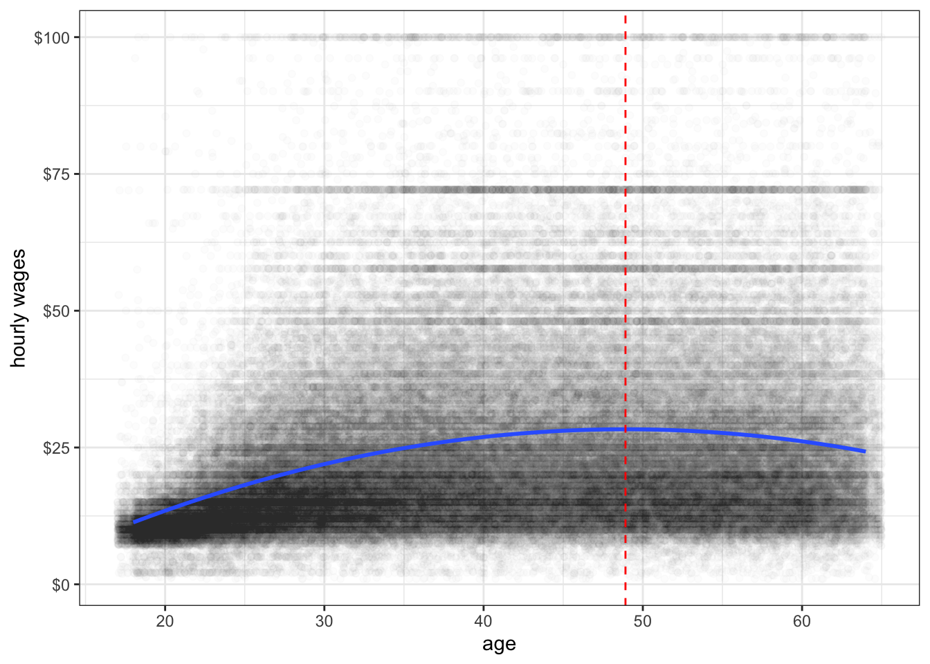
Figure 6.17 shows the relationship between age and wages after adding a squared term to our linear model. I have also added a dashed line to indicate the inflection point at which the relationship shifts from positive to negative.
Polynomial models do not need to stop at a squared term. You can also add a cubic term and so on. The more polynomial terms you add, the more inflection points you are allowing for in the data, but also the more complex it will be to interpret. Figure 6.18 shows the predicted relationship between GDP per capita and life expectancy in the gapminder data when using a squared and cubic term in the model. You can see two different inflection points in the data that allow for more complex curves than one could get using transformations.
ggplot(subset(gapminder, year==2007), aes(x=gdpPercap, y=lifeExp))+
  geom_point()+
  labs(x="GDP per capita", y="life expectancy")+
  geom_smooth(se=FALSE, method="lm", formula=y~x+I(x^2)+I(x^3))+
  theme_bw()
Another approach to fitting non-linearity is to fit a spline. Splines can become quite complex, but I will focus here on a very simple spline. In a basic spline model, you allow the slope of a variable to have a different linear effect at different cutpoints or “hinge” values of \(x\). Within each segment defined by the cutpoints, we simply estimate a linear model (although more complex spline models allow for non-linear effects within segments).
Looking at the diminishing returns to wages from age in the earnings data, it might be reasonable to fit this effect with a spline model. It looks like age 35 might be a reasonable value for the hinge.
In order to fit the spline model, we need to add a spline term. This spline term will be equal to zero for all values where age is equal to or below 35 and will be equal to age minus 35 for all values where age is greater than 35. We then add this variable to the model. I fit this model below.
earnings$age.spline <- ifelse(earnings$age<35, 0, earnings$age-35)
model <- lm(wages~age+age.spline, data=earnings)
coef(model)
(Intercept) age age.spline
-6.0393027 0.9472390 -0.9549087 This spline will produce two different slopes. For individuals 35 years of age or younger, the predicted change in wages for a one year increase will be given by the main effect of age, because the spline term will be zero. For individuals over 35 years of age, a one year increase in age will produce both the main age effect and the spline effect, so the total effect is given by adding the two together. So in this case, I would say the following:
The model predicts that for individuals 35 years of age and younger, a one year increase in age is associated with a $0.95 increase in wages on average. The model predicts that for individuals over 35 years of age, a one year increase in age is associated with a $0.0077 (0.9742-0.9549).
We can also graph this spline model, but we cannot do it simply through the formula argument in geom_smooth. In order to do that, you will need to learn a new command. The predict command can be used to get predicted values from a model for a different dataset. The predict command needs at least two arguments: (1) the model object for the model you want to predict, and (2) a data.frame that has the same variables as those used in the model. In this case, we can create a simple “toy” dataset that just has one person of every age from 18 to 65, with only the variables of age and age.spline. We can then use the predict command to get predicted wages for these individuals and add that as a variable to our new dataset. We can than plot these predicted values as a line in ggplot by feeding in the new data into the geom_line command. The r code chunk below does all of this to produce Figure 6.19. The spline model seems to fit pretty well here and is quite close to the smoothed line. This kind of model is sometimes called a “broken arrow” model because the two different slopes produce a visual effect much like an arrow broken at the hinge point.
predict_df <- data.frame(age=18:65)
predict_df$age.spline <- ifelse(predict_df$age<35, 0, predict_df$age-35)
predict_df$wages <- predict(model, newdata=predict_df)
ggplot(earnings, aes(x=age, y=wages))+
  geom_jitter(alpha=0.01, width = 1)+
  geom_smooth(se=FALSE)+
  geom_line(data=predict_df, color="red", size=1.5, alpha=0.75)+
  theme_bw()
Lets return to the idea of the idea of the linear model as a data-generating process:
\[y_i=\underbrace{\beta_0+\beta_1x_{i1}+\beta_2x_{i2}+\ldots+\beta_px_{ip}}_{\hat{y}_i}+\epsilon_i\]
To get a given value of \(y_i\) for some observation \(i\) you feed in all of the independent variables for that observation into your linear model equation to get a predicted value, \(\hat{y}_i\). However, you still need to take account of the stochastic element that is not predicted by your linear function. To do this, imagine reaching into a bag full of numbers and pulling out one value. That value is your \(\epsilon_i\) which you add on to your predicted value to get the actual value of \(y\).
What exactly is in that “bag full of numbers?” Each time you reach into that bag, you are drawing a number from some distribution based on the values in that bag. The procedure of estimating linear models makes two key assumption about how this process works:
Together these two assumptions are often called the IID assumption which stands for independent and identically distributed.
What is the consequence of violating the IID assumption? The good news is that violating this assumption will not bias your estimates of the slope and intercept. The bad news is that violating this assumption will often produce incorrect standard errors on your estimates. In the worst case, you may drastically underestimate standard errors and thus reach incorrect conclusions from classical statistical inference procedures such as hypothesis tests.
How do IID violations occur? Lets talk about a couple of common cases.
The two most common ways for the independence assumption to be violated are by serial autocorrelation and repeated observations.
Serial autocorrelation occurs in longitudinal data, most commonly with time series data. In this case, observations close in time tend to be more similar for reasons not captured by the model and thus you observe a positive correlation between subsequent residuals when they are ordered by time.
For example, the longley data that come as an example dataset in base R provide a classic example of serial autocorrelation, as illustrated in Figure 6.20.

The number unemployed tends to be cyclical and cycles last longer than a year, so we get a an up-down-up pattern show in red that leads to non-independence among the residuals from the linear model (shown in blue).
We can more formally look at this by looking at the correlation between temporally-adjacent residuals, although this requires a bit of work to set up.
model <- lm(Employed~GNP, data=longley)
temp <- augment(model)$.resid
temp <- data.frame(earlier=temp[1:15], later=temp[2:16])
head(temp)
earlier later
1 0.33732993 0.26276150
2 0.26276150 -0.64055835
3 -0.64055835 -0.54705800
4 -0.54705800 -0.05522581
5 -0.05522581 -0.26360117
6 -0.26360117 0.44744315The two values in the first row are the residuals fro 1947 and 1948. The second row contains the residuals for 1948 and 1949, and so on. Notice how the later value becomes the earlier value in the next row.
Lets look at how big the serial autocorrelation is:
cor(temp$earlier, temp$later)[1] 0.1622029We are definitely seeing some positive serial autocorrelation, but its of a moderate size in this case.
Imagine that you have data on fourth grade students at a particular elementary school. You want to look at the relationship between scores on some test and a measure of socioeconomic status (SES). In this case, the students are clustered into different classrooms with different teachers. Any differences between classrooms and teachers that might affect test performance (e.g. quality of instruction, lower stugdent/teacher ratio, aid in class) will show up in the residual of your model. But because students are clustered into these classrooms, their residuals will not be independent. Students from a “good” classroom will tend to have higher than average residuals while students from a “bad” classroom will tend to have below average residuals.
The issue here is that our residual terms are clustered by some higher-level identification. This problem most often appears when your data have a multilevel structure in which you are drawing repeated observations from some higher-level unit.
Longitudinal or panel data in which the same respondent is interviewed at different time intervals inherently face this problem. In this case, you are drawing repeated observations on the same individual at different points in time and so you expect that if that respondent has a higher than average residual in time 1, they also likely have a higher than average residual in time 2. However, as in the classroom example above, it can occur in a variety of situations even with cross-sectional data.
Say what? Yes, this is a real term. Heteroscedasticity means that the variance of your residuals is not constant but depends in some way on the terms in your model. In this case, observations are not drawn from identical distributions because the variance of this distribution is different for different observations.
One of the most common ways that heteroscedasticity arises is when the variance of the residuals increases with the predicted value of the dependent variables. This can easily be diagnosed on a residual by fitted value plot, where it shows up as a cone shape as in Figure 6.21.
model <- lm(box_office~runtime, data=movies)
ggplot(augment(model), aes(x=.fitted, y=.resid))+
  geom_point(alpha=0.7)+
  scale_y_continuous(labels=scales::dollar)+
  scale_x_continuous(labels=scales::dollar)+
  geom_hline(yintercept = 0, linetype=2)+
  theme_bw()+
  labs(x="predicted box office returns",
       y="residuals from the model")
Such patterns are common with right-skewed variables that have a lower threshold (often zero). In Figure @ref(fig:heteroscedasticity-cone), the residuals can never produce an actual value below zero, leading to the very clear linear pattern on the low end. The high end residuals are more scattered but also seem to show a cone pattern. Its not terribly surprising that as our predicted values grow in absolute terms, the residuals from this predicted value also grow in absolute value. In relative terms, the size of the residuals may be more constant.
Given that you have identified an IID violation in your model, what can you do about it? The best solution is to get a better model. IID violations are often implicitly telling you that the model you have selected is not the best approach to the actual data-generating process that you have.
Lets take the case of heteroscedasticity. If you observe a cone shape to the residuals, it suggests that the absolute size of the residuals is growing with the size of the predicted value of your dependent variable. In relative terms (i.e. as a percentage of the predicted value), the size of those residuals may be more constant. A simple solution would be to log our dependent variable because this would move us from a model of absolute change in the dependent variable to one of relative change.
model <- lm(log(box_office)~runtime, data=movies)
ggplot(augment(model), aes(x=.fitted, y=.resid))+
  geom_point(alpha=0.7)+
  geom_hline(yintercept = 0, linetype=2)+
  theme_bw()+
  labs(x="predicted log of box office returns",
       y="residuals from the model")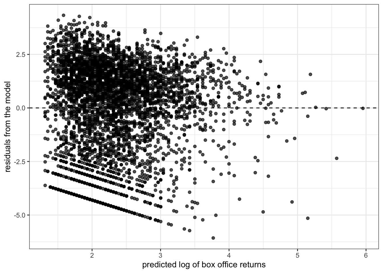
I now no longer observe the cone shape to my residuals. I might be a little concerned about the lack of residuals in the lower right quadrant, but overall this plot does not suggest a strong problem of heteroscedasticity. Furthermore, loggin box office returns may help address issues of non-linearity and outliers and give me results that are more sensible in terms of predicting percent change in box office returns rather than absolute dollars and cents.
Similarly, the problem of repeated observations can be addressed by the use of multilevel models that explicitly account for the higher-level units that repeated observations are clustered within. We won’t talk about these models in this course, but in aaddition to resolving the IID problem, these models make possible more interesting and complex models that analyze effects at different levels and across levels.
In some cases, a clear and better alternative may not be readily apparent. In this case, two techniques are common. The first is the use of weighted least squares and the second is the use of robust standard errors. Both of these techniques mathematically correct for the IID violation on the existing model. Weighted least squares requires the user to specify exacty how the IID violation arises, while robust standard errors seemingly figures it out mathemagically.
To do a weighted least squares regression model, we need to add a weighting matrix, \(\mathbf{W}\), to the standard matrix calculation of model coefficients and standard errors:
\[\mathbf{\beta}=(\mathbf{X'W^{-1}X})^{-1}\mathbf{X'W^{-1}y}\] \[SE_{\beta}=\sqrt{\sigma^{2}(\mathbf{X'W^{-1}X})^{-1}}\]
This weighting matrix is an \(n\) by \(n\) matrix of the residuals. What goes into that weighting matrix depends on what kind of IID violation you are addressing.
In practice, the values of this weighting matrix \(\mathbf{W}\) have to be estimated by the results from a basic OLS regression model. Therefore, in practice, people actually use iteratively-reweighted estimating or IRWLS for short. To run an IRWLS:
For some types of weighted least squares, R has some built-in packages to handle the details internally. The nlme package can handle IRWLS using the gls function for a variety of weighting structures. For example, we can correct the longley data above by using an “AR1” structure for the autocorrelation. The AR1 pattern (which stands for “auto-regressive 1”) assumes that each subsequent residual is only correlated with its immediate temporal predecessor.
library(nlme)
model.ar1 <- gls(Employed~GNP+Population, correlation=corAR1(form=~Year),data=longley)
summary(model.ar1)$tTable
Value Std.Error t-value p-value
(Intercept) 101.85813307 14.1989324 7.173647 7.222049e-06
GNP 0.07207088 0.0106057 6.795485 1.271171e-05
Population -0.54851350 0.1541297 -3.558778 3.497130e-03Robust standard errors have become popular in recent years, partly due (I believe) to how easy they are to add to standard regression models in Stata. We won’t delve into the math behind the robust standard error, but the general idea is that robust standard errors will give you “correct” standard errors even when the model is mis-specified due to issues such as non-linearity, heteroscedasticity, and autocorrelation. Unlike weighted least squares, we don’t have to specify much about the underlying nature of the IID violation.
Robust standard errors can be estimated in R using the sandwich and lmtest packages, and specifically with the coeftest command. Within this command, it is possible to specify different types of robust standard errors, but we will use the “HC1” version which is equivalent to the robust standard errors produced in Stata by default.
library(sandwich)
library(lmtest)
model <- lm(box_office~runtime, data=movies)
summary(model)$coef
Estimate Std. Error t value Pr(>|t|)
(Intercept) -116.729211 7.15674859 -16.31037 4.309160e-58
runtime 1.521091 0.06623012 22.96675 2.936061e-110coeftest(model, vcov=vcovHC(model, "HC1"))
t test of coefficients:

              Estimate Std. Error t value  Pr(>|t|)
(Intercept) -116.72921   11.44674 -10.198 < 2.2e-16 ***
runtime        1.52109    0.11239  13.534 < 2.2e-16 ***
---
Signif. codes:  0 '***' 0.001 '**' 0.01 '*' 0.05 '.' 0.1 ' ' 1
Notice that the standard error has increased from 0.074 in the OLS regression model to 0.127 for the robust standard error. It is implicitly correcting for the heteroscedasticity problem.
The problem with robust standard errors is that the “robust” does not necessarily mean “better.” Robust standard errors will still be inefficient because they are implicitly telling you that your model specification is wrong. Intuitively, it would be better to fit the right model with regular standard errors than the wrong model with robust standard errors. From this perspective, robust standard errors can be an effective diagnostic tool but are generally not a good ultimate solution.
To illustrate this, lets run the same model as above but now with the log of box office returns which we know will resolve the problem of heteroscedasticity:
model <- lm(log(box_office)~runtime, data=movies)
summary(model)$coef
Estimate Std. Error t value Pr(>|t|)
(Intercept) -1.7528129 0.216053764 -8.112855 6.377149e-16
runtime 0.0383472 0.001999409 19.179266 9.197219e-79coeftest(model, vcov=vcovHC(model, "HC1"))
t test of coefficients:

              Estimate Std. Error t value  Pr(>|t|)
(Intercept) -1.7528129  0.2060051 -8.5086 < 2.2e-16 ***
runtime      0.0383472  0.0018533 20.6908 < 2.2e-16 ***
---
Signif. codes:  0 '***' 0.001 '**' 0.01 '*' 0.05 '.' 0.1 ' ' 1
The robust standard error (0.026) is no longer larger than the regular standard error (0.029). This indicates that we have solved the underlying problem leading to inflated robust standard errors by better model specification. Whenever possible, you should try to fix the problem in your model by better model specification rather than rely on the brute-force method of robust standard errors.
Thus far, we have acted as if all of the data we have analyzed comes from a simple random sample , or an SRS for short. For a sample to be a simple random sample, it must exhibit the following property:
In a simple random random sample (SRS) of size \(n\), every possible combination of observations from the population must have an equally likely chance of being drawn.
if every possible combination of observations from the population has an equally likely chance of being drawn, then every observation also has an equally likely chance of being drawn. This latter property is important. If each observation from the population has an equally likely chance to be drawn, then any statistic we draw from the sample should be unbiased - it should approximate the population parameter except for random bias. In simple terms, our sample should be representative of the population.
However, SRS’s have an additional criteria above and beyond each observation having an equally likely chance of being drawn. Every possible combination of observations from the population must have an equally likely chance of being drawn. What does this mean? Imagine that I wanted to sample two students from our classroom. First I divide the class into two equally sized groups and then I sample one student from each group. In this case, each student has an equal likelihood of being drawn, specifically \(2/N\) where \(N\) is the number of students in the class. However, not every possible combination of two students from the class is possible. Students will never be drawn in combination with another student from their own cluster.
This additional criteria for an SRS is necessary for the standard errors that we have been using to be accurate for measures of statistical inference such as hypothesis tests and confidence intervals. If this criteria is not true, then we must make adjustments to our standard errors to account for the sample design. These adjustments will typically lead to larger standarde errors.
In practice, due to issues of cost and efficiency, most large scale samples are not simple random samples and we must take into account these issues of sample design. In addition, samples sometimes intentionally oversample some groups (typically small groups in the population) and thus statustical results must be weighted in order to calculate unbiased statistics.
Cluster or multistage sampling is a sampling technique often used to reduce the time and costs of surveying. When surveys are conducted over a large area such as the entire United States, simple random samples are not cost effective. Surveyors would have to travel extensively across every region of the United States to interview respondents chosen for the sample. Therefore, in practice most surveys use some form of multistage sampling, which is a particular form of cluster sampling.
The idea of multistage sampling is that observations are first grouped into primary sampling units or PSUs. These PSUs are typically defined geographically. For example, the General Social Survey uses PSUs that are made up of a combination of metropolitan areas and clusters of rural counties. In the first stage of this sampling process, certain PSUs are sampled. Then at the second stage, individual observations are sampled within the PSUs. PSUs of unequal size are typically sampled relative to population size so that each observation still has an equally likely chance of being drawn.
In practice, there may be even more than two stages of sampling. For example, one might sample a counties as the PSU and then within sample counties may sample census tracts or blocks, before then sampling households within those tracts. A sample of schoolchildren might first sample school districts, and then schools within the district before sampling individual students.
If PSUs are sample with correct probability, then the resulting sample will still be representative because every observation in the population had an equally likely chance of being drawn. However, it will clearly violate the assumption of an SRS. The consequence of cluster sampling is that if the variable of interest is distributed differently across clusters, the resulting standard error for statistical inference will be greater than that calculated in our default formulas.
To see why this happens, lets take a fairly straightforward example: what percent of the US population is Mormon? The General Social Survey (GSS) collects information on religious affiliation, so this should be a fairly straightforward calculation. To do this I have extracted a subset of GSS data from 1972-2014 that includes religious affiliation. For reasons that will be explained in more detail in the next section, religious affiliation is divided into three categories and the Mormon affiliation is in the “other” variable. Taking account of some missing value issues, I can calculate the percent mormon by year:
relig$mormon <- ifelse(is.na(relig$relig), NA,
                       ifelse(!is.na(relig$other) &
                                relig$other=="mormon", TRUE,
                              FALSE))
mormons <- tapply(relig$mormon, relig$year, mean, na.rm=TRUE)
mormons <- data.frame(year=as.numeric(rownames(mormons)),
                      proportion=mormons,
                      n=as.numeric(table(relig$year)))
rownames(mormons) <- NULL
head(mormons)
year proportion n
1 1972 0.009299442 1613
2 1973 0.003989362 1504
3 1974 0.005390836 1484
4 1975 0.006711409 1490
5 1976 0.006004003 1499
6 1977 0.007189542 1530Lets go ahead and plot this proportion up over time.
mormonmean <- mean(relig$mormon, na.rm=TRUE)
se <- sqrt((mormonmean*(1-mormonmean))/table(relig$year))*100
mormons$highmark <- 100*mormonmean+1.96*se
mormons$lowmark <- 100*mormonmean-1.96*se
ggplot(mormons, aes(x=year, y=proportion*100))+
  geom_ribbon(aes(ymin=lowmark, ymax=highmark),
              alpha=0.4, fill="red")+
  geom_line()+
  geom_point()+
  geom_hline(yintercept = mormonmean*100, linetype=2)+
  annotate("text", 1980, 1.5, label="expected 95% confidence\ninterval under SRS",
           color="red")+
  labs(x="year",
       y="sample percent Mormon")
In addition to the time series, I have included two other features. The dotted line gives the mean proportion across all years (1.19%). The red band gives the expected 95% confidence interval for sampling assuming that the mean across all years is correct and this proportion hasn’t changed over time. For each year this is given by:
\[0.0119 \pm 1.96(\sqrt{0.0119(1-0.0119)/n})\]
Where \(n\) is the sample size in that year.
What should be clear from this graph is that the actual variation in the sample proportion far exceeds that expected by simple random sampling. We would expect 19 out of 20 sample proportions to fall within that red band and most within the red band to fall close to the dotted line, but most values fall either outside the band or at its very edge. Our sample estimate of the percent Mormon fluctuates drastically from year to year.
Why do we have such large variation. The GSS uses geographically based cluster sampling and Mormons are not evenly distributed across the US. They are highly clustered in a few states (e.g. Utah, Idaho, Colorado, Nevada) and more commo in the western US than elsewhere. Therefore, in years where a Mormon PSU makes it into the sample we get overestimates of the percent Mormon and in years where a Mormon PSU does not make it into the sample, we get underestimates. Over the long term (assuming no change over time in the population) the average across years should give us an unbiased estimate of around 1.19%.
In a stratified sample, we split our population into various strata by some characteristic and then sample observations from every stratum. For example, I might split households by household income strata of $25K. I would then sample observations from every single one of those income stratum.
On the surface, stratified sampling sounds very similar to clustering sample, but it has one important difference. In cluster/multistage sampling, only certain clusters are sampled. In stratified sampling, observations are drawn from all stratum. The goal is not cost savings or efficiency but ensuring adequate coverage in the final dataset for some variable of interest.
Stratified sampling also often has the opposite effect as clustered sampling. Greater similarity in some variable of interest within strata will actually reduce standard errors below that expected for simple random sampling, whereas greater similarity in some variable of interest in clusters will increase standard errors.
Observations can be drawn from stratum relative to population size in order to maintain the representativeness of the sample. However, researchers often intentionally sample some stratum with a higher frequency than their population size in order to ensure that small groups are present in enough size in the sample that representative statistics can be drawn for that group and comparisons can be made to other groups. For example, it is often common to oversample racial minorities in samples to ensure adequate inferences can be made for smaller groups. This is called oversampling.
If certain strata/groups are oversampled, then the sample will no longer be representative without applying some kind of weight. This leads us into a discussion of the issue of weights in sample design.
The use of weights in sample design can get quite complex and we will only scratch the surface here. The basic idea is that if your sample is not representative, you need to adjust all statistical results a sampling weight for each observation. The sampling weight for each observation should be equal to the inverse of that observation’s probability of being sampled \(p_i\). So:
\[w_i=\frac{1}{p_i}\]
To illustrate this, lets create a fictional population and draw a sample from it. For this exercise, I want to sample from the Dr. Seuss town of Sneetchville. There are two kinds of Sneetches in Sneetchville, those with stars on their bellies (Star-Bellied Sneetches) and regular Sneetches. Star-bellied Sneetches are relatively more advantaged and make up only 10% of the population. Lets create our populations by sampling incomes from the normal distribution.
reg_sneetch <- rnorm(18000, 10, 2)
sb_sneetch <- rnorm(2000, 15, 2)
sneetchville <- data.frame(type=factor(c(rep("regular",18000), rep("star-bellied",2000))),
                           income=c(reg_sneetch, sb_sneetch))
mean(sneetchville$income)
[1] 10.47902tapply(sneetchville$income, sneetchville$type, mean) regular star-bellied
9.973621 15.027597 ggplot(sneetchville, aes(x=type, y=income))+
geom_boxplot()
We can see that Star-bellied Sneetches make considerably more than regular Sneetches on average. Because there are far more regular Sneetches, the mean income in Sneetchville of 10.5 is very close to the regular Sneetch mean income of 10.
Those are the population values which we get to see because we are omnipotent in this case. But our poor researcher needs to draw a sample to figure out these numbers. Lets say the researcher decides to draw a stratified sample that includes 100 of each type of Sneetch.
sneetch_sample <- sneetchville[c(sample(1:18000, 100, replace=FALSE),
                                 sample(18001:20000, 100, replace=FALSE)),]
mean(sneetch_sample$income)
[1] 12.40761tapply(sneetch_sample$income, sneetch_sample$type, mean) regular star-bellied
10.02163 14.79360 ggplot(sneetch_sample, aes(x=type, y=income))+
geom_boxplot()
When I separate mean income by Sneetch type, I get estimates that are pretty close to the population values of 10 and 15. However, when I estimate mean income for the whole sample, I overestimate the population parameter substantially. It should be about 10.5 but I get 12.4. Why? My sample contains equal numbers of Star-bellied and regular Sneetches, but Star-bellied Sneetches are only about 10% of the population. Star-bellied Sneetches are thus over-represented and since they have higher incomes on average, I systematically overestimate income for Sneetchville as a whole.
I can correct for this problem if I apply weights that are equal to the inverse of the probability of being drawn. There are 2000 Star-bellied Sneetches in the population and I sampled 100, so the probability of being sampled is 100/2000. Similarly for regular Sneetches the probability is 100/18000.
sneetch_sample$sweight <- ifelse(sneetch_sample$type=="regular",
                                 18000/100, 2000/100)
tapply(sneetch_sample$sweight, sneetch_sample$type, mean)
regular star-bellied
180 20 The weights represent how many observations in the population a given observation in the sample represents. I can use these weights to get a weighted mean. A weighted mean can be calculated as:
\[\frac{\sum w_i*x_i}{\sum w_i}\]
sum(sneetch_sample$sweight*sneetch_sample$income)/sum(sneetch_sample$sweight)[1] 10.49883weighted.mean(sneetch_sample$income, sneetch_sample$sweight)[1] 10.49883Our weighted sample mean is now very close to the population mean of 10.5.
So why add this complication to my sample? Lets say I want to do a hypothesis test on the mean income difference between Star-bellied Sneetches and regular Sneetches in my sample. Lets calculate the standard error for that test:
sqrt(sum((tapply(sneetch_sample$income, sneetch_sample$type, sd))^2/
  table(sneetch_sample$type)))
[1] 0.2974474Now instead of a stratified sample, lets draw a simple random sample of the same size (200) and calculate the same standard error.
sneetch_srs <- sneetchville[sample(1:20000,200, replace = FALSE),]
sqrt(sum((tapply(sneetch_srs$income, sneetch_srs$type, sd))^2/
  table(sneetch_srs$type)))
[1] 0.5086267The standard errors on the mean difference are nearly doubled. Why? Remember that the sample size of each group is a factor in the standard error calculation. In this SRS we had the following:
table(sneetch_srs$type)
     regular star-bellied
         182           18
We had far fewer Star-bellied Sneetches because we did not oversample them and this led to higher standard errors on any sort of comparison we try to draw between the two groups.
In some cases where oversamples are drawn for particular cases and population numbers are well known, it may be possible to calculate simple sample weights as we have done above. However, in many cases, researchers are less certain about how the sampling procedure itself might have under-represented or over-represented some groups. In these cases, it is common to construct post-stratification weights by comparing sample counts across a variety of strata to that from some trusted population source and then constructing weights that adjust for discrepancies. These kinds of calculations can be quite complex and we won’t go over them in detail here.
Regardless of how sample weights are constructed, they also have an effect on the variance in sampling. The use of sampling weights will increase the standard error of estimates above and beyond what we would expect in simple random sampling and this must be accounted for in statistical inference techniques. The greater the variation in sample weights, the bigger the design effect will be on standard errors.
Clustering, stratification and weighting can all effect the representativeness and sampling variability of our sample. In samples that are not simple random samples, we need to take account of these design effects in our models.
To illustrate such design effects, we will consider the Add Health data that we have been using. This data is the result of a very complex sampling design. Schools were the PSU in a multistage sampling design. The school sample and the individual sample of students within schools were also stratified by a variety of characteristics. For example, the school sample was stratified by region of the US to ensure that all regions were represented. Certain ethnic/racial groups were also oversampled by design and post-stratification weights were also calculated.
In the publically available Add Health data, we do not have information on stratification variables, but we do have measures of clustering and weighting.
head(addhealth[,c("cluster","sweight")])# A tibble: 6 × 2
cluster sweight
<dbl> <dbl>
1 472 3664.
2 472 4472.
3 142 3325.
4 142 271.
5 145 3940.
6 145 759.The cluster variable is a numeric id for each school and tells us which students were sampled from which PSU. The sweight variable is our sampling weight variable and tells us how many students in the US this observation represents.
Lets start with a naive model that ignores all of these design effects and just tries to predict number of friend nominations by our pseudoGPA measure:
model_basic <- lm(nominations~pseudo_gpa, data=addhealth)
round(summary(model_basic)$coef, 3)
Estimate Std. Error t value Pr(>|t|)
(Intercept) 2.177 0.258 8.444 0
pseudo_gpa 0.861 0.087 9.902 0This model is not necessarily representative of the population because it does not take account of the differential weight for each student. We can correct these estimates by adding in a weight argument to the lm command. This will essentially run a weighted least squares (WLS) model with these weights along the diagonal of the weight matrix. Intuitively, we are trying to minimize the weighted sum of squared residuals rather than the unweighted sum of squared residuals.
model_weighted <- lm(nominations~pseudo_gpa, data=addhealth, weights = sweight)
round(summary(model_weighted)$coef, 3)
Estimate Std. Error t value Pr(>|t|)
(Intercept) 2.252 0.261 8.622 0
pseudo_gpa 0.857 0.088 9.717 0In this case, the unweighted slope of 0.837 is not very differnet from the weighted slope of 0.826.
This model give us more representative and generalizable results, but we are still not taking account of the design effects that increase the standard errors of our estimates. Therefore, we are underestimating standard errors in the current model. There are two sources of these design effects that we need to account for:
We can address the first issue of variance in sample weights by using robust standard errors:
library(sandwich)
library(lmtest)
model_robust <- coeftest(model_weighted, vcov=vcovHC(model_weighted, "HC1"))
model_robust
t test of coefficients:

            Estimate Std. Error t value  Pr(>|t|)
(Intercept)  2.25230    0.33239  6.7760 1.446e-11 ***
pseudo_gpa   0.85653    0.11563  7.4075 1.609e-13 ***
---
Signif. codes:  0 '***' 0.001 '**' 0.01 '*' 0.05 '.' 0.1 ' ' 1
Notice that the standard error increased from about 0.075 to 0.095.
Robust standard errors will adequately address the design effect resulting from the variance of the sampling weights, but it does not address the design effect arising from clustering. Doing that is more mathematically complicated. We won’t go into the details here, but we will use the survey library in R that can account for a variety of design effects. To make use of this library, we first need to create a svydesign object that identifies the sampling design effects:
library(survey)
addhealth_svy <- svydesign(ids=~cluster, weight=~sweight, data=addhealth)
The survey library comes with a variety of functions that can be used to run a variety of models that expect this svydesign object rathre than a traditional data.frame. In this case, we want the svyglm command which can ge used to run “generalized linear models” which include our basic linear model.
model_svy <- svyglm(nominations~pseudo_gpa, design=addhealth_svy)
round(summary(model_svy)$coef, 3)
Estimate Std. Error t value Pr(>|t|)
(Intercept) 2.252 0.417 5.400 0
pseudo_gpa 0.857 0.137 6.272 0We now get standard errors of about 0.109 which should reflect both the sampling weight heterogeneity and the cluster sampling design effects. Note that our point estimate of the slope is so large that even with this enlarged standard error, we are pretty confident the result is not zero.
| unweighted OLS | weighted OLS | robust SE | survey: weights | survey: weights+cluster | |
|---|---|---|---|---|---|
| (Intercept) | 2.177*** | 2.252*** | 2.252*** | 2.252*** | 2.252*** |
| (0.258) | (0.261) | (0.332) | (0.332) | (0.417) | |
| pseudo_gpa | 0.861*** | 0.857*** | 0.857*** | 0.857*** | 0.857*** |
| (0.087) | (0.088) | (0.116) | (0.116) | (0.137) | |
| N | 3466 | 3466 | 3466 | 3466 | 3466 |
| R-squared | 0.028 | 0.027 | 0.027 | 0.027 | |
| * p < 0.05, ** p < 0.01, *** p < 0.001 | |||||
Table 6.2 shows all of the models estimated above plus an additional model that uses the survey library but only adjust for weights. All of the techniques except for the unweighted linear model produce identical and properly weighted estimates of the slope and intercept. They vary in the standard errors. The robust standard error approach produces results identical to the survey library method that only adjusts for weights. Only the final model using the survey library for weights and clustering addresses all of the design effects.
Up until this point, we have analyzed data that had no missing values. In actuality, the data did have missing values, but I used an imputation technique to remove the missing values to simplify our analyses. However, we now need to think more clearly about the consequences of missing values in datasets, because the reality is that most datasets that you want to use will have some missing data. Howe you handle this missing data can have important implications for your results.
A missing value occurs when a value is missing for an observation on a particular value. Its important to distinguish in your data between situations in which a missing value is actually a valid response, from situations in which it is invalid and must be addressed.
It may seem unusual to think of some missing values as valid, but based on the structure of survey questionnaires is not unusual to run into valid missing values. In particular, valid skips are a common form of missing data. Valid skips occur when only a subset of respondents are asked a question that is a follow-up to a previous question. Typically to be asked the follow up question, respondents have to respond to the original question in a certain way. All respondents who weren’t asked the follow up question then have valid skips for their response.
As an example, lets look at how the General Social Survey asks about a person’s religious affiliation. The GSS asks this using a set of three questions. First, all respondents are asked “What is your religious preference? Is it Protestant, Catholic, Jewish, some other religion, or no religion?” After 1996, the GSS also started recording more specific responses for the “some other religion” category, but for simplicity lets just look at the distribution of this variable in 1996.
table(gss$relig, exclude=NULL)
  catholic     jewish       none      other protestant       <NA>
       685         68        339        143       1664          5
On this variable, we have five cases of item nonresponse in which the respondent did not answer the question. They might have refused to answer it or perhaps they just did not know the answer.
For most of the respondents, this is the only question on religious affiliation. However, those who responded as Protestant are then asked further questions to determine more information about their particular denomination. This denom question includes prompts for most of the large denominations in the US. Here is the distribution of that variable.
table(gss$denom, exclude=NULL)
    afr meth ep zion   afr meth episcopal    am bapt ch in usa
                   8                   11                   28
     am baptist asso          am lutheran     baptist-dk which
                  57                   51                  181
           episcopal     evangelical luth   luth ch in america
                  79                   33                   15
   lutheran-dk which    lutheran-mo synod   methodist-dk which
                  25                   48                   23
 nat bapt conv of am    nat bapt conv usa      no denomination
                  12                    8                   99
               other       other baptists       other lutheran
                 304                   69                   15
     other methodist   other presbyterian presbyterian c in us
                  12                   19                   34
  presbyterian-dk wh presbyterian, merged     southern baptist
                  11                   13                  273
    united methodist united pres ch in us   wi evan luth synod
                 190                   29                   11
                <NA>
                1246
Notice that we seem to have a lot of missing values here (1246). Did a lot of people just not know their denomination? No, in fact there is very little item nonresponse on this measure. The issue is that all of the people who were not asked this question because they didn’t respond as Protestant are listed as missing values here, but they are actually valid skips. We can see this more easily by crosstabbing the two variables based on whether the response was NA or not.
table(gss$relig, is.na(gss$denom), exclude=NULL)
             FALSE TRUE
  catholic       0  685
  jewish         0   68
  none           0  339
  other          0  143
  protestant  1658    6
  <NA>           0    5
You can see that almost all of the cases of NA here are respondents who did not identify as Protestants and therefore were not asked the denom question, i.e. valid skips. We have only six cases of individuals who were asked the denom question and did not respond.
For Protestants who did not identify with one of the large denominations prompted in denom were identified as “other”. For this group, a third question (called other in the GSS) was asked in which the respondent’s could provide any response. I won’t show the full table here as the number of denominations is quite large, but we can use the same logic as above to identify all of the valid skips vs. item nonresponses.
table(gss$denom, is.na(gss$other), exclude=NULL)
                       FALSE TRUE
  afr meth ep zion         0    8
  afr meth episcopal       0   11
  am bapt ch in usa        0   28
  am baptist asso          0   57
  am lutheran              0   51
  baptist-dk which         0  181
  episcopal                0   79
  evangelical luth         0   33
  luth ch in america       0   15
  lutheran-dk which        0   25
  lutheran-mo synod        0   48
  methodist-dk which       0   23
  nat bapt conv of am      0   12
  nat bapt conv usa        0    8
  no denomination          0   99
  other                  300    4
  other baptists           0   69
  other lutheran           0   15
  other methodist          0   12
  other presbyterian       0   19
  presbyterian c in us     0   34
  presbyterian-dk wh       0   11
  presbyterian, merged     0   13
  southern baptist         0  273
  united methodist         0  190
  united pres ch in us     0   29
  wi evan luth synod       0   11
  <NA>                     0 1246
We can see here that of the individuals who identified with an “other” Protestant denomination, only four of those respondents did not provide a write-in response.
Valid skips are generally not a problem so long as we take account of them when we construct our final variable. In this example, we ultimately would want to use these three questions to create a parsimonious religious affiliation variable, perhaps by separating Protestants into evangelical and “mainline” denominations. In that case, the only item nonresponses will be the five cases for relig, the six cases for denom, and the four cases for other for a total of 15 real missing values.
In statistics, missingness is actually a word. It describes how we think values came to be missing from the data. In particular, we are concerned with whether missingness might be related to other variables that are related to the things we want to study. In this case, our results might be biased as a result of missing values. For example, income is a variable that often has lots of missing data. If missingness on income is related to education, gender, or race, then we might be concerned about how representative our results are in understanding the process. The biases that results from relationships between missingness and other variables can be hard to understand and therefore particularly challenging.
Missingness is generally considered as one of three types. The best case scenario is that the data are missing completely at random (MCAR). A variable is MCAR if every observation has the same probability of missingness. In other words, the missingness of a variable has no relationship to other observed or unobserved variables. If this is true, then removing observations with missing values will not bias results. However, it pretty rare that MCAR is a reasonable assumption for missingness. Perhaps if you randomly spill coffee on a page of your data, you might have MCAR.
A somewhat more realistic assumption is that the data are **missing at random* (MAR). Its totally obvious how this is different, right? A variable is MAR if the different probabilities of missingness can be fully accounted for by other observed variables in the dataset. If this is true, then various techniques can be used to produce unbiased results by imputing values for the missing values.
A more honest assessment is that the data are not missing at random (NMAR). A variable is NMAR if the different probabilities of missingness depend both on observed and unobserved variables. For example, some respondents may not provide income data because they are just naturally more suspicious. This variation in suspiciousness among respondents is not likely to be observed directly even though it may be partially correlated with other observed variables. The key issue here is the unobserved nature of some of the variables that produce missingness. Because they are unobserved, I have no way to account for them in my corrections. Therefore, I can never be certain that bias from missing values has been removed from my results.
In practice, although NMAR is probably the norm in most datasets, the number of missing values on a single variable may be small enough that even the incorrect assumption of MAR or MCAR might have little effect on the results. In my previous example, I had only 16 missing values on religious affiliation for 2904 respondents. So, its not likely to have a large effect on the results no matter how I deal with the missing values.
How exactly does one deal with those missing values? The data analyst typically has two choices. You can either remove cases with missing values or you can do some form of imputation. These two techniques are tied to the assumptions above. Removing cases is equivalent to assuming MCAR while imputation is equivalent to MAR.
To illustrate these different approaches below, we will look at a new example. We are going to examine the Add Health data again, but this time I am going to use a dataset that does not have imputed values for missing values. In particular, we are going to look at the relationship between parental income and popularity. Lets look at how many missing values we have for income.
summary(addhealth$parent_income) Min. 1st Qu. Median Mean 3rd Qu. Max. NA's
0.00 23.00 40.00 45.37 60.00 200.00 1027 Yikes! We are missing 1027 cases of parental income. That seems like a lot. Lets go ahead and calculate the percent of missing cases for all of the variables in our data.
temp <- apply(is.na(addhealth), 2, mean)
# enframe is a useful command to make a named vector into a tibble
enframe(temp) |>
  arrange(desc(value)) |>
  gt() |>
  fmt_percent(value) |>
  cols_label(
    name = "Variable",
    value = "Percent Missing"
)| Variable | Percent Missing |
|---|---|
| parent_income | 23.36% |
| pseudo_gpa | 21.17% |
| grade | 1.18% |
| smoker | 0.93% |
| alcohol_use | 0.66% |
| race | 0.32% |
| gender | 0.00% |
| nominations | 0.00% |
| honor_society | 0.00% |
| bandchoir | 0.00% |
| nsports | 0.00% |
| cluster | 0.00% |
| sweight | 0.00% |
For most variables, we only have a very small number of missing values, typically less than 1% of cases. However, for parental income we are missing values for nearly a quarter of respondents.
The simplest approach to dealing with missing values is to just drop observations (cases) that have missing values. In R, this is what will either happen by default or if you give a function the argument na.rm=TRUE. For example, lets calculate the mean income in the Add Health data:
mean(addhealth$parent_income)[1] NAIf we don’t specify how R should handle the missing values, R will report back a missing value for many basic calculations like the mean, median, and standard deviation. In order to get the mean for observations with valid values of income, we need to include the na.rm=TRUE option:
mean(addhealth$parent_income, na.rm=TRUE)[1] 45.37389The lm command in R behaves a little differently. It will automatically drop any observations that are missing values on any of the variables in the model. Lets look at this for a model predicting popularity by parental income and number of sports played:
model <- lm(nominations~parent_income+nsports, data=addhealth)
summary(model)
Call:
lm(formula = nominations ~ parent_income + nsports, data = addhealth)

Residuals:
    Min      1Q  Median      3Q     Max
-6.7920 -2.6738 -0.7722  1.8585 22.2967

Coefficients:
              Estimate Std. Error t value Pr(>|t|)
(Intercept)   3.526054   0.114310  30.846  < 2e-16 ***
parent_income 0.012309   0.001884   6.534 7.39e-11 ***
nsports       0.451061   0.048920   9.220  < 2e-16 ***
---
Signif. codes:  0 '***' 0.001 '**' 0.01 '*' 0.05 '.' 0.1 ' ' 1

Residual standard error: 3.652 on 3367 degrees of freedom
  (1027 observations deleted due to missingness)
Multiple R-squared:  0.04164,   Adjusted R-squared:  0.04107
F-statistic: 73.14 on 2 and 3367 DF,  p-value: < 2.2e-16
Note the comment in parenthesis at the bottom that tells us we lost 1027 observations due to missingness.
This approach is easy to implement but comes at a significant cost to the actual analysis. First, removing cases is equivalent to assuming MCAR, which is a strong assumption. Second, since most cases that you will remove typically have valid values on most of their variables, you are throwing away a lot of valid information as well as reducing your sample size. For example, all 1027 observations that were dropped in the model above due to missing values on parental income had valid responses the variable on number of sports played. If you are using a lot of variables in your analysis, then even with moderate amounts of missingness, you may reduce your sample size substantially.
In situations where only a very small number of values are missing, then removing cases may be a reasonable strategy for reasons of practicality. For example, in the Add Health data, the race variable has missing values on two observations. Regardless of whether the assumption of MCAR is violated or not, the removal of two observations in a sample of 4,397 is highly unlikely to make much difference. Rather, than use more complicated techniques that are labor intensive, it probably makes much more sense remove them.
Two strategies are available when you remove cases. You can either do available-case analysis or complete-case analysis. Both strategies refer to how you treat missing values in an analysis which will include multiple measurements that may use different numbers of variables. The most obvious and frequent case here is when you run multiple nested models in which you include different number of variables. For example, lets say we want to predict a student’s popularity by in a series of nested models: - Model 1: predict popularity by number of sports played - Model 2: add smoking and drinking behavior as predictors model 1 - Model 3: add parental income as a predictor to model 2
In this case, my most complex model is model 3 and it includes five variables: popularity, number of sports played, smoking behavior, drinking behavior, and parental income. I need to consider carefully how I am going to go about removing cases.
In available-case analysis (also called pairwise deletion) observations are only removed for each particular component of the analysis (e.g. a model) in which they are used. This is what R will do by default when you run nested models because it will only remove cases if a variable in that particular model is missing.
model1.avail <- lm(nominations~nsports, data=addhealth)
model2.avail <- update(model1.avail, .~.+alcohol_use+smoker)
model3.avail <- update(model2.avail, .~.+parent_income)
As a sidenote, I am introducing a new function here called update that can be very useful for model building. The update function can be used on a model object to make some changes to it and then re-run it. In this case, I am changing the model formula, but you could also use it to change the data (useful for looking at subsets), add weights, etc. When you want to update the model formula, the syntax .~.+ will include all of the previous elements of the formula and then you can make additions. I am using it to build nested models without having to repeat the entire model syntax every time.
| (1) | (2) | (3) | |
|---|---|---|---|
| (Intercept) | 3.997*** | 3.851*** | 3.391*** |
| (0.072) | (0.079) | (0.120) | |
| nsports | 0.504*** | 0.508*** | 0.454*** |
| (0.043) | (0.043) | (0.049) | |
| alcohol_useDrinker | 0.707*** | 0.663*** | |
| (0.155) | (0.180) | ||
| smokerSmoker | 0.194 | 0.383* | |
| (0.162) | (0.188) | ||
| parent_income | 0.012*** | ||
| (0.002) | |||
| N | 4397 | 4343 | 3332 |
| R-squared | 0.031 | 0.037 | 0.048 |
| * p < 0.05, ** p < 0.01, *** p < 0.001 | |||
Table 6.4 shows the results of the nested models in table form. Pay particular attention to the change in the number of observations in each model. In the first model, there are no missing values on nsports or indegree so we have the full sample size of 4397. In model 2, we are missing a few values on drinking and smoking behavior, so the sample size drops to 4343. In Model 3, we are missing a large number of observations, so the sample size drops to 3332. We lose nearly a quarter of the data from Model 2 to Model 3.
The changing sample sizes across models make model comparisons extremely difficult. We don’t know if changes from model to model are driven by different combinations of independent variables or changes in sample size. Note for example that the effect of smoking on popularity almost doubles from Model 2 to Model 3. Was that change driven by the fact that we controlled for parental income or was it driven by the exclusion of nearly a quarter of the sample. We have no way of knowing.
For this reason, available-case analysis is generally not the best way to approach your analysis. You don’t want your sample sizes to be changing across models. There are a few special cases (I will discuss one in the next section) where it may be acceptable and sometimes it is just easier in the early exploratory phase of a project, but in general you should use complete-case analysis.
In complete-case analysis (also called listwise deletion) you remove observations that are missing on any variables that you will use in the analysis even for some calculations that may not involve those variables. This techniques ensures that you are always working with the same sample throughout your analysis so any comparisons (e.g. across models) are not comparing apples and oranges.
In our example, I need to restrict my sample to only observations that have valid responses for all five of the variables that will be used in my most complex model. I can do this easily with the na.omit command which will remove any observation that is missing any value in a given dataset:
addhealth.complete <- na.omit(addhealth[,c("nominations","nsports","alcohol_use",
                                           "smoker","parent_income")])
model1.complete <- lm(nominations~nsports, data=addhealth.complete)
model2.complete <- update(model1.complete, .~.+alcohol_use+smoker)
model3.complete <- update(model2.complete, .~.+parent_income)| (1) | (2) | (3) | |
|---|---|---|---|
| (Intercept) | 4.051*** | 3.876*** | 3.391*** |
| (0.085) | (0.091) | (0.120) | |
| nsports | 0.490*** | 0.494*** | 0.454*** |
| (0.049) | (0.049) | (0.049) | |
| alcohol_useDrinker | 0.717*** | 0.663*** | |
| (0.181) | (0.180) | ||
| smokerSmoker | 0.372* | 0.383* | |
| (0.189) | (0.188) | ||
| parent_income | 0.012*** | ||
| (0.002) | |||
| N | 3332 | 3332 | 3332 |
| R-squared | 0.029 | 0.037 | 0.048 |
| * p < 0.05, ** p < 0.01, *** p < 0.001 | |||
Table 6.5 shows the results for the models using complete-case analysis. Note that the sample size for each model is the same and is equivalent to that for the most complex model in the available-case analysis above.
It is now apparent that the change in the effect of smoking on popularity above was driven by the removal of cases and not the controls for parental income. I can see this because now that I have performed the same sample restriction on Model 2, I get a similar effect size for smoking. Its worth noting that this is not really a great thing, because it suggests that by dropping cases, I am biasing the sample in some way, but at least I can make consistent comparisons across models.
When only a small number of cases are missing, then complete-case analysis is a reasonable option that is practical and not labor intensive. For example, I wouldn’t worry too much about the 54 cases lost due to the inclusion of smoking and drinking behavior in the models above. However, when you are missing substantial numbers of cases, either from a single variable or from the cumulative effects of dropping a moderate number of observations for lots of variables, then both case removal techniques are suspect. In those cases, it is almost certainly better to move to an imputation strategy.
Imputing a “fake” value for a missing value may seem worse than just removing it, but in many cases imputation is a better alternative than removing cases. First, imputation allows us to preserve the original sample size as well as all of the non-missing data that would be thrown way for cases with some missing values. Second, depending on methodology, imputation may move from a MCAR assumption to a MAR assumption.
There are a variety of imputation procedures, but they can generally be divided up along two dimensions. First, predictive imputations use information about other variables in the dataset to impute missing values, while non-predictive imputations do not. In most cases, predictive imputation uses some form of model structure to predict missing values. Predictive imputation moves the assumption on missingness from MCAR to MAR, but is more complex (and thus prone to its own problems of model mis-specification) and more labor-intensive.
Second, random imputations include some randomness in the imputation procedure, while deterministic imputations do not include randomness. Including randomness is necessary in order to preserve the actual variance in the variable that is being imputed. Deterministic imputations will always decrease this variance and thus lead to under-estimation of inferential statistics. However, random imputation identify an additional issue because random imputations will produce slightly different results each time the imputation procedure is conducted. To be accurate, the researcher must account for this additional imputation variabilty in their results.
In general, the gold standard for imputation is called multiple imputation which is a predictive imputation that include randomness and adjusts for imputation variability. However, this technique is also complex and labor-intensive, so it may not be the best practical choice when the number of missing values is small. Below, I outline several of these different approaches, from simplest to most complex.
The simplest form of imputation is to just replace missing values with a single value. Since the mean is considered the “best guess” for the non-missing cases, it is customary to impute the mean value here and so this technique is generally called mean imputation. We can perform mean imputation in R simply by using the bracket-and-boolean approach to identify and replace missing values:
addhealth <- addhealth |>
  mutate(parent_income_missing = is.na(parent_income),
         parent_income.meani = ifelse(parent_income_missing,
                                     mean(parent_income, na.rm = TRUE),
                                     parent_income))
I create a separate variable called parent_income.meani for the mean imputation so that I can compare it to other imputation procedures later. I also create an parent_income_missing variable that is just a boolean indicating whether income is missing for a given respondent.

Figure 6.26 shows the effect of mean imputation on the scatterplot of the relationship between parental income and number of friend nominations. All of the imputed values fall along a vertical line that corresponds to the mean parental income for the non-missing values. The effect on the variance of parental income is clear. Because this imputation procedure fits a single value, its imputation does not match the spread of observations along parental income. We can also see this by comparing the standard deviations of the original variable and the mean imputed one:
sd(addhealth$parent_income, na.rm=TRUE)[1] 33.6985sd(addhealth$parent_income.meani)[1] 29.50069Since the variance of the independent variable is a component of the standard error calculation (see the first section of this chapter for details), underestimating the variance will lead to underestimates of the standard error in the linear model. A similar method that will account for the variance in the independent variable is to just randomly sample values of parental income from the valid responses. I can do this in R using the sample function.
addhealth$parent_income.randi <- addhealth$parent_income
addhealth$parent_income.randi[addhealth$parent_income_missing] <-
  sample(na.omit(addhealth$parent_income), sum(addhealth$parent_income_missing))
I create a new variable for this imputation. The sample function will sample from a given data vector (in this case the valid responses to parental income) a specified number of times (in this case the number of missing values). I also specify that I want to sample with replacement, which means that I replace values that I have already sampled before drawing a new value.
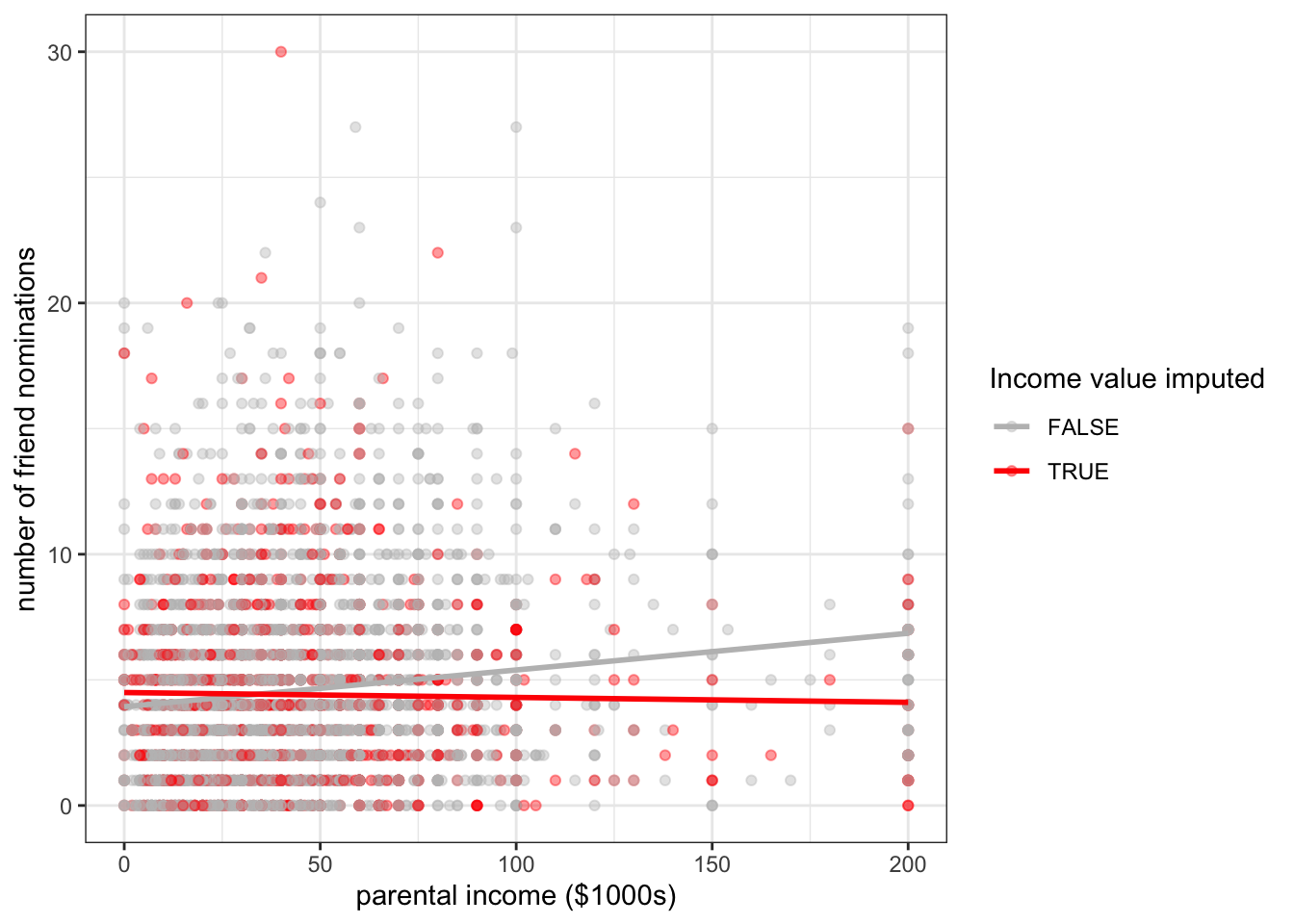
Figure 6.27 shows the same scatterplot as above, but this time with random imputation. You can see that my imputed values are now spread out across the range of parental income, thus preserving the variance in that variable.
Although random imputation is preferable to mean imputation, both methods have a serious drawback. Because I am imputing values without respect to any other variables, these imputed values will by definition be uncorrelated with the dependent variable. You can see this in Figure 6.27 where I have drawn the best fitting line for the imputed and non-imputed values. The red line for the imputed values is basically flat because there will be no association except for that produced by sampling variability. Because imputed values are determined without any prediction, non-predictive imputation will always bias estimates of association between variables downward.
| sample | correlation | slope | sd |
|---|---|---|---|
| Valid cases | 0.132 | 0.015 | 33.70 |
| Valid cases + mean imputed | 0.117 | 0.015 | 29.50 |
| Valid cases + random imputed | 0.100 | 0.011 | 33.95 |
Table 6.6 compares measures of association and variance in the Add Health data for these two techniques to the same numbers when only valid cases are used. The reduction in correlation in the two imputed samples is apparent, relative to the case with only valid responses. The reduction in variance of parental income is also clear for the case of mean imputation. Interestingly, the mean imputation does not downwardly bias the measure of slope because the reduction in correlation is perfectly offset by the reduction in variance. However, this special feature only holds when there are no other independent variables in the model and is also probably best thought of as a case of two wrongs (errors) not making a right (correct measurement).
In general, because of these issues with downward bias, non-predictive imputation is not and advisable technique. However, in some cases it may be preferable as a “quick and dirty” method that is useful for initial exploratory analysis or because the number of missing cases is moderate. It may also be reasonable if the variable that needs to be imputed is intended to serve primarily as a control variable and inferences are not necessarily going to be drawn for this variable itself.
In these cases where non-predictive imputation serves as a quick and dirty method, one additional technique, which I call mean imputation with dummy is advisable. In this case, the researcher performs mean imputation as above but also includes the missingness boolean variable into the model specification as above. The effect of this dummy is to estimate a slope and intercept for the imputed variable that is unaffected by the imputation, while at the same time producing a measure of how far out mean imputation is off relative to where the model expects the missing cases to fall.
Since, we already have an incmiss dummy variable, we can implement this model very easily. Lets try it in a model that predicts number of friend nominations by parental income and number of sports played.
model.valid <- lm(nominations~parent_income+nsports, data=addhealth)
model.meani <- lm(nominations~parent_income.meani+nsports, data=addhealth)
model.mdummyi <- lm(nominations~parent_income.meani+nsports+parent_income_missing,
data=addhealth)| (1) | (2) | (3) | |
|---|---|---|---|
| (Intercept) | 3.526*** | 3.479*** | 3.510*** |
| (0.114) | (0.107) | (0.111) | |
| parent_income | 0.012*** | ||
| (0.002) | |||
| nsports | 0.451*** | 0.471*** | 0.469*** |
| (0.049) | (0.043) | (0.043) | |
| parent_income.meani | 0.012*** | 0.012*** | |
| (0.002) | (0.002) | ||
| parent_income_missingTRUE | -0.122 | ||
| (0.129) | |||
| N | 3370 | 4397 | 4397 |
| R-squared | 0.042 | 0.040 | 0.040 |
| * p < 0.05, ** p < 0.01, *** p < 0.001 | |||
Table 6.7 shows the results of these models. In this case, the results are very similar. The coefficient on the income missing dummy basically tells us how far the average number of friend nominations was off for cases with income missing relative to what was predicted by the model. In this case, the model is telling us that with a mean imputation the predicted value of friend nominations for respondents with missing income data is 0.12 nominations higher than where it is in actuality. If we believe our model, this might suggest that the parental income of those with missing income is somewhat lower than those who are not missing, on average.
This quick and dirty method is often useful in practice, but keep in mind that it still has the same problems of underestimating variance and assuming MCAR. A far better solution would be to move to predictive imputation.
In a predictive imputation, we use other variables in the dataset to get predicted values for cases that are missing. In order to do this, an analyst must specify some sort of model to determine predicted values. A wide variety of models have been developed for this, but for this course, we will only discuss the simple case of using a linear model to predict missing values (sometimes called regression imputation).
In the case of the Add Health data, we have a variety of other variables that we can consider using to predict parental income including race, GPA, alcohol use, smoking, honor society membership, band/choir membership, academic club participation, and number of sports played. We also could consider using the dependent variable (number of friend nominations) here but there is some debate on whether dependent variables should be used to predict missing values, so we will not consider it here.
There is really no reason not to use as much information as possible here, so I will use all of these variables. However, in order to model this correctly, I want to consider the skewed nature of the my parental income data. To reduce the skewness and produce better predictions, I will transform parental income in my predictive model by square rooting it. I can then fit a model predicting parental income:
model <- lm(sqrt(parent_income)~race+pseudo_gpa+honor_society+alcohol_use+smoker
            +bandchoir+nsports+nominations, data=addhealth)
predicted <- predict(model, addhealth)
addhealth$parent_income.regi <- addhealth$parent_income
addhealth$parent_income.regi[addhealth$parent_income_missing] <-
  predicted[addhealth$parent_income_missing]^2
#addhealth <- addhealth |>
#  mutate(parent_income.regi = ifelse(parent_income_missing,
#                                     predicted[parent_income_missing]^2,
#                                     parent_income))
summary(addhealth$parent_income.regi)
Min. 1st Qu. Median Mean 3rd Qu. Max. NA's
0.00 25.00 39.30 44.06 55.00 200.00 259 After fitting the model, I just use the predict command to get predicted parental income values (square rooted) for all of my observations. I remember to square these predicted values when I impute them back.
One important thing to note is that my imputed parental income still has 39 missing values. That is a lot less than 1027, but how come we didn’t remove all the missing values? The issue here is that some of my predictor variables (particularly smoking, alcohol use, and GPA) also have missing values. Therefore, for observations that are missing on those values as well as parental income, I will get missing values in my prediction. I will address how to handle this problem further below.
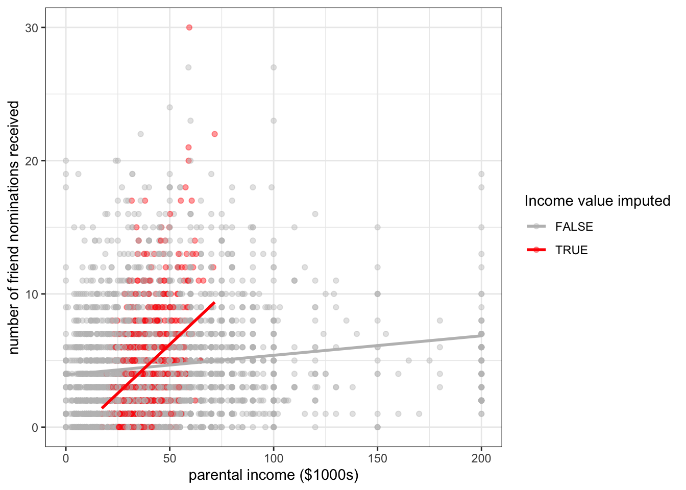
This regression imputation only accounts for variability in parental income that is accountable for in the model and ignores residual variation. This imputation procedure therefore underestimates the total variance in parental income with similar consequences as above. This can be clearly seen in Figure 6.28 where the imputed values have a much smaller variance in parental income than the variance overall.
To address this problem, we can use random regression imputation which basically adds a random “tail” onto each predicted value based on the variance of our residual terms. It is also necessary to define a distribution from which to sample our random tails. We will use the normal distribution.
# sample random values based on the residual variance from the model
random_bit <- rnorm(sum(addhealth$parent_income_missing), 0, sigma(model))
addhealth$parent_income.rregi <- addhealth$parent_income
addhealth$parent_income.rregi[addhealth$parent_income_missing] <-
  (predicted[addhealth$parent_income_missing] + random_bit)^2
The rnorm function samples from a normal distribution with a given mean and standard deviation. We use the sigma function to pull the standard deviation of the residuals from our model.
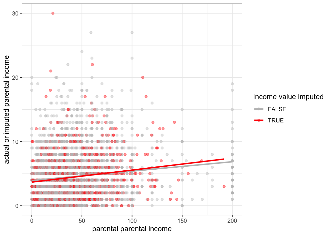
Figure 6.29 shows that the variation of our imputed values now mimics that of the actual values and that the slope of the relationship to friend nominations is similar between the imputed and non-imputed data.
| sample | correlation | slope | sd |
|---|---|---|---|
| Valid cases | 0.132 | 0.015 | 33.70 |
| Valid cases + mean imputed | 0.117 | 0.015 | 29.50 |
| Valid cases + random imputed | 0.100 | 0.011 | 33.95 |
| Valid cases + regression imputed | 0.143 | 0.017 | 30.84 |
| Valid cases + random regression imputed | 0.137 | 0.015 | 33.16 |
As we saw above, one downside of using a model to predict missing values is that missing values on other variables in the dataset can cause the imputation procedure to not impute all of the missing values. There are a few different ways of handling this but the most popular technique is to use an iterative procedure called **multiple imputation by chained equations* or MICE for short. The basic procedure is as follows:
The purpose of the iterations is to improve the imputation by moving further and further away from the mean imputation that was used to get an initial fit.
This procedure is complicated to implement in practice, but luckily the mice library in R already provides an excellent implementation. Furthermore, the mice library has a variety of modeling options that include the ability to handle missing values in both quantitative and categorical models. For quantitative variables, it does not by default use regression imputation, but rather a technique called predictive mean matching that is more flexible and resistant to mis-specification.
The basic command in the mice library to run MICE is … mice:
library(mice)
addhealth.complete <- mice(addhealth[,c("nominations", "race", "gender", "grade",
                                        "pseudo_gpa", "honor_society",
                                        "alcohol_use", "smoker", "bandchoir",
                                        "nsports","parent_income")],
                           m=5)
 iter imp variable
  1   1  race  grade  pseudo_gpa  alcohol_use  smoker  parent_income
  1   2  race  grade  pseudo_gpa  alcohol_use  smoker  parent_income
  1   3  race  grade  pseudo_gpa  alcohol_use  smoker  parent_income
  1   4  race  grade  pseudo_gpa  alcohol_use  smoker  parent_income
  1   5  race  grade  pseudo_gpa  alcohol_use  smoker  parent_income
  2   1  race  grade  pseudo_gpa  alcohol_use  smoker  parent_income
  2   2  race  grade  pseudo_gpa  alcohol_use  smoker  parent_income
  2   3  race  grade  pseudo_gpa  alcohol_use  smoker  parent_income
  2   4  race  grade  pseudo_gpa  alcohol_use  smoker  parent_income
  2   5  race  grade  pseudo_gpa  alcohol_use  smoker  parent_income
  3   1  race  grade  pseudo_gpa  alcohol_use  smoker  parent_income
  3   2  race  grade  pseudo_gpa  alcohol_use  smoker  parent_income
  3   3  race  grade  pseudo_gpa  alcohol_use  smoker  parent_income
  3   4  race  grade  pseudo_gpa  alcohol_use  smoker  parent_income
  3   5  race  grade  pseudo_gpa  alcohol_use  smoker  parent_income
  4   1  race  grade  pseudo_gpa  alcohol_use  smoker  parent_income
  4   2  race  grade  pseudo_gpa  alcohol_use  smoker  parent_income
  4   3  race  grade  pseudo_gpa  alcohol_use  smoker  parent_income
  4   4  race  grade  pseudo_gpa  alcohol_use  smoker  parent_income
  4   5  race  grade  pseudo_gpa  alcohol_use  smoker  parent_income
  5   1  race  grade  pseudo_gpa  alcohol_use  smoker  parent_income
  5   2  race  grade  pseudo_gpa  alcohol_use  smoker  parent_income
  5   3  race  grade  pseudo_gpa  alcohol_use  smoker  parent_income
  5   4  race  grade  pseudo_gpa  alcohol_use  smoker  parent_income
  5   5  race  grade  pseudo_gpa  alcohol_use  smoker  parent_income
In this case, I specified all of the variables that I wanted to go into my multiple imputation. If you want all of the variables in your dataset to be used, you can just feed in the dataset with no list of variable names. You can see that mice went through five iterations of imputation, with a list of the variables imputed and the order in which they were imputed. You can also see that it cycled through something called “imp.” This value corresponds to the m=5 argument I specified. This is the number of times that mice performed the entire imputation procedure. In this case, I now have five complete datasets (datasets with no missing values) in the object addhealth.complete. To access any one of them, I need to use the complete function with an id number:
summary(complete(addhealth.complete, 1)) nominations race gender
Min. : 0.000 White :2632 Female:2307
1st Qu.: 2.000 Black/African American :1149 Male :2090
Median : 4.000 Latino : 403
Mean : 4.551 Asian/Pacific Islander : 161
3rd Qu.: 6.000 American Indian/Native American: 26
Max. :30.000 Other : 26
grade pseudo_gpa honor_society alcohol_use
Min. : 7.000 Min. :1.00 No :3990 Non-drinker:3673
1st Qu.: 8.000 1st Qu.:2.25 Yes: 407 Drinker : 724
Median :10.000 Median :3.00
Mean : 9.509 Mean :2.86
3rd Qu.:11.000 3rd Qu.:3.50
Max. :12.000 Max. :4.00
smoker bandchoir nsports parent_income
Non-smoker:3732 No :3340 Min. :0.000 Min. : 0.00
Smoker : 665 Yes:1057 1st Qu.:0.000 1st Qu.: 23.00
Median :1.000 Median : 40.00
Mean :1.098 Mean : 45.34
3rd Qu.:2.000 3rd Qu.: 60.00
Max. :6.000 Max. :200.00 I can run a model on my first complete dataset like so:
model <- lm(nominations~parent_income, data=complete(addhealth.complete, 1))
summary(model)
Call:
lm(formula = nominations ~ parent_income, data = complete(addhealth.complete,
    1))

Residuals:
    Min      1Q  Median      3Q     Max
-6.8320 -2.6636 -0.7521  1.7789 25.0856

Coefficients:
              Estimate Std. Error t value Pr(>|t|)
(Intercept)   3.881834   0.092337  42.040   <2e-16 ***
parent_income 0.014751   0.001633   9.032   <2e-16 ***
---
Signif. codes:  0 '***' 0.001 '**' 0.01 '*' 0.05 '.' 0.1 ' ' 1

Residual standard error: 3.659 on 4395 degrees of freedom
Multiple R-squared:  0.01822,   Adjusted R-squared:  0.018
F-statistic: 81.59 on 1 and 4395 DF, p-value: < 2.2e-16Why did I run five different imputations using the mice function in the example above? To explore this question, lets first look at the slope predicting the number of friend nominations by parental income across all five complete imputations:
coefs <- NULL
for(i in 1:5) {
  coefs <- c(coefs,
             coef(lm(nominations~parent_income,
                     data=complete(addhealth.complete,i)))[2])
}
coefs
parent_income parent_income parent_income parent_income parent_income
0.01475059 0.01550278 0.01285434 0.01266155 0.01599953 I get different values on each complete imputation. This is because there is an element of randomness in my imputation procedure. That randomness is needed to correctly impute while preserving the variance in the underlying variables, but it adds an additional layer of uncertainty to understanding my results. Which of these values should I use for my results? This additional layer of uncertainty is called imputation variability. Imputation variability adds additional uncertainty above and beyond sampling variability when attempting to make statistical inferences.
To accurately account for imputation variability, we need to use multiple imputation. The multiple imputation process is as follows:
m=5 is sufficient.m separate parallel models on each imputed dataset. As a result, you will have m sets of regression coefficients and standard errors.m datasets.m datasets plus the between model standard deviation in coefficients. The formula for the overall standard error is:\[SE_{\beta}=\sqrt{W+B+\frac{B}{m}}\]
Where \(W\) is the squared average standard error across all \(m\) datasets and \(B\) is the variance in coefficient estimates across all \(m\) models.
The mice library provides some nice utilities for accounting for multiple imputation in basic linear models. However, it is worth learning how to to do this procedure by hand, so I will first show you how to do it without using built-in functions.
The first step is to loop through each imputation, calculate the model and extract the coefficients and standard errors:
b <- se <- NULL
for(i in 1:5) {
  model <- lm(nominations~parent_income+smoker+alcohol_use+nsports,
              data=complete(addhealth.complete,i))
  b <- cbind(b, coef(model))
  se <- cbind(se, summary(model)$coef[,2])
}
The b and se objects are just matrices of the regression coefficients and standard errors across imputations. For example:
round(b,3) [,1] [,2] [,3] [,4] [,5]
(Intercept) 3.371 3.335 3.451 3.437 3.310
parent_income 0.012 0.013 0.010 0.010 0.013
smokerSmoker 0.234 0.188 0.168 0.184 0.195
alcohol_useDrinker 0.622 0.620 0.653 0.646 0.642
nsports 0.461 0.461 0.471 0.471 0.459With the application of the apply command we can estimate averages for these values across imputations as well as the variability in regression coefficients across models.
b.pool <- apply(b, 1, mean)
between.var <- apply(b, 1, var)
within.var <- apply(se^2, 1, mean)
se.pool <- sqrt(within.var+between.var+between.var/5)
t.pool <- b.pool/se.pool
pvalue.pool <- (1-pnorm(abs(t.pool)))*2
results <- data.frame(b.pool, se.pool, t.pool, pvalue.pool)
round(results,4)
b.pool se.pool t.pool pvalue.pool
(Intercept) 3.3806 0.1229 27.5167 0.0000
parent_income 0.0116 0.0023 5.0400 0.0000
smokerSmoker 0.1937 0.1618 1.1969 0.2313
alcohol_useDrinker 0.6364 0.1547 4.1136 0.0000
nsports 0.4647 0.0435 10.6797 0.0000We now have results that make use of a complete dataset and also adjust for imputation variability. We can also use the results above to estimate the relative share of the between and within variation to our total uncertainty. Figure @ref(fig:share-impute-var) shows the relative contribution of between and within variability to our total uncertainty. Because most variables in this model are missing few or no values, the contribution of between sample imputation variability is quite small for most cases. However, for parental income which was missing a quarter of observations, it is a substantial share of around 30% of the total variability.

The for-loop approach above is an effective method for pooling results for multiple imputation and is flexible enough that you can utilize a wide variety of techniques within the for-loop, such as adjustments for sample design. However, if you are just running vanilla lm commands, then the mice library also has an easier approach:
model.mi <- pool(with(addhealth.complete,
                      lm(nominations~parent_income+smoker+alcohol_use+nsports)))
summary(model.mi)
term estimate std.error statistic df p.value
1 (Intercept) 3.38064875 0.122858215 27.516668 42.36531 1.179704e-28
2 parent_income 0.01164777 0.002311079 5.039969 15.70769 1.276000e-04
3 smokerSmoker 0.19369487 0.161827283 1.196923 2355.02624 2.314569e-01
4 alcohol_useDrinker 0.63641729 0.154711320 4.113579 3827.43826 3.977629e-05
5 nsports 0.46465304 0.043508082 10.679695 2768.34778 4.055719e-26As I said earlier, multiple imputation is the gold standard for dealing with missing values. However, it is important to realize that it is not a bulletproof solution to the problem of missing values. It still assumes MAR and if the underlying models used to predict missing values are not good, then it may not produce the best results. Ideally, when doing any imputation procedure you should also perform an analysis of your imputation results to ensure that they are reasonable. These techniques are beyond the scope of this class, but further reading links can be found on Canvas.
The problem of multicollinearity arises when the independent variables in a linear model are highly correlated with one another. In such a case it is possible to predict with reasonable accuracy the value of one independent variable based on all of the other independent variables in the model.
Multicollinearity creates problem for model estimation in two ways. First, multicollinearity between independent variables will increase the standard error on regression coefficients making it difficult to identify statistically significant effects. Second, in nested models with highly collinear variables, results from model to model can be highly variable and inconsistent. It is not unusual that two highly collinear variables both produce substantively large and statistically significant effects when put in a model separately, but when put in together, both variables fail to produce a statistically significant effect.
The intuition behind why this happens is fairly straightforward. If two independent variables are highly correlated with one another, then when they are both included in a model, it is difficult to determine which variable is actually driving the effect, because there are relatively few cases where the two variables are different. Thus, the two variables are effectively blowing each other up in the full model.
Structural multicollinearity occurs when one variable is perfectly predicted by some combination of other variables. In this situation, a model with all of these variables cannot be estimated unless one variable is dropped.
To provide a simple example of perfect multicollinearity, I have coded a variable in the crime dataset for the percent female in a state. This term is perfectly collinear with the variable percent male in a state and thus it will cause problems for model estimation if I include them both:
crimes$percent_female <- 100-crimes$percent_male
summary(lm(violent_rate~percent_male+percent_female, data=crimes))
Call:
lm(formula = violent_rate ~ percent_male + percent_female, data = crimes)

Residuals:
    Min      1Q  Median      3Q     Max
-275.24 -104.25  -40.38   61.07  695.41

Coefficients: (1 not defined because of singularities)
               Estimate Std. Error t value Pr(>|t|)
(Intercept)     2067.27    1482.04   1.395    0.169
percent_male     -34.11      30.00  -1.137    0.261
percent_female       NA         NA      NA       NA

Residual standard error: 177.2 on 49 degrees of freedom
Multiple R-squared:  0.0257,    Adjusted R-squared:  0.005817
F-statistic: 1.293 on 1 and 49 DF,  p-value: 0.2611
Note that the result for percent_female is missing and the note above the coefficient table tells us that one variable is not defined because of a “singularity.” The singularity here is a matrix singularity which technically means that no inverse matrix exists for the design matrix of \(X\). However, the intuition here is more straightforward: percent_female contains no information that is not already contained in percent_male so it is impossible to predict separate effects for each variable. A 1% increase in the percent male means a 1% increase in the percent female, and vice versa.
We have already seen an example of perfect multicollinearity in the case of dummy variables for categorical variables. We always have to leave one dummy variable out of the model to serve as the reference category. This is because once we know the results for all but one category, we also know the results for that category. Lets say I have four categories of marital status: never married, married, widowed, and divorced. If I know you are not married, widowed, or divorced, then by process of elimination you must be never married.
Structural multicollinearity is generally a specification error by the researcher rather than a true problem with the data. What we are more concerned about is data-based multicollinearity in which one variable can be predicted with high but not perfect accuracy by other variables in the model.
As an example for this section, we will use data that I have collected with Nicole Marwell on the contracting out of social services in New York City. The data were collected from 1997-2001 and contain information on the amount of dollars per capita going to neighborhoods in NYC for social services that were contracted out to non-profit organization. Our key concern here is with the distribution of this money and whether or not it was it going to more socioeconomically disadvantaged neighborhoods or more socioeconomically advantaged neighborhoods. The unit of analysis for the dataset is a “health area” which is a bureaucratic unit used by the city government that loosely corresponds to a neighborhood. The dataset has four variables:
amtcapita: the amount of dollars received by a health area divided by population size. This variable is heavily right skewed so we log it in all of the models.poverty: the poverty rate in the health area.unemployed: the unemployment rate in the health area.income: the median household income in the health area. This is also right-skewed so we log it.Median income, the poverty rate, and the unemployment rate are all good measures of the socioeconomic status of a neighborhood, but we also have reason to be concerned that multicollinearity might be a problem here.
A first step to detecting data-based multicollinearity is to examine the correlation matrix between the independent variables. This can be done simply with the cor command:
nyc$lincome <- log(nyc$income)
cor(nyc[,c("poverty", "unemployed", "lincome")])
poverty unemployed lincome
poverty 1.0000000 0.6982579 -0.9120680
unemployed 0.6982579 1.0000000 -0.7419472
lincome -0.9120680 -0.7419472 1.0000000Another more visual-pleasing approach to looking at these correlations is to graph a correlogram, which is a figure that shows the correlations between a set of variables. The excellent corrgram package in R will do this for us, and it also includes a variety of customizations that allow us to visualize this correlation in different ways.
library(corrgram)
corrgram(nyc[,c("poverty", "unemployed", "lincome")],
         upper.panel="panel.cor", lower.panel="panel.pts")
In this case, I am showing the correlation coefficients in the upper panel and the full bivariate scatterplots in the lower panel. the numbers are also shaded somewhat by their strength of association, although in this case the correlations are so high that the shading is not very apparent.
The correlation between these three variables is very high and raises immediate concerns about a potential problem of multicollinearity if we were to try to fit these models.
Examining correlations between independent variables prior to running models is advisable. However, we can also sometimes detect multicollinearity by looking at model results across nested models. To show how this works, I have run all the possible models that involve some combination of these three variables and reported them in ?tbl-multicollinear-models) below.
| (1) | (2) | (3) | (4) | (5) | (6) | (7) | |
|---|---|---|---|---|---|---|---|
| (Intercept) | 4.142*** | 4.135*** | 10.238*** | 4.121*** | 3.078 | -24.699*** | -29.597*** |
| (0.172) | (0.231) | (2.052) | (0.226) | (3.272) | (4.941) | (5.309) | |
| poverty | 0.039*** | 0.038*** | 0.127*** | 0.124*** | |||
| (0.007) | (0.010) | (0.017) | (0.017) | ||||
| unemployed | 0.091*** | 0.005 | 0.100** | 0.080* | |||
| (0.024) | (0.033) | (0.036) | (0.033) | ||||
| lincome | -0.493* | 0.091 | 2.516*** | 2.912*** | |||
| (0.191) | (0.282) | (0.431) | (0.458) | ||||
| N | 341 | 341 | 341 | 341 | 341 | 341 | 341 |
| R-squared | 0.080 | 0.041 | 0.019 | 0.080 | 0.041 | 0.164 | 0.178 |
| * p < 0.05, ** p < 0.01, *** p < 0.001 | |||||||
The presence of multicollinearity is most easily detectable in models with both the poverty rate and median household income. Compare the results from Model 5 to those from Models 1 and 3. The effect on poverty rate, more than triples in size and the standard error is doubled. The results for income completely reverse direction and become very large and the standard error more than doubles. These are clear signs of multicollinearity. These same patterns are visible in Model 7. Unemployment is less affected by these issues, but its standard error also increases fairly substantially in models with either of the other two variables. In particular the effects of income here seem particularly sensitive to the other variables. These are all hints that multicollinearity is a serious problem in the models.
We can more formally assess the problem of multicollinearity in models by calculating the variance inflation factor or VIF. VIF measures the degree to which the variance in estimating an independent variable is inflated in a model due to the correlation with other independent variables in the model. For a given independent variable \(i\), the VIF is defined as:
\[VIF_i=\frac{1}{1-R_i^2}\]
where \(R_i^2\) is the r-squared value from a model in which the \(i\) independent variable is predicted by all of the other independent variables in the model.
For example, if we wanted to calculate the VIF for the poverty rate in a model that also included the unemployment rate and the median household income, we would do the following:
model <- lm(poverty~unemployed+lincome, data=nyc)
1/(1-summary(model)$r.squared)
[1] 5.984485So, the VIF is 5.98. This number is in terms of variance, so if we want to know the inflation in the standard errors, we need to square root it. In this case, the square root produces a value of 2.45 indicating that the standard errors for the poverty rate will be more than double in a model with both unemployment and log income, as a result of multicollinearity.
The car library has a vif function in which you can feed in a model object and get out the VIF for all independent variables in the model:
library(car)
model.full <- lm(log(amtcapita)~poverty+unemployed+lincome, data=nyc)
vif(model.full)
poverty unemployed lincome
5.984485 2.238379 6.822173 Since a VIF of four implies a doubling of the standard error, this is often used as a rule of thumb to identify problematic levels of VIF. However, even a smaller increase in the standard error can produce problems for model estimation, so this rule of thumb should be exercised with care.
Given that you have identified data-based multicollinearity, what do you do about it? A simple approach is to remove some of the highly collinear variables. However, this approach has some drawbacks. First, you have to decide which variable(s) to keep and which to remove. Because the effects of these variables are not easily distinguished, making this decision may not be easy. If the variables operationalize different conceptual ideas, you don’t have a strong empirical rationale for preferring one over the other. Second, because the variables are not perfectly correlated, you are throwing away some information.
Another approach is to run separate models with only one of the highly collinear variables in each model. The primary advantage of this approach over removal is that you are being more honest with yourself (and potential readers) about the indeterminacy over which variable properly predicts the outcome. However, in this case you are also underestimating the total effects of these variables collectively and their effect as control variables in models with additional variables. It also can become unworkably complex if you have multiple sets of highly correlated variables.
If the variables that are highly collinear are all thought to represent the same underlying conceptual variable, then another approach is to combine these variables into a single scale. In my example, for instance, all three of my independent variables are thought to represent I turn to the mechanics of such scale creation in the next section.
We can create a simple summated scale simply by summing up the responses to a set of variables. However, there are several issues that we need to consider before doing this summation.
First, we need to consider how to handle the case of categorical variables. If we have a set of yes/no questions, we might simply sum up the number of “yes” responses. For example, the GSS has a series of questions about whether people would allow certain groups (e.g. atheists, communists, racists, militarists) to (1) speak in their community, (2) teach at a university, or (3) have a book in a library. Many researchers have summed up the number of “yes” responses across all groups and questions to form an index of “tolerance.”
Ordinal variables with more than two categories are more difficult. A typical example is a Likert-scale question that asks for someone’s level of agreement with a statement (e.g. “strongly disagree”, “disagree”,“neither”,“agree”,“strongly agree”). A typical approach is to score responses (e.g. from 1-5 for five categories) and then to sum up those scores. However, since we are dealing with ordinal categorical responses, we are making an assumption that a change of one on this scale is the same across all levels.
Second, we need to consider that some variables might be measured on different unit scales. If we are counting up a score on a set of Likert-scale questions that are all scored 1-5, then this is not usually considered an important issue. However, if we want to combine variables measured in very different units or with different spreads, then these variables will not be represented equally in th scale unless we first standardize them. The most common approach to standardization is to take the z-score of a variable by subtracting its mean and dividing by its standard deviation:
\[z_i=\frac{x_i-\bar{x}}{s_x}\]
When variables are re-scaled in this way, they will all have a mean of zero and a standard deviation of one. This re-scaling is easy to do manually in R, but the scale function will also do it for you:
nyc$poverty.z <- scale(nyc$poverty)
nyc$unemployed.z <- scale(nyc$unemployed)
mean(nyc$unemployed.z)
[1] -2.61635e-15sd(nyc$unemployed.z)[1] 1Even when re-scaling is not necessary because variables are all measured on the same scale, I think re-scaling can be useful so that the final summated scale is easier to interpret.
Third, we need to be careful to make sure that all of the variables are coded in the same direction relative to the underlying concept. In my case, median household income is coded in the opposite direction as poverty and unemployment. Whereas higher poverty and unemployment indicates greater disadvantage, higher household income indicates less disadvantage. in these cases, you need to reverse the coding of some of the variables so that higher values are associated with being higher on the underlying conceptual variable you are trying to measure. In my case, I can do this for income by multiplying by -1 after re-scaling:
nyc$lincome.z <- -1 * scale(nyc$lincome)Once all of these considerations are done, I can add up my re-scaled and properly coded variables to create a single scale of “neighborhood deprivation.” It is not necessary but I usually like to re-scale the final summated scale again so that one unit equals a one standard deviation change.
nyc$deprivation.summated <- scale(nyc$poverty.z+nyc$unemployed.z+nyc$lincome.z)And now lets use this summated scale in the model:
model.summated <- lm(log(amtcapita)~deprivation.summated, data=nyc)
summary(model.summated)
Call:
lm(formula = log(amtcapita) ~ deprivation.summated, data = nyc)

Residuals:
    Min      1Q  Median      3Q     Max
-6.8369 -0.8123  0.0968  0.9119  4.9476

Coefficients:
                     Estimate Std. Error t value Pr(>|t|)
(Intercept)           4.94742    0.08807  56.175  < 2e-16 ***
deprivation.summated  0.37479    0.08820   4.249 2.78e-05 ***
---
Signif. codes:  0 '***' 0.001 '**' 0.01 '*' 0.05 '.' 0.1 ' ' 1

Residual standard error: 1.626 on 339 degrees of freedom
Multiple R-squared:  0.05057,   Adjusted R-squared:  0.04777
F-statistic: 18.06 on 1 and 339 DF,  p-value: 2.775e-05
The model predicts that a one standard deviation increase in a neighborhood’s deprivation score is associated with about a 45% increase (\(100 * (e^{0.3748}-1)\)) in the amount of per-capita funding for social services.
One important measure of the quality of a scale composed of multiple variables is the internal consistency (also sometimes called internal reliability) of the scale. Internal consistency is assessed by the degree to which variables within the scale are correlated with one another. Although examination of the full correlation matrix provides some measure of this internal consistency, the most common single measure used to test for internal consistency is Cronbach’s alpha.
We won’t go into the details of how to calculate Cronbach’s alpha here. It ranges from a value of 0 to 1, with higher values indicating greater internal consistency. Intuitive explanations for what Cronbach’s alpha measures are somewhat lacking, but it gives something like the expected correlation between two items measuring the underlying construct.
Cronbach’s alpha can be easily in R with the alpha function in the psych library. You can feed all the variables that make up the scale into Cronbach’s alpha or just the correlation matrix between these variables. The variables do not need to be re-scaled but we do not to ensure they are all coded in the same direction.
library(psych)
alpha(cor(nyc[,c("poverty.z","unemployed.z","lincome.z")]))
Reliability analysis
Call: alpha(x = cor(nyc[, c("poverty.z", "unemployed.z", "lincome.z")]))

  raw_alpha std.alpha G6(smc) average_r S/N median_r
      0.92      0.92     0.9      0.78  11     0.74

    95% confidence boundaries
      lower alpha upper
Feldt   0.1  0.92     1

 Reliability if an item is dropped:
             raw_alpha std.alpha G6(smc) average_r  S/N var.r med.r
poverty.z         0.85      0.85    0.74      0.74  5.8    NA  0.74
unemployed.z      0.95      0.95    0.91      0.91 20.7    NA  0.91
lincome.z         0.82      0.82    0.70      0.70  4.6    NA  0.70

 Item statistics
                r r.cor r.drop
poverty.z    0.94  0.93   0.86
unemployed.z 0.88  0.76   0.74
lincome.z    0.96  0.95   0.90
Cronbach’s alpha ranges from a value of 0 to 1. As a rule of thumb, many people use a value of 0.7 as a benchmark for a good Cronbach’s alpha, although as with all rules of thumb, caution should be taken in interpreting this too literally. In this case, the “raw alpha” of 0.92 is very good and suggests that the internal consistency of this deprivation measure is high. This function also returns a sensitivity analysis telling us how much Cronbach’s alpha would change if we were to remove a given variable from the scale. In this case, the results suggest that we would get even higher internal consistency if we removed the unemployment rate. However, since the alpha on all three was so high, it seems unnecessary to drop it in this case.
Cronbach’s alpha is often thought of as a test of whether the individual items all measure the same “latent” construct. While, it can be thought of as a test of whether items measure a construct vs no construct at all, it does not directly address another issue which is that items used as a measure of a single scale may instead be related to multiple latent constructs. In order to address that issue, we must move to factor analysis.
Generally speaking, factor analysis is a broad set of techniques that are designed to test whether specific variables are related to one or more underlying latent constructs. Most of the original work on factor analysis comes out of psychology where researchers were interested in whether items though to capture underlying latent concepts like “anxiety” and “depression” were actually correlated with some underlying constructs and whether these constructs were Differentiable. So, if you give respondents a survey with several items measuring anxiety and several other items measuring depression, you want the anxiety measures to all correlate highly and the depression measures to all correlate highly, but for the two groups to be distinguishable from each other.
Factor analysis is so broadly deployed across disciplines that there is some terminological confusion in the way people talk about specific techniques. There are two separate approaches methodologically to factor analysis. In the first approach, often called principal factors analysis or principal axis analysis, the researcher only uses information about the shared variance (the communality in factor analysis speak) between items to conduct a factor analysis. In the second approach, principal component analysis (PCA), the researcher uses the entire variance across all items. To add greater confusion, people often refer to factor analysis as the first technique and treat PCA as something distinct, although factor analysis should properly be thought of as encompassing both techniques. In practice, the results across these two techniques are usually quite similar. The argument for using one approach or the other is whether the researcher is interested primarily in data reduction (simplifying analyses by combining similar items) or truly measuring a latent construct. For our purposes, I will outline principal factor analysis here, but the pca command in the psych package can be used in an almost identical fashion to conduct a PCA.
To begin, lets assume a simple model with three items (\(z_1\), \(z_2\), and \(z_3\)) which we believe are measured by a single latent construct, \(F\). All items are standardized as z-scores. We believe that the outcome for a given observation on these three items is a function of the latent construct and some component unique to each item (\(Q_1\), \(Q_2\), and \(Q_3\)). We then can construct a system of equations like so:
\[z_{i1}=b_1F_i+u_1Q_1\] \[z_{i2}=b_2F_i+u_2Q_2\] \[z_{i3}=b_3F_i+u_3Q_3\]
Each of the \(b\) values below is the correlation coefficient between the underlying facto (\(F\)) and the given item. These are called factor loadings. The \(F_i\) values are the factor scores underlying the common latent factor and the \(Q\) values are the unique component to each item that is not explained by the common factor.
Factor analysis solves this system of equations to find factor loadings and factor scores. The factor loadings are particularly important because they provide information about how strongly correlated the individual items are to the underlying factor and thus the validity of the assumption that they are all represented by a single common factor.
The fa command in the pysch library will conduct a factor analysis. Just as for alpha, you can feed in raw data or just the correlation matrix. However, if you want the factor analysis to estimate factor scores, you need to feed in the raw data.
Lets do a factor analysis of the three measures of neighborhood deprivation in the NYC data.
factor_nyc <- fa(nyc[,c("poverty.z","unemployed.z","lincome.z")], nfactors = 1)
loadings(factor_nyc)
Loadings:
             MR1
poverty.z    0.926
unemployed.z 0.754
lincome.z    0.984

                 MR1
SS loadings    2.396
Proportion Var 0.799
The loadings function lets us extract the factor loadings. We can see that the factor loadings here are all very high, although the correlation for the unemployment rate is lower than the other two. We can also see that this single factor can account for nearly 80% of the variation across the three items.
We can also display what this factor analysis looks like graphically with the fa.diagram function in the psych library.
fa.diagram(factor_nyc)
In this case its not terribly helpful, because we only had a single factor and the factor loadings were all high. When the factor loadings are below some threshold the lines are typically not drawn which can make this diagrams really useful for sorting out relationships with cases of multiple factors.
The example above assumed only one common factor, but we can also explore models that allow for more common factors. The only hard rule is that you have to have less common factors than items.
To generalize the equations above, lets say we have a set of \(J\) observed variables that we want to divide between \(m\) common factors. We then have a set of \(J\) equations where the equation for the \(j\)th observed variable is:
\[z_{ji}=b_{j1}F_{1i}+b_{j2}F_{2i}+b_{jm}F_{mi}+u_jQ_{ji}\]
This means that we will have \(m\) factor loadings for each item. If our variables really do split into the expected number of common factors, then we should observe high factor loadings for each item on only one of the underlying common factors.
The factor loadings that are estimated in factor analysis also depend on what is called a rotation. We won’t delve into the technical details of rotation here, but the basic idea is that there are actually an infinite number of ways to display the same set of factor loadings in \(n\)-dimensional space for a set of \(n\) common factors. So, we need to choose some way to “rotate” those loadings in n-dimensional space in order to understand them better. You can either rotate them orthogonally so that the common factors are uncorrelated or obliquely so that correlation between the common factors is allowed. The “varimax” rotation is the most popular orthogonal rotation because it chooses factor loadings that either maximize or minimize the loadings on certain variables, easing interpretation. The “oblimin” rotation is popular for the oblique case and is the default setting in the fa function. Personally, I don’t see a lot of practical value in assuming orthogonal factors, so I tend to prefer “oblimin.”
To illustrate how this all works, lets look at another example. This example comes from Pew data collected on Muslim respondents in thirty-five different countries between 2008-2012. One set of questions in the survey asked respondents to rate the morality of a variety of stigmatized behaviors. Respondents could either select “morally acceptable”, “depends/not a moral value”, or “morally wrong.” Respondents were asked about the following behaviors:
I would like to explore to what extent answers to these responses reflect an underlying common factor of “social conservativeness.” In order to do that I need to show that these responses fit well for a single common factor and that they fit better for a single common factor than for multiple factors.
First, I need to scale my ordinal variables into quantitative variables with a score from 1 to 3. Since they are already ordered correctly, I can just use the as.numeric to cast them to numeric values.
morality <- tibble(moral_divorce=as.numeric(pew$moral_divorce),
                  moral_fertility=as.numeric(pew$moral_fertility),
                  moral_alcohol=as.numeric(pew$moral_alcohol),
                  moral_euthansia=as.numeric(pew$moral_euthanasia),
                  moral_suicide=as.numeric(pew$moral_suicide),
                  moral_abortion=as.numeric(pew$moral_abortion),
                  moral_prostitution=as.numeric(pew$moral_prostitution),
                  moral_premar_sex=as.numeric(pew$moral_premar_sex),
                  moral_gay=as.numeric(pew$moral_gay))
head(morality)
# A tibble: 6 × 9
moral_divorce moral_fertility moral_alcohol moral_euthansia moral_suicide
<dbl> <dbl> <dbl> <dbl> <dbl>
1 3 2 2 2 3
2 3 1 2 2 3
3 3 2 3 2 2
4 3 2 3 3 2
5 2 1 2 2 2
6 3 1 2 2 2
# ℹ 4 more variables: moral_abortion <dbl>, moral_prostitution <dbl>,
# moral_premar_sex <dbl>, moral_gay <dbl>Lets start with a look at the correlation matrix:

We can already see here that two of these behaviors (divorce and fertility) do not look like the others. Although they are somewhat weakly correlated with one another, they have very weak correlation with the other variables. Among the remaining variables, we do see a fairly substantial pattern of intercorrelation.
I also want to examine Cronbach’s alpha, but before I do that I want to take advantage of the fact that Cronbach’s alpha and the factor analysis only requires the correlation matrix rather than the dataset itself. My data has missing values and this is one area where available-case analysis is probably preferable to complete-case analysis. For the correlation matrix, I can use all of the valid data for each pairwise comparison. That will lead to different sample sizes on each correlation coefficient, but will allow me to use the data to its fullest. I can do that in R by including the use="pairwise.complete.obs" argument in cor:
morality_r <- cor(morality, use="pairwise.complete.obs")Lets look at Cronbach’s alpha before proceeding to full-blown factor analysis.
alpha(morality_r)
Reliability analysis
Call: alpha(x = morality_r)

  raw_alpha std.alpha G6(smc) average_r S/N median_r
      0.71      0.71    0.71      0.21 2.5     0.24

    95% confidence boundaries
      lower alpha upper
Feldt  0.31  0.71  0.92

 Reliability if an item is dropped:
                   raw_alpha std.alpha G6(smc) average_r S/N var.r med.r
moral_divorce           0.73      0.73    0.72      0.25 2.7 0.017  0.27
moral_fertility         0.73      0.73    0.73      0.26 2.8 0.015  0.27
moral_alcohol           0.68      0.68    0.68      0.21 2.1 0.021  0.23
moral_euthansia         0.68      0.68    0.68      0.21 2.1 0.021  0.25
moral_suicide           0.67      0.67    0.67      0.20 2.0 0.018  0.23
moral_abortion          0.67      0.67    0.67      0.20 2.0 0.021  0.23
moral_prostitution      0.67      0.67    0.66      0.20 2.0 0.015  0.23
moral_premar_sex        0.67      0.67    0.66      0.20 2.0 0.018  0.24
moral_gay               0.67      0.67    0.66      0.20 2.0 0.016  0.23

 Item statistics
                      r r.cor r.drop
moral_divorce      0.34  0.18   0.15
moral_fertility    0.31  0.14   0.12
moral_alcohol      0.59  0.51   0.43
moral_euthansia    0.57  0.48   0.41
moral_suicide      0.62  0.56   0.47
moral_abortion     0.61  0.54   0.46
moral_prostitution 0.64  0.59   0.49
moral_premar_sex   0.63  0.57   0.48
moral_gay          0.63  0.59   0.49
A Cronbach’s alpha of 0.71 is decent, but the results also suggest that I would improve Cronbach’s alpha by removing either divorce or fertility from my set of measures.
For the factor analysis, I will try out a one factor, two factor, and a three factor solution.
morality_fa1 <- fa(morality_r, 1)
morality_fa2 <- fa(morality_r, 2)
morality_fa3 <- fa(morality_r, 3)
Lets compare the diagrams graphically:

As you can see, for the single factor solution, the factor loadings were so low that divorce and fertility are dropped from the common factor. The two factor solution adds them back in as a separate factor, but even here the factor loadings of 0.4 are pretty low. The three factor solution splits my main group into two separate groups where one group seems to measure death in some way (suicide, euthanasia, and abortion) while the first group measures mostly sex with the addition of alcohol - suggesting alcohol use is viewed similarly to stigmatized sexual behavior.
Although the division in the three factor solution is interesting, this level of detail does not necessarily seem warranted and leads to some low factor loadings. What seems clear above all else, is that the fertility limitation and divorce questions do not belong with the others. Therefore, a summated scale that included all variables except for these two is reasonably justified.
To check this, lets see how Cronbach’s alpha does if we remove the fertility and divorce questions.
alpha(cor(morality[,c(-1,-2)], use="pairwise.complete.obs"))
Reliability analysis
Call: alpha(x = cor(morality[, c(-1, -2)], use = "pairwise.complete.obs"))

  raw_alpha std.alpha G6(smc) average_r S/N median_r
      0.76      0.76    0.75      0.32 3.2      0.3

    95% confidence boundaries
      lower alpha upper
Feldt  0.34  0.76  0.95

 Reliability if an item is dropped:
                   raw_alpha std.alpha G6(smc) average_r S/N  var.r med.r
moral_alcohol           0.74      0.74    0.72      0.33 2.9 0.0054  0.33
moral_euthansia         0.75      0.75    0.72      0.33 3.0 0.0045  0.33
moral_suicide           0.73      0.73    0.70      0.31 2.7 0.0058  0.29
moral_abortion          0.74      0.74    0.72      0.32 2.9 0.0063  0.31
moral_prostitution      0.72      0.72    0.69      0.30 2.6 0.0036  0.29
moral_premar_sex        0.73      0.73    0.70      0.31 2.7 0.0039  0.30
moral_gay               0.72      0.72    0.70      0.30 2.6 0.0037  0.29

 Item statistics
                      r r.cor r.drop
moral_alcohol      0.61  0.50   0.44
moral_euthansia    0.58  0.47   0.41
moral_suicide      0.66  0.58   0.50
moral_abortion     0.62  0.52   0.45
moral_prostitution 0.69  0.62   0.54
moral_premar_sex   0.66  0.58   0.50
moral_gay          0.68  0.62   0.53
We now get a stronger alpha of around 0.76 and little evidence that more removals would improve the internal consistency.
In closing, I should note that factor analysis is a huge area of research and I am only touching on the surface of it here. On the Canvas pages, I provide links for additional information.
In practice, researchers often have to decide between a variety of possible models. The different models available to a researcher can derive from a number of factors, but most often arise because the researcher has a wide set of possible control variables that could be added to the model. In addition, these models could be added as simple additive effects, or the researcher could add additional interaction terms, squared terms, splines, etc. In practice, the number of possible models one could construct from a set of variables is quite large. How does one go about choosing the “right” model?
For example, Table 6.10 shows a variety of models that could be used to predict violent crime rates across US states. Note that the model estimates for some variables such as percent male differ substantially across models. How can we possibly decide which of these models is the best model?
Nested models
|
Unnested models
|
|||||
|---|---|---|---|---|---|---|
| (1) | (2) | (3) | (4) | (5) | (6) | |
| (Intercept) | 5453.265** | 468.760 | 365.062 | 666.324 | -52.794 | 509.551 |
| (1593.807) | (2779.162) | (2728.357) | (2567.726) | (102.609) | (568.294) | |
| median_age | -36.949*** | -29.980** | -26.265* | -28.576** | -28.563*** | |
| (9.815) | (10.002) | (10.065) | (9.504) | (7.947) | ||
| percent_male | -74.052* | -9.897 | -3.277 | -2.188 | ||
| (28.669) | (40.650) | (40.092) | (37.697) | |||
| gini | 33.260* | 21.827 | 11.692 | 12.824 | ||
| (15.452) | (16.637) | (16.102) | (11.847) | |||
| poverty_rate | 17.436 | 1.476 | ||||
| (10.435) | (11.509) | |||||
| unemploy_rate | 64.599* | 78.481*** | 66.318** | |||
| (24.352) | (18.092) | (20.280) | ||||
| N | 51 | 51 | 51 | 51 | 51 | 51 |
| R-squared | 0.248 | 0.315 | 0.354 | 0.442 | 0.277 | 0.441 |
| * p < 0.05, ** p < 0.01, *** p < 0.001 | ||||||
By definition, models are not a 100% accurate representation of reality. Therefore, its silly to think that a single model can be the “right” one. In this chapter, we will learn some tools that can help with making decisions about model selection, but the decision about model selection is one that must be driven first and foremost by the research question at hand. For example, if my goal is to understand the relationship between percent male and violent crimes, then only models 1-4 from Table 6.10 are relevant, because only these models include the percent male variable as a predictor. Within that set, it probably makes more sense to think about how robust my results are to several different model specifications than to focus on a single model. Generally, so long as issues of multicollinearity do not arise it might be better to control for more variables rather than less in this context.
A different research question might focus on two different competing explanations for an outcome. In this case, I might need to directly compare the results of two different models to address my research question. In this case, some of the model selection tools we develop below will be more crucial in making this decision, but I still might need to consider how robust my results are to the inclusion of different control variables.
Ultimately, model selection can never be simplified into an automated process that protects the researcher from having to make decisions. There is no one way to make such decisions and must be considering such things as the research question, theoretical arguments about the process, the results of prior research, and the sensitivity of results to alternative specifications.
If we have an additional variable avaliable to us, why not throw it into the model? More control variables allow us to eliminate potential sources of confounding in the relationships we care about, so isn’t more always better than less? There are two reasons, why we don’t always want to use this kitchen sink approach.
First, as discussed in the previous section, adding in additional variables can lead to problems of multicollinearity. Collinearity between your independent varibles can increase standard errors on your estimates and lead you to a situation in wich in spite of strong point estimates of association, none of your results are statistically significant. For this reason, you should never just look at statistically significance when you observe that the addition of another variable made the relationship between \(x\) and \(y\) go away. If might have become non-significant because of an inflation in standard errors rather than a reducation in the correlation.
Second, we generally value the concept of parsimony as well as accuracy. Accuracy is measured by goodness-of-fit statistics like \(R^2\). Your model is more accurate if it can account for more variation in the outcome variable \(y\). However, an additional independent variable can never make \(R^2\) decrease and will almost always make it increase by some amount. Therefore, if we only prioritize accuracy we will continue to add variables into our models indefinitely.
We also prize parsimony. We want a model that gets the most “bang for our buck” so to speak. We prefer simpler explanations and models to more complex ones if those simpler models can be almost as accurate as the more complex model.
One important feature of parsimony and the very idea of scientific “models” in general is that we are not simply trying to reproduce reality. If we wanted to do that, we could simply create a dummy variable for each observation and produce a model with an \(R^2=1\). Yet, such a model would tell us nothing about the underlying process that produces variation in our outcome - we would just reproduce the world as it is. In principle, the very idea of scientific modeling is to reduce the complexity of the actual data in order to hopefully understand better the process. Including more and more variables into a model is rarely theoretically interesting and may in fact be misleading or confusing as to the underlying causal processes we hope to uncover.
In practice, we must balance these two features of models. Gains in parsimony will be offset by reductions in accuracy, and vice versa. There is no precise way to say where the threshold for that tradeoff should be, but as a practical researcher, you should always understand that this is the tradeoff you are making when you choose between models.
Two conceptual models illustrate the extreme ends of the accuracy vs. parsimony spectrum. The most parsimonious model that we can ever have is one without any independent variables. In this case, our predicted value for the outcome variable would always equal the mean of the outcome variable. Formally, we would have:
\[\hat{y}_i=\bar{y}\]
This null model has zero accuracy. It doesn’t even pretend to be accurate. We can estimate this model easily enough in R:
model_null <- lm(violent_rate~1, data=crimes)
coef(model_null)
(Intercept)
382.5468 summary(model_null)$r.squared[1] 0At the other end of the spectrum, we have the saturated model. In the saturated model, we have a number of variables equal to the number of observations minus one. The saturated model is not something we typically observe in practice because these independent variables must be uncorrelated enough that we don’t observe perfect collinearity. A simple example would be to simply include a dummy variable for each observation. Since we have the state as a variable in the crimes dataset, we can actually calculate a saturated model here:
model_saturated <- lm(violent_rate~state, data=crimes)
summary(model_saturated)$r.squared
[1] 1In practice, all real models fall somewhere between these two extremes. Most of the model selection tools that we discuss below will make use of these two conceptual models theoretically.
The F-test is not terribly useful in practice, but we will build some important principles from it for later tools in this module and the next module. The F-test is a classic tool that uses the framework of hypothesis testing to adjudicate between models.
The F-test can compare any two nested models. For one model to be nested within another, it must contain all of the original variables in the other model plus additional variables. When models are built by starting with a few variables and then adding in additional variables in a sort of reverse stairstep, then we have nested models. Models 1-4 from Table 6.10 above are nested models, while models 5-6 are not nested within models 1-4.
If we take any two nested models, the null hypothesis of the F-test is that none of the additional variables in the more complex model are correlated with the outcome (e.g. the \(\beta\) slope is zero on all additional variables). To test this, we calculate the F-statistic:
\[F=\frac{(SSR_1-SSR_2)/g}{SSR_2/(n-g-k-1)}\]
Where \(SSR\) is the sum of squared residuals for the given model, \(g\) is the number of additional variables in model 2 and \(k\) is the number of variables in model 1. Basically we are taking the reduction in SSR per variable added in model 2 divided by the SSR left in model 2 per remaining degree of freedom. If the null hypothesis is correct, we expect this number to be one. The larger the F-statistic gets, the more suspicious we are of the null hypothesis. We can formalize this by calculating the p-value from the right tail of an F-distribution for a given F-statistic. This F-distribution will As an example, lets calculat the F-statistic between the null model predicting violent crimes and a model that predicts violent crimes by the median age and percent male in a state.
model_null <- lm(violent_rate~1, data=crimes)
model_demog <- lm(violent_rate~median_age+percent_male, data=crimes)
SSR1 <- sum(model_null$residuals^2)
SSR2 <- sum(model_demog$residuals^2)
g <- length(model_demog$coef)-length(model_null$coef)
k <- length(model_null$coef)-1
n <- length(model_null$residuals)
Fstat <- ((SSR1-SSR2)/g)/(SSR2/(n-g-k-1))
Fstat
[1] 7.905258That seems quite a bit bigger than one. We can find out the probability of getting an F-statistic this large or larger if median age and percent male were really uncorrelated with violent crime rates in the population by getting the area of the right tail for a corresponding F-distribution:
1-pf(Fstat, g, n-g-k-1)[1] 0.001077397There is a very small probability that we would have gotten an F-statistic this large or larger if the null hypothesis was true. Therefore we reject the null hypothesis and prefer the model with median age and percent male to the null model.
Rather than doing this by hand, we could have used the anova command in R to make the comparison:
anova(model_null, model_demog)Analysis of Variance Table
Model 1: violent_rate ~ 1
Model 2: violent_rate ~ median_age + percent_male
Res.Df RSS Df Sum of Sq F Pr(>F)
1 50 1579186
2 48 1187907 2 391280 7.9053 0.001077 **
---
Signif. codes: 0 '***' 0.001 '**' 0.01 '*' 0.05 '.' 0.1 ' ' 1ANOVA stands for Analysis of Variance and can be used to conduct F-tests between models. We can also use it to compare more than two models at the same time, so long as they are all nested:
model_gini <- update(model_demog, .~.+gini)
model_complex <- update(model_gini, .~.+poverty_rate+percent_lhs)
anova(model_null, model_demog, model_gini, model_complex)
Analysis of Variance Table
Model 1: violent_rate ~ 1
Model 2: violent_rate ~ median_age + percent_male
Model 3: violent_rate ~ median_age + percent_male + gini
Model 4: violent_rate ~ median_age + percent_male + gini + poverty_rate +
percent_lhs
Res.Df RSS Df Sum of Sq F Pr(>F)
1 50 1579186
2 48 1187907 2 391280 9.2642 0.0004271 ***
3 47 1081309 1 106598 5.0477 0.0296105 *
4 45 950307 2 131002 3.1017 0.0547100 .
---
Signif. codes: 0 '***' 0.001 '**' 0.01 '*' 0.05 '.' 0.1 ' ' 1The F-test prefers model 2 to model 1 (the null model) and model 3 to model 2, but does not prefer model 4 to 3. The additional reduction in SSR from model 3 to 4 (131,002) is not enough higher than what could be expected by chance if these two additional parameters were not correlated with violent crime rates.
However, you need to be careful about making model selections here because the order in which things are entered can affect the results. Lets say for example that we first added the poverty rate and percent less than high school in model 3 and then added ghe gini coefficient in model 4.
model_povertyplus <- update(model_demog, .~.+poverty_rate+percent_lhs)
model_complex <- update(model_povertyplus, .~.+gini)
anova(model_null, model_demog, model_povertyplus, model_complex)
Analysis of Variance Table
Model 1: violent_rate ~ 1
Model 2: violent_rate ~ median_age + percent_male
Model 3: violent_rate ~ median_age + percent_male + poverty_rate + percent_lhs
Model 4: violent_rate ~ median_age + percent_male + poverty_rate + percent_lhs +
gini
Res.Df RSS Df Sum of Sq F Pr(>F)
1 50 1579186
2 48 1187907 2 391280 9.2642 0.0004271 ***
3 46 1010545 2 177362 4.1993 0.0212743 *
4 45 950307 1 60238 2.8525 0.0981529 .
---
Signif. codes: 0 '***' 0.001 '**' 0.01 '*' 0.05 '.' 0.1 ' ' 1Now we prefer to have poverty rates and percent less than high school in the model and not to have gini coefficients in the mdoel. However, it gets even worse than this. Lets take a look at the actual results of the final model:
summary(model_complex)
Call:
lm(formula = violent_rate ~ median_age + percent_male + poverty_rate +
    percent_lhs + gini, data = crimes)

Residuals:
    Min      1Q  Median      3Q     Max
-278.43  -85.15  -13.48   53.71  404.75

Coefficients:
             Estimate Std. Error t value Pr(>|t|)
(Intercept)   168.093   2665.560   0.063  0.95000
median_age    -26.818      9.830  -2.728  0.00905 **
percent_male   -3.044     39.137  -0.078  0.93836
poverty_rate   36.184     14.530   2.490  0.01653 *
percent_lhs   -24.335     13.450  -1.809  0.07709 .
gini           28.035     16.599   1.689  0.09815 .
---
Signif. codes:  0 '***' 0.001 '**' 0.01 '*' 0.05 '.' 0.1 ' ' 1

Residual standard error: 145.3 on 45 degrees of freedom
Multiple R-squared:  0.3982,    Adjusted R-squared:  0.3314
F-statistic: 5.956 on 5 and 45 DF,  p-value: 0.000262
Percent male is not statistically significant and has a small substantive effect, because its large negative effect was driven by an indirect association with the gini coefficient. Percent less than high school has a marginally significant but also small effect. But we never tested a model with just median age, the gini coefficient, and the poverty rate. What happens if we try that?
model_another <- lm(violent_rate~median_age+gini+poverty_rate, data=crimes)
anova(model_null, model_another, model_complex)
Analysis of Variance Table
Model 1: violent_rate ~ 1
Model 2: violent_rate ~ median_age + gini + poverty_rate
Model 3: violent_rate ~ median_age + percent_male + poverty_rate + percent_lhs +
gini
Res.Df RSS Df Sum of Sq F Pr(>F)
1 50 1579186
2 47 1019584 3 559603 8.8330 0.0001025 ***
3 45 950307 2 69277 1.6402 0.2053170
---
Signif. codes: 0 '***' 0.001 '**' 0.01 '*' 0.05 '.' 0.1 ' ' 1Now we prefer another model that was nested within our more complex model but not nested within the original model structure. F-tests can easily lead you into situations like this.
If you add in variables one at a time, the F-test will also produce the exact same result as a t-test on the additional variable:
model_one <- lm(violent_rate~median_age, data=crimes)
model_two <- update(model_one, .~.+poverty_rate)
anova(model_one, model_two)
Analysis of Variance Table
Model 1: violent_rate ~ median_age
Model 2: violent_rate ~ median_age + poverty_rate
Res.Df RSS Df Sum of Sq F Pr(>F)
1 49 1353027
2 48 1087066 1 265960 11.744 0.001261 **
---
Signif. codes: 0 '***' 0.001 '**' 0.01 '*' 0.05 '.' 0.1 ' ' 1summary(model_two)$coef Estimate Std. Error t value Pr(>|t|)
(Intercept) 1007.86825 356.837650 2.824445 0.006878413
median_age -23.50851 8.802564 -2.670643 0.010303859
poverty_rate 28.54662 8.330168 3.426896 0.001261187Notice that the p-value for the poverty variable in model 2 is identical to the p-value for the F-test between models 1 and 2. Thus the F-test does not really do much for us that we couldn’t already do with a t-test one variable at a time.
Aside from the issues highlighted above, the primary problem with the F-test is that its decisions are driven by the logic of hypothesis testing and the search for “statistically significant” results. Putting aside that this logic makes no sense for the crime data because they are not a sample, this is not a good practice in general. If we decide what to prioritize by statistical significance, then in smaller datasets we will prefer different, more parsimonious, models than in larger datasets. It would be better to choose models based on theoretical principles that are consistent across sample size than to mechanistically determine them in this way.
Two model selection tools allow us to more formally consider the parsimony vs. accuracy tradeoff. We can think of the \(R^2\) value as a measure of accuracy. These two tools then apply a “parsimony penalty” to this measure of accuracy to get a single score that measures the quality of the model. In both cases, lack of parsimony is reflected by \(p\), the number of independent variables in the model.
The adjusted \(R^2\) subtracts a certain value from \(R^2\) based on the number of independent variables in the model. Formally:
\[R^2_{adj}=R^2-(\frac{p}{n-p-1})(1-R^2)\]
The parsimony penalty is based on a scaling of the lack of goodness of fit \((1-R^2)\) and the number of variables proportionate to the size of the sample.
Adjusted \(R^2\) is provided by default in the summary of an lm object:
summary(model_demog)
Call:
lm(formula = violent_rate ~ median_age + percent_male, data = crimes)

Residuals:
    Min      1Q  Median      3Q     Max
-355.16  -84.33  -29.09   78.93  457.92

Coefficients:
             Estimate Std. Error t value Pr(>|t|)
(Intercept)  5453.265   1593.807   3.422 0.001281 **
median_age    -36.949      9.815  -3.764 0.000455 ***
percent_male  -74.052     28.669  -2.583 0.012897 *
---
Signif. codes:  0 '***' 0.001 '**' 0.01 '*' 0.05 '.' 0.1 ' ' 1

Residual standard error: 157.3 on 48 degrees of freedom
Multiple R-squared:  0.2478,    Adjusted R-squared:  0.2164
F-statistic: 7.905 on 2 and 48 DF, p-value: 0.001077summary(model_demog)$adj.r.squared[1] 0.2164301The parsimony penalty in the adjusted \(R^2\) will be smaller as \(n\) increases. Therefore this tool will tend to prefer more complex models in larger samples. This feature distinguishes its approach from the Bayesian Information Criterion (BIC) below.
The Bayesian Information Criterion, or BIC for short, is based implicitly on a Bayesian logic to statistical inference that we are going to gloss over for now. In practice, there are two forms of the BIC:
BIC will give you this version.I find that the BIC’ formulation is more pleasing and so we will focus on that version here. However, you can compare any two non-null models directly using either criterion and the differences between them will be the same.
The formula for \(BIC'\) is:
\[BIC'=n\log(1-R^2)+p\log(n)\]
The first term includes \(R^2\) and is our measure of accuracy. Because we are actually loggin something less than one, we will get a negative value here. For the BIC, lower scores are better and negative scores are the best. bove, I said that each BIC type was implicitly being compared to either the saturated or the null model. If the respective BIC score is below zero then this model is preferred to the null or saturated model, respectively.
The second term \(p\log(n)\) is the parsimony penalty. In this case, we actually weight the parsimony penalty higher in larger samples. As a result, BIC will tend to prefer the same model more consistently in different sample sizes.
Since, R does not give us a BIC’ calculations, lets go ahead and create our own with a function:
bic_null <- function(model) {
  rsq <- summary(model)$r.squared
  n <- length(model$resid)
  p <- length(model$coef)-1
  return(n*log(1-rsq)+p*log(n))
}
bic_null(model_demog)
[1] -6.656915The negative value for BIC’ tells us that we prefer the model with median age and percent male as predictors to the null model.
We can also compare two non-null models directly by comparing their BIC or BIC’ scores. Whichever is lower is the preferred model. These models do not have to be nested.
bic_null(model_demog)[1] -6.656915model_econ <- lm(violent_rate~poverty_rate+unemploy_rate+gini, data=crimes)
bic_null(model_econ)[1] -6.294607BIC(model_demog)[1] 673.3088BIC(model_econ)[1] 673.6711In this situation, we slightly prefer the demographic explanation to the economic one. Note that although bic_null and BIC give us different values, the differences between them in different models are the same:
bic_null(model_demog)-bic_null(model_econ)[1] -0.3623081BIC(model_demog)-BIC(model_econ)[1] -0.3623081You can use the rules of thumb listed in Table 6.11 to evaluate differences in BIC:
| Difference in BIC | Strength of Preference |
|---|---|
| 0-2 | Weak |
| 2-6 | Moderate |
| 6-10 | Strong |
| greater than 10 | Very Strong |
To access the gapminder data, just install and load the gapminder R package.↩︎
Technically, this is somewhat inaccurate as many more movies than these five were tied at an IMDB rating of 6.2 and the second sorting factor here is alphabetical title.↩︎
Both of these figures also reveal an additional problem unrelated to non-linearity. Both figures show something of a cone shape to the scatterplot in which the variance of the residuals gets larger at higher fitted values. This is the problem of heteroskedasticity that we will return to in the next section.↩︎