tab <- table(politics$party, politics$globalwarm)
tab
                No  Yes
  Democrat     234 1238
  Republican   570  666
  Independent  330 1051
Other 49 99Measuring association between variables, in some form or another, is really what social scientists use statistics for the most. Establishing whether two variables are related to one another can help to affirm or cast doubt on theories about the social world. Does substance use improve an adolescent’s popularity in school? Does increasing wealth in a country lead to more or less environmental degradation? Does income inequality inhibit voter participation? These are just a few of the questions one could ask that require a measurement of the association between two or more variables.
In this chapter, we will learn how to visualize and measure association between two variables. How we do this depends on the kinds of variables that we have. There are three possibilities:
Each of these cases requires that we learn and master different techniques. In the three sections that follow, we will learn how to measure association for all three cases.
Slides for this chapter can be found here.
The two-way table (also known as a cross-tabulation or crosstab) gives the joint distribution of two categorical variables. Lets use the politics dataset to construct a two-way table of belief in anthropogenic climate change by political party. We can do that in R using the same table command we used in Chapter 2, except this time we will add a second variable as an additional argument.
tab <- table(politics$party, politics$globalwarm)
tab
No Yes
Democrat 234 1238
Republican 570 666
Independent 330 1051
Other 49 99The two-way table gives us the joint distribution of the two variables, which is the number of observations that belong to a particular intersection of both variables. For example, we can see that 234 Democrats did not believe in anthropogenic climate change, while 1238 Demcrats did.
Notice that the table is showing party affiliation on the rows and climate change belief on the columns. Which way R does this will depend on the order in which you entered the variables into the table command. The row variable always comes first, followed by the column variable. So, if I reversed the ordering, I would get:
table(politics$globalwarm, politics$party)
      Democrat Republican Independent Other
  No       234        570         330    49
  Yes     1238        666        1051    99
There is no right or wrong way to order the variables, but it often makes it easier to read in R if you put the variable with more categories on the rows and the variable with fewer categories on the columns.
In general, this ordering reflects the dimensions of the created table object. When we create a table of a single variable, we have a table of a single dimension. When we create a table with two variables we have a table with two dimensions. You can also create three-way tables, four-way tables, and so on, but the results get a lot more complicated to track!
The dimensions are also referred to by number and this will be important below when we start calculating conditional distributions. Just always remember the following rule:
From this table, we can also calculate the marginal distribution of each of the variables, which are just the distributions of each of the variables separately. We can do that by adding up across the rows and down the columns:
| Party | Deniers | Believers | Total |
|---|---|---|---|
| Democrat | 234 | 1238 | 234+1238=1472 |
| Republican | 570 | 666 | 570+666=1236 |
| Independent | 330 | 1051 | 330+1051=1381 |
| Other | 49 | 99 | 49+99=148 |
| Total | 234+570+330+49=1183 | 1238+666+1051+99=3054 | 4237 |
The marginal distribution of party affiliation is given by the “Total” column on the right and the marginal distribution of climate change belief is given by the “Total” row on the bottom. Looking at the marginal distribution on the right, we can see that there were a total of 1472 Democrats, 1236 Republicans, and so on. Looking at the marginal distribution on the bottom, we can see that there were 1183 anthropogenic climate change deniers and 3054 anthropogenic climate change believers. The final number (4237) in the far right corner is the total number of respondents altogether. You can get this number by summing up the column marginals (1183+3054) or row marginals (1472+1236+1381+148).
The margin.table command in R will also calculate marginals for us. This command expects to be fed the output from the table command as its input, which is why I saved the output of the table command above to an object named tab. I can now use the margin.table command on this tab object to calculate the marginal distributions. To indicate which marginal you want, you need to include a second argument which is either a 1 for rows or a 2 for columns.
margin.table(tab,1)
   Democrat  Republican Independent       Other
1472 1236 1381 148 margin.table(tab,2)
  No  Yes
1183 3054
The two-way table provides us with evidence about the association between two categorical variables. To understand what the association looks like, we will learn how to calculate conditional distributions.
To this point, we have learned about the joint and marginal distributions in a two-way table. In order to look at the relationship between two categorical variables, we need to understand a third kind of distribution: the conditional distribution. The conditional distribution is the distribution of one variable conditional on being in a certain category of the other variable. In a two-way table, one can always create two different conditional distributions. In our case, we could look at the distribution of climate change belief conditional on party affiliation, or we could look at the distribution of party affiliation conditional on climate change belief. Both of these distributions ultimately provide us the same information about the association, but sometimes one way is more intuitive to understand. In this case, I am going to calculate the distribution of climate change belief conditional on party affiliation.
This conditional distribution is basically given by the rows of our two-way table, which give the number of individuals of a given party who fall into each belief category. For example, the distribution of denial/belief among Democrats is 234 and 1238, while among Republicans, the same distribution is 570 and 666. However, these two sets of numbers are not directly comparable because Republicans are a smaller group than Democrats. Thus, even if the shares were the same between the two groups, the absolute numbers for Republicans would probably be smaller for both categories. In order to make these rows comparable, we need to calculate the proportion of each party that belongs in each belief category. In order to do that, we need to divide our row numbers through by the marginal distribution of party affiliation, like so:
| Deniers | Believers | Total | |
|---|---|---|---|
| Democrat | 234/1472 | 1238/1472 | 1472 |
| Republican | 570/1236 | 666/1236 | 1236 |
| Independent | 330/1381 | 1051/1381 | 1381 |
| Other | 49/148 | 99/148 | 148 |
If we do the math here, we will come out with the following proportions:
| Deniers | Believers | Total | |
|---|---|---|---|
| Democrat | 0.159 | 0.841 | 1 |
| Republican | 0.461 | 0.539 | 1 |
| Independent | 0.239 | 0.761 | 1 |
| Other | 0.331 | 0.669 | 1 |
Note that the proportions should add up to 1 within each row because we are basically calculating the share of each row that belongs to each column category. To understand these conditional distributions, you need to look at the numbers within each row. For example, the first row tells us that 15.9% of Democrats are deniers and 84.1% of Democrats are believers. The second row tells us that 46.1% of Republicans are deniers and 53.9% of Republicans are believers.
The row and column variables are associated with one another if the conditional distributions are different across categories. In Table 3.3, we can clearly see that they are different. The vast majority (84.1%) of Democrats are believers while only about half (53.9%) of Republicans are believers. About 76.1% of Independents are believers, while about 66.9% of members of other parties are believers.
We can use the prop.table command we saw in Chapter 2 to estimate these conditional distributions. The approach here is identical to that for marginal distributions. The first argument is our table object and the second is the dimension we want to condition on. If we condition on rows here, we will get the same table as above.
prop.table(tab, 1)
                     No       Yes
  Democrat    0.1589674 0.8410326
  Republican  0.4611650 0.5388350
  Independent 0.2389573 0.7610427
Other 0.3310811 0.6689189To properly compare conditional distributions, you must always use proportions and never the raw values from the table. Groups can vary in size and thus the raw numbers may tell us little about the associations we are interested in, but rather just indicate which groups are larger or smaller. The reason we divide through by the marginal distribution is so that we put each group on a level playing field, by directly comparing the proportions of each group that fall into each of the categories of the other variable.
For example, lets look at belief in climate change by race using the politics data.
table(politics$race, politics$globalwarm)
                           No  Yes
  White                   868 2179
  Black                   114  280
  Latino                  106  339
  Asian/Pacific Islander   33  115
  American Indian           6   22
  Other/Mixed              56  119
If we just look at the “Yes” column, we can see that there are a far larger number of responses for White people (2179) than other racial groups. Does this indicate that White people are more likely to believe in climate change. No, it does not! You will notice that there are more White responses than any other in the “No” column as well (868). All we have learned here is that White people are the largest racial group in the survey. To understand how race really affects climate change, we need to calculate the distribution of climate change belief conditional on race.
prop.table(table(politics$race, politics$globalwarm), 1)
                                No       Yes
  White                  0.2848704 0.7151296
  Black                  0.2893401 0.7106599
  Latino                 0.2382022 0.7617978
  Asian/Pacific Islander 0.2229730 0.7770270
  American Indian        0.2142857 0.7857143
  Other/Mixed            0.3200000 0.6800000
From this table, we can see that racial groups do not differ considerably in their belief in climate change. Most groups are in the 70-80% belief range. White people in the survey actually have one of the lower levels of belief in climate change at 71.5%. Never forget the denominator!
Its important to remember which variable is your conditioning variable to correctly interpret your results. If you are not sure, just note which way the proportions add up to one - this is the direction you should be looking (i.e. within row or column). In the case above, I am looking at the distribution of variables within rows, so the proportions refer to the proportion of respondents from a given political party who hold a given belief. But, I could have done my conditional distribution the other way:
prop.table(tab,2)
                      No        Yes
  Democrat    0.19780220 0.40537001
  Republican  0.48182587 0.21807466
  Independent 0.27895182 0.34413883
  Other       0.04142012 0.03241650
This table looks deceptively similar to the table above. But look again. The numbers no longer add up to one within each row. They do however add up to one within each column. In order to read this table properly, we have to understand that it is giving us the distribution within each column: the proportion of respondents of a given belief who belong to a given political party. So we can see in the first column that 19.8% of deniers are Democrats, 48.2% are Republicans, 27.9% are independents, and 4.1% belong to other parties. This distribution is very different from the party affiliation distribution of believers in the second column. Democrats are overrepresented among believers and underrepresented among deniers, while the opposite is true of Republicans. This discrepancy tells us there is an association, but the large party cleavages on the issue are not as immediately obvious here as they were with the previous conditional distribution. Always think carefully about which conditional distribution is more sensible to interpret and always make sure that you are interpreting them in the correct way.
We can also graph the conditional distribution as a set of barplots. To do so, we will learn a new feature of ggplot called faceting. Faceting allows us to repeat the same plot for subsets of the data in a series of panels. In this case, we can use the code for a univariate barplot of one variable but faceted by the other variable.
1ggplot(politics, aes(x=globalwarm, y=after_stat(prop), group=1))+
  geom_bar()+
2  facet_wrap(~party)+
  scale_y_continuous(labels = scales::percent)+
  labs(x="belief in anthropogenic climate change", y=NULL)+
theme_bw()y=after_stat(prop) and group=1 to get the proportions of respondents in each category of climate change belief.
facet_wrap command. We are basically telling ggplot to make different panels of the same graph separately by the categories of the party variable. The ~ symbol basically means “by” in R-speak.
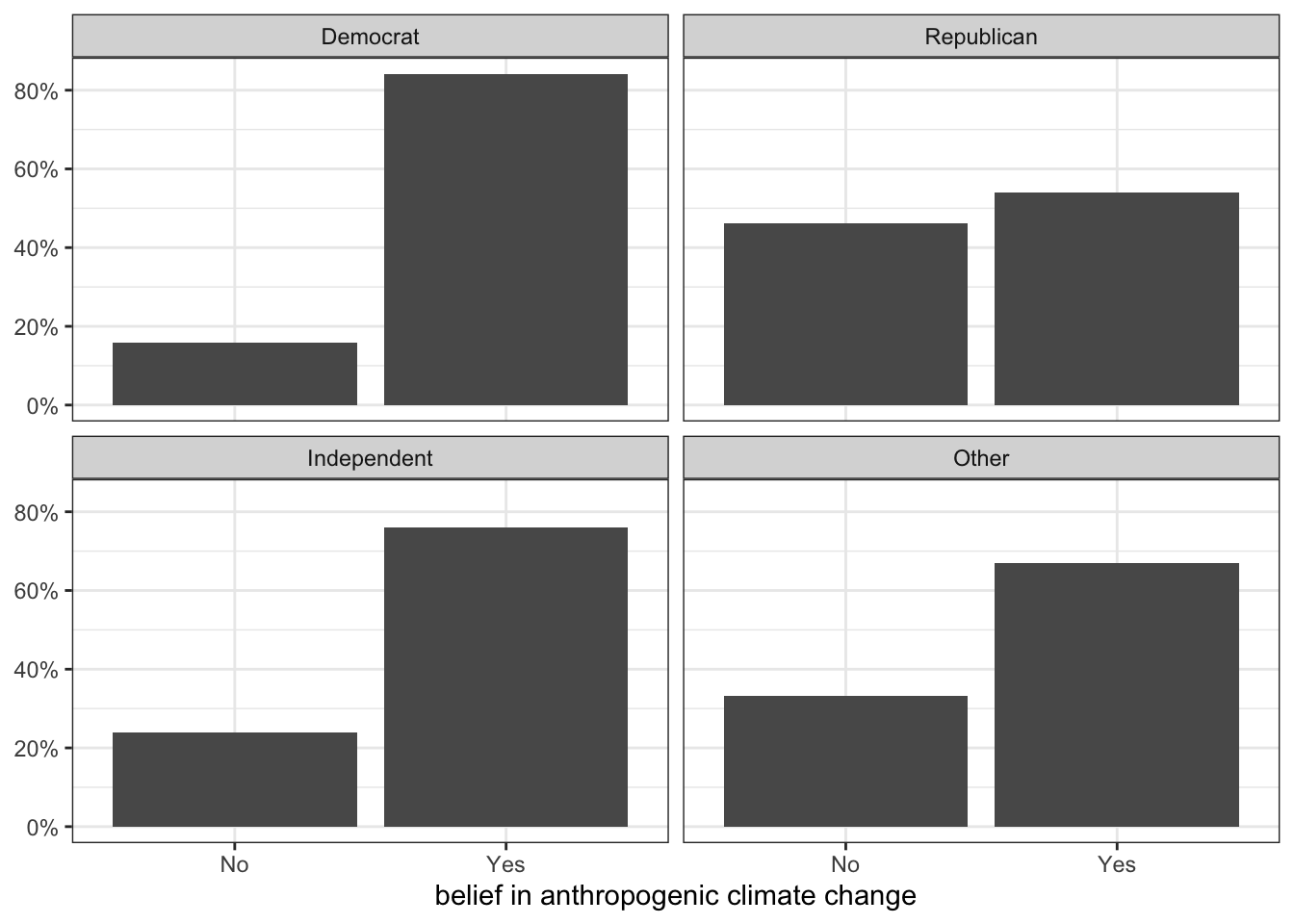
Figure 3.1 is a comparative barplot. Each panel shows the distribution of climate change beliefs for respondents with that particular party affiliation. What we are interested in is whether the distributions looks different across each panel. In this case, because there were only two categories of the response variable, we only really need to look at the heights of the bar for one category to see the variation across party affiliation, which is substantial.
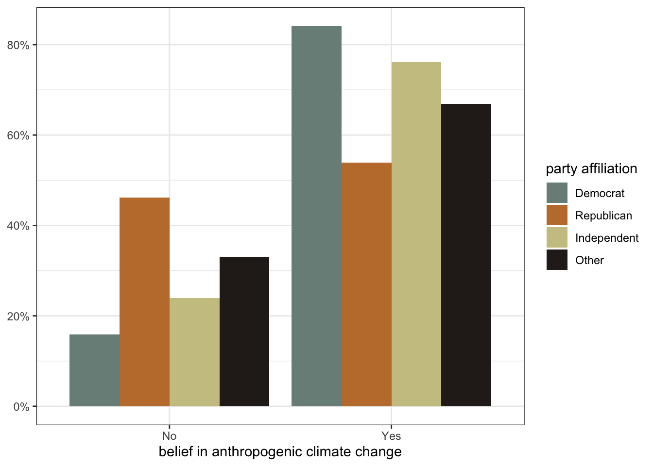
Faceting is one way to get a comparative barplot. Another approach is to use color on a single figure to look at differences.
ggplot(politics, aes(x=globalwarm, y=after_stat(prop),
1                     group=party, fill=party))+
2  geom_bar(position = "dodge")+
  scale_y_continuous(labels = scales::percent)+
3  scale_fill_viridis_d()+
  labs(x="belief in anthropogenic climate change", y=NULL,
       fill="party affiliation")+
theme_bw()group=1 (all one group), I am now grouping by the party variable. This will calculate correct conditional distributions of the globalwarm variable by party affiliation. I also add another aesthetic here of fill=party. This means that the fill color of the bars will vary by party affiliation.
geom_bar as usual. However, if I specify this geom without an argument, the bars for each party will end up stacked on top of each other, which is not what I want. The position="dodge" argument tells ggplot to stack these next to each other instead (think of dodging shapes in Tetris).
scale_fill_* command. In this case, I am using a built-in palette called viridis that is known to be colorblind safe. The callout below provides more information on using other color schemes.
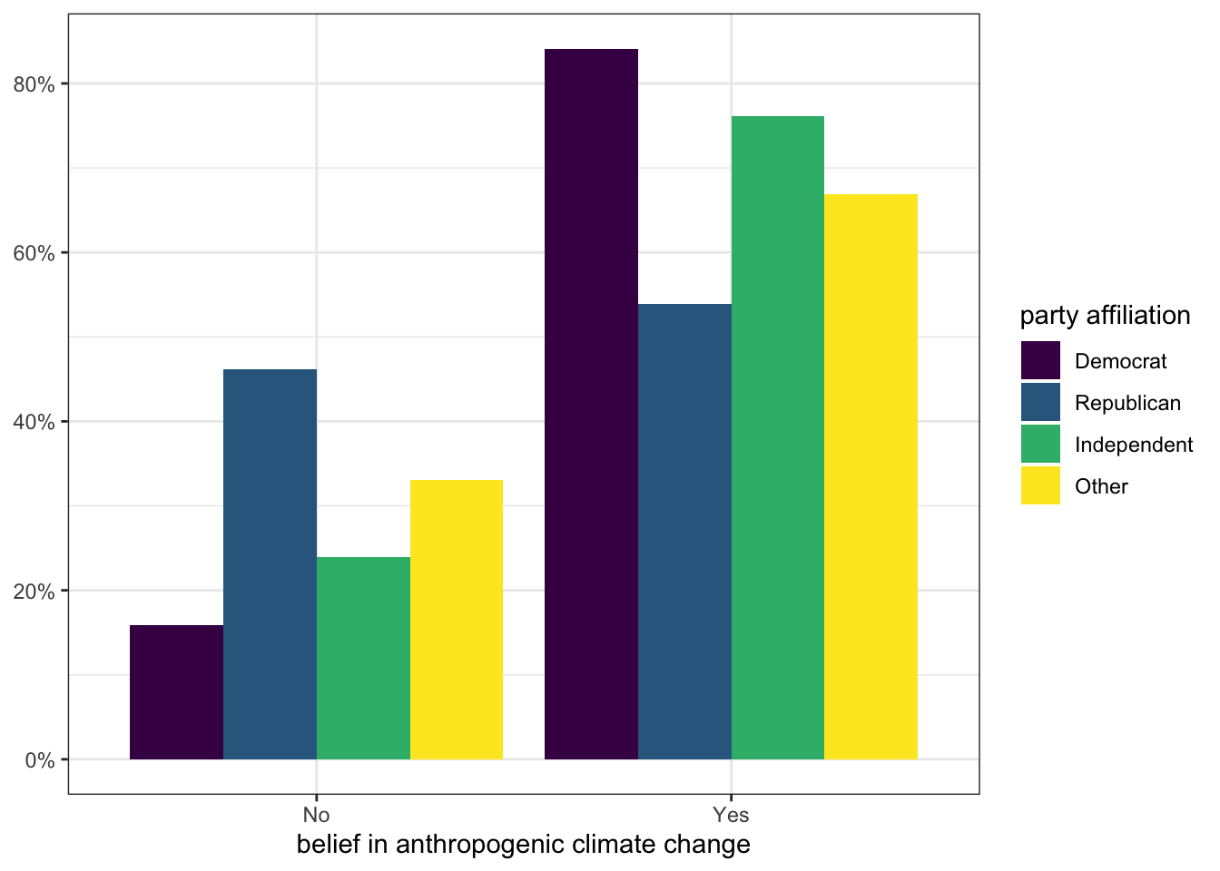
In this figure, the colors indicate each party affiliation and we plot the bars for each different affiliation next to each other. This approach allows us to easily compare the proportion for each group. For example, I can see that Democrats have the largest proportion in the “Yes” column and Republicans have the smallest proportion.
In the previous chapter, I showed you how to color geoms using the fill and col arguments. You will notice in the comparative barplot above that we are using color in a different way. Color is now one of the aesthetics that we use to add information to the plot, not just style. In this case, the fill color indicated which political party a given bar represents. When we use color in this way, we can’t just define a single color. Instead we need to define a color palette that contains at least as many colors as we have categories (in this case four). If we don’t specify a color palette, ggplot will use a default one.
We can select from some built-in color palettes, we can design our own, or we can install one of the many color palettes that are available online. However we do it, we will need to use some form of a scale_fill_ or scale_color_ command depending on whether the aesthetic is for a fill or col. You will notice above that I am using scale_fill_viridis_d. This uses a built-in color scheme known as viridis which is considered to be a professional quality and colorblind-safe color palette. This is the color palette you will see throughout this book.
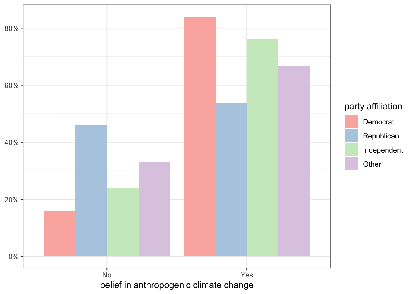
You can also use another command called scale_fill_brewer or scale_color_brewer which will give you several built-in palettes to choose from. Specifically, it provides the following color palettes by name:
So, if I wanted to get the “Pastel1” qualitative color palette, I would use:
ggplot(politics, aes(x=globalwarm, y=after_stat(prop),
                     group=party, fill=party))+
  geom_bar(position = "dodge")+
  scale_y_continuous(labels = scales::percent)+
1  scale_fill_brewer(palette = "Pastel1")+
  labs(x="belief in anthropogenic climate change", y=NULL,
       fill="party affiliation")+
theme_bw()palette argument with the name of one of the built-in color palettes, I can change the color scheme.
If you prefer to roll your own color scheme, you can use the scale_fill_manual or scale_color_manual commands to provide a list of built-in R color names or hex codes in the values argument. For example:
ggplot(politics, aes(x=globalwarm, y=after_stat(prop),
                     group=party, fill=party))+
  geom_bar(position = "dodge")+
  scale_y_continuous(labels = scales::percent)+
1  scale_fill_manual(values=c("royalblue","tomato","thistle","seagreen"))+
  labs(x="belief in anthropogenic climate change", y=NULL,
       fill="party affiliation")+
theme_bw()c() command. Just remember that you need at least as many colors as the number of categories you have.
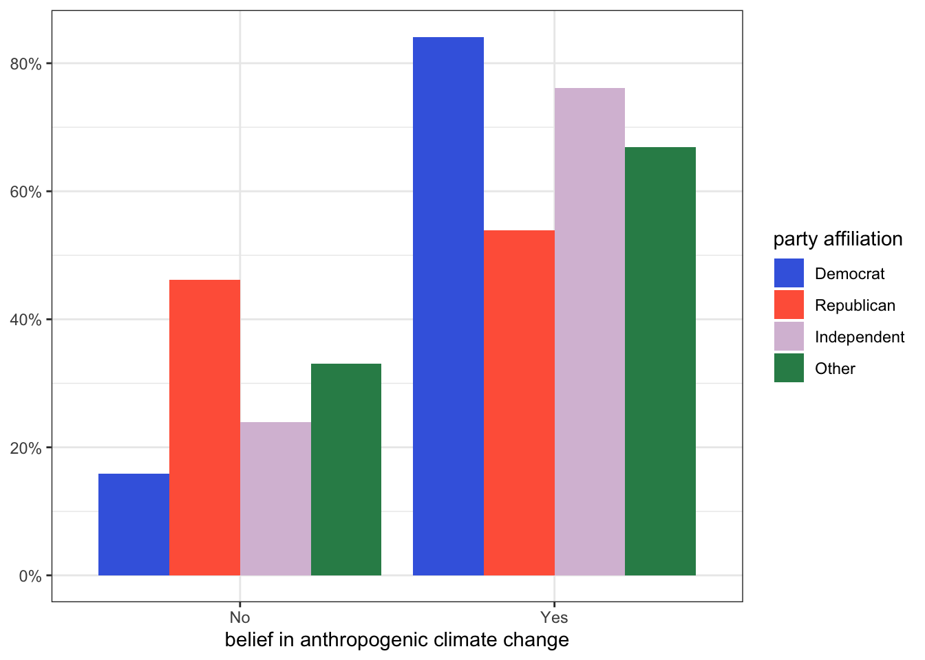
In this case, the manual option is useful because there is a well-known color association for the two major parties that will help readers understand the figure.
A final option is to install an optional package with additional color palettes. There are many packages to choose from here, but my personal favorite is the Wes Anderson Palettes package which will give you palettes for all Wes Anderson movies. For this to work, you have to first install the package:
install.packages("wesanderson")You will then need to load this package with the library command before using one of the custom palettes:
1library(wesanderson)
ggplot(politics, aes(x=globalwarm, y=after_stat(prop),
                     group=party, fill=party))+
  geom_bar(position = "dodge")+
  scale_y_continuous(labels = scales::percent)+
2  scale_fill_manual(values=wes_palette("Moonrise2"))+
  labs(x="belief in anthropogenic climate change", y=NULL,
       fill="party affiliation")+
theme_bw()scale_fill_manual but then use the wes_palette command with a palette name to get the right colors. Type wesanderson::wes_palettes into the console to see a full list of palettes.
Lets try an example with more than two categories. For this example, I want to know whether there was a difference in passenger class by gender on the Titanic. I start with a comparative barplot:
ggplot(titanic, aes(x=pclass, y=after_stat(prop), group=1))+
  geom_bar()+
  facet_wrap(~sex)+
  scale_y_continuous(labels = scales::percent)+
  labs(x="passenger class", y=NULL)+
  theme_bw()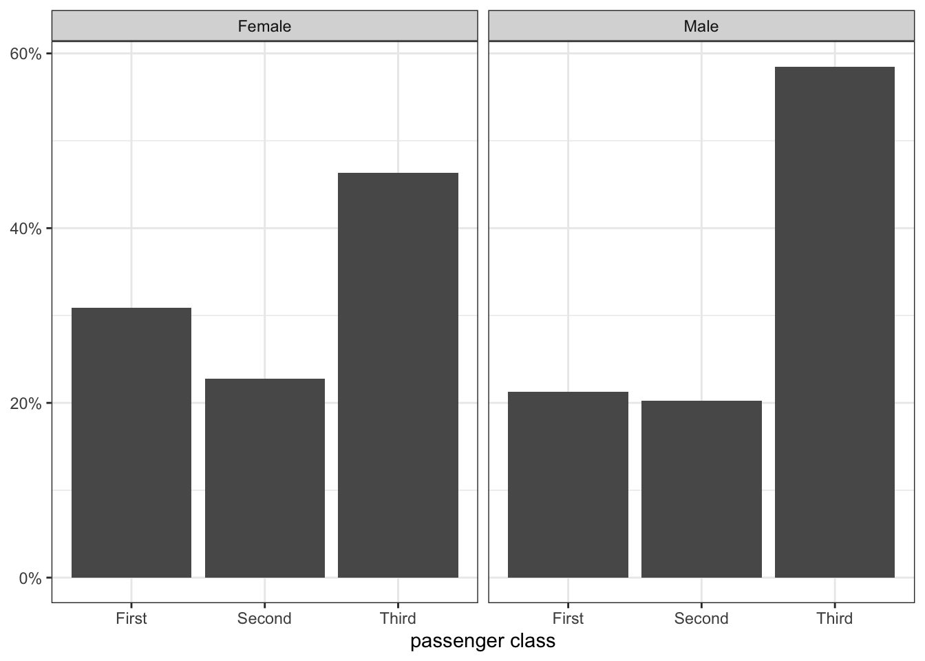
I can also calculate the conditional distributions by hand using prop.table:
round(prop.table(table(titanic$sex, titanic$pclass),1),3)*100
         First Second Third
  Female  30.9   22.7  46.4
  Male    21.2   20.3  58.5
As these numbers and Figure 3.6 show, the distribution of men and women by passenger class is very different. Women were less likely to be in third class and more likely to be in first class than men, while about the same percent of men and women were in second class.
We can also use the odds ratio to measure the association between two categorical variables. The odds ratio is not a term of everyday speech, but it is a critical concept in all kinds of scientific research.
Lets take the different distributions of climate change belief for Democrats and Republicans. About 84% of Democrats were believers, but only 54% of Republicans were believers. How can we talk about how different these two numbers are from one another? We could subtract one from the other or we could take the ratio by dividing one by the other. However, both of these approaches have a major problem. Because the percents (and proportions) have minimum and maximum values of 0 and 100, as you approach those boundaries the differences necessarily have to shrink because one group is hitting its upper or lower limit. This makes it difficult to compare percentage or proportional differences across different groups because the overall average proportion across groups will affect the differences in proportion.
Odds ratios are a way to get around this problem. To understand odds ratios, you first have to understand what odds are. All probabilities (or proportions) can be converted to a corresponding odds. If you have a \(p\) probability of success on a task, then your odds \(O\) of success are given by:
\[O=\frac{p}{1-p}\]
The odds are the ratio of the probability of success to the probability of failure. This tells you how many successes you expect to get for every one failure. Lets say a baseball player gets a hit 25% of the time that the player comes up to bat (a batting average of 250). The odds are then given by:
\[O=\frac{0.25}{1-0.25}=\frac{0.25}{0.75}=0.33333\]
The hitter will get, on average, 0.33 hits for every one out. Alternatively, you could say that the hitter will get one hit for every three outs.
Re-calculating probabilities in this way is useful because unlike the probability, the odds has no upper limit. As the probability of success approaches one, the odds will just get larger and larger.
We can use this same logic to construct the odds that a Democratic and Republican respondent, respectively, will be climate change believers. For the Democrat, the probability is 0.841, so the odds are:
\[O=\frac{0.841}{1-0.841}=\frac{0.841}{0.159}=5.289\]
Among Democrats, there are 5.289 believers for every one denier. Among Republicans, the probability is 0.539, so the odds are:
\[O=\frac{0.539}{1-0.539}=\frac{0.539}{0.461}=1.169\]
Among Republicans, there are 1.169 believers for every one denier. This number is close to “even” odds of 1, which happen when the probability is 50%.
The final step here is to compare those two odds. We do this by taking their ratio, which means we divide one number by the other:
\[\frac{5.289}{1.169}=4.52\]
This is our odds ratio. How do we interpret it? This odds ratio tells us how much more or less likely climate change belief is among Democrats than Republicans. In this case, I would say that “the odds of belief in anthropogenic climate change are 4.52 times higher among Democrats than Republicans.” Note the “times” here. This 4.52 is a multiplicative factor because we are taking a ratio of the two numbers.
You can calculate odds ratios from conditional distributions just as I have done above, but there is also a short cut technique called the cross-product. Lets look at the two-way table of party affiliation but this time just for Democrats and Republicans. For reasons I will explain below, I am going to reverse the ordering of the columns so that believers come first.
| party | Believer | Denier |
|---|---|---|
| Democrat | 1238 | 234 |
| Republican | 666 | 570 |
The two numbers in blue are called the diagonal and the two numbers in red are the reverse diagonal. The cross-product is calculated by multiplying the two numbers in the diagonal by each other and multiplying the two numbers in the reverse diagonal together and then dividing the former product by the latter:
\[\frac{1238*570}{666*234}=4.53\]
I get the exact same odds ratio (with some rounding error) as above without having to calculate the proportions and odds themselves. This is a useful shortcut for calculating odds ratios.
The odds ratio that you calculate is always the odds of the first row being in the first column relative to those odds for the second row. Its easy to show how this would be different if I had kept the original ordering of believers and deniers:
| party | Denier | Believer |
|---|---|---|
| Democrat | 234 | 1238 |
| Republican | 570 | 666 |
\[\frac{234*666}{570*1238}=0.22\]
I get a very different odds ratio, but that is because I am calculating something different. I am now calculating the odds ratio of being a denier rather than a believer. So I would say that the “the odds of denial of anthropogenic climate change among Democrats are only 22% as high as the odds for Republicans.” In other words, the odds of being a denier are much lower among Democrats.
An odds ratio less than one, like the example above, indicates that the odds (in this case of climate change denial) are smaller for the top category (in this case, Democrats) than the bottom category. We are being told that to get the odds for Democrats, we multiply the odds for Republicans by 0.22. When you multiply by a number less than one, it gets smaller.
In terms of interpretation, we can use two different approaches. In the first approach, we use this number directly and indicate that the odds of climate change denial for Democrats are only 22% as high as the odds for Republicans.
Another approach is to more specifically call out the negative nature of the relationship by describing how much lower the odds are for Democrats compared to Republicans. If one group’s odds are only 22% as high as another, how much lower are they, in percentage terms? The answer is to take \(22-100\) to get \(-78\). So, we would say that the odds of climate change denial are 78% lower among Democrats than Republicans.
In general, we can use a simple formula to express the odds ratio in percentage difference terms. If we have an odds ratio given by \(R\), then:
\[100*(R-1)\]
The table below shows some examples of how this formula can be applied to understand the percentage change in the odds of the outcome for a given odds ratio.
| R | % change |
|---|---|
| 0.1 | -90% |
| 0.2 | -80% |
| 0.5 | -50% |
| 1 | 0% |
| 1.1 | 10% |
| 1.25 | 25% |
| 1.5 | 50% |
| 2 | 100% |
| 4 | 300% |
While this approach can be useful, it also has limits in terms of the ease of interpretation when you get to high positive odds ratios. For example, an odds ratio of 2 is probably easier to interpret for most people as a “doubling” of the odds rather than a 100% increase in the odds. Similarly, an odds ratio of four is probably easier to interpret as a quadrupling of the odds than as a 300% increase in the odds.
Interestingly, if you take the original odds ratio of 4.53 and invert it by taking 1/4.53, you will get 0.22. The odds ratio of denial is just the inverted mirror image of the odds ratio of belief. So both of these numbers convey the same information. The important thing to remember for a correct interpretation is that you are always calculating the odds ratio of being of the category of the first row being in the category of the first column, whatever category that may be.
Measuring association between a quantitative and categorical variable is fairly straightforward. We want to look for differences in the distribution of the quantitative variable at different categories of the categorical variable. For example, if we were interested in the gender wage gap, we would want to compare the distribution of wages for women to the distribution of wages for men. There are two ways we can do this. First, we can graphically examine the distributions using the techniques we have already developed, particularly the boxplot. Second, we can compare summary measures such as the mean of the quantitative variable across categories of the categorical variable.
We could compare entire histograms of the quantitative variable across different categories of the categorical variable, but this is often too much information. A simpler method is to use comparative boxplots. Comparative boxplots construct boxplots of the quantitative variable across all categories of the categorical variable and plot them next to each other for easier comparison. We can easily construct a comparative boxplot examining differences in the distribution of movie runtime across different movie genres in ggplot with the following code:
1ggplot(movies, aes(x=reorder(genre, runtime, median), y=runtime))+
  geom_boxplot(fill="seagreen", outlier.color = "red")+
2  labs(x=NULL, y="movie runtime in minutes")+
3  coord_flip()+
theme_bw()x aesthetic, which in this case is genre. However, I am also going to use the reorder command to reorder the categories of genre by the median of the runtime variable. The syntax for this command is reorder(category_variable, quantitative_variable, command) where category_variable is the categorical variable we want to reorder, quantitative_variable is the variable we want to use to determine the new order, and command is the command we want to run on the quantitative_variable to determine the new ordering.
x="genre" for the x-axis label, but I feel like the names of this variable combined with the title are self-explanatory. So, I use x=NULL to suppress an x-axis label altogether.
coord_flip() ensures that the genre labels won’t run into each other on the x-axis.
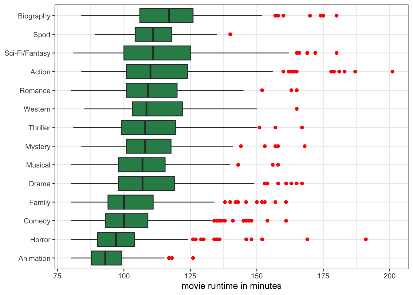
Figure 3.7 now contains a lot of information. At a glance, I can see which genres had the longest median runtime and which had the shortest. For example, I can see that biographical movies are substantially longer on average than all other movie genres. At the other end of the spectrum, animation movies are, on average, the shortest.
I can also see how much variation in runtime there is within movies by comparing the width of the boxes. For example, I can see that there is relatively little variation in runtime for animation movies, and the most variation in runtime among sci-fi/fantasy movies. I can also see some of the extreme outliers by genre, which are all in the direction of really long movies.
We can also establish a relationship by looking at differences in summary measures. Implicitly, we are already doing this in the comparative boxplot when we look at the median bars across categories. However, in practice it is more common to compare the mean of the quantitative variable across different categories of the categorical variable, which we call conditional means. In R, you can get these conditional means using the tapply command like so:
tapply(movies$runtime, movies$genre, mean) Action Animation Biography Comedy Drama
114.63260 94.16250 116.69274 101.46277 109.22591
Family Horror Musical Mystery Other
104.00435 98.63196 108.14724 111.17949 NA
Romance Sci-Fi/Fantasy Sport Thriller Western
111.18696 113.88009 112.28000 110.49315 113.76923 The tapply command takes three arguments. The first argument is the quantitative variable for which we want a statistic. The second argument is the categorical variable. The third argument is the command for the statistic we want to caculate for the quantitative variable, which, in this case, is the mean. The output is the mean movie runtime by genre.
If we want a quantitative measure of how genre and runtime are related we can calculate a mean difference. This number is simply the difference in means between any two categories. For example, action movies are 114.6 minutes long, on average, while horror movies are 98.6 minutes long, on average. The difference is \(114.6-98.6=16\). Thus, we can say that, on average, action movies are 16 minutes longer than horror movies.
We could have reversed that differencing to get \(98.6-114.6=-16\). In this case, we would say that horror movies are 16 minutes shorter than action movies, on average. Either way, we get the same information. However, its important to keep track of which number applies to which category when you take the difference, so that you get the interpretation correct.
You will notice that when I interpret these mean differences, I always include the phrase “on average.” It’s important to include this to avoid overly deterministic and monolithic statements. In the previous example, while action movies have a higher mean movie runtime than horror movies, some horror movies are also long and some action movies are also short (as evidenced in Figure 3.7). The mean is, by intent, collapsing all of this individual level heterogeneity to get a summary measure. We don’t want to incorrectly imply that all action movies are longer than all horror movies, but rather that, “on average,” action movies are longer than horror movies.
This issue becomes even more important when we go from talking about movies to the kinds of social issues that sociologists often study. For example, lets compare the wages of men and women from the earnings data:
tapply(earnings$wages, earnings$gender, mean) Male Female
26.20302 22.26460 We can see from the results that men make about $3.94 more an hour than women, on average. However, this does not mean there are not cases in the data where some women are making more than lots of men. There are many such cases! We want to capture the underlying social inequality here while also recognizing considerable underlying heterogeneity. The term “on average” allows us to do this.
The tapply command can be used to get other statistics as well. We could, for example, calculate conditional medians rather than conditional means. To do so, we just need to change the third argument to median:
tapply(movies$runtime, movies$genre, median) Action Animation Biography Comedy Drama
110.0 93.0 117.0 100.0 107.0
Family Horror Musical Mystery Other
100.0 97.0 107.0 108.0 NA
Romance Sci-Fi/Fantasy Sport Thriller Western
109.0 111.0 111.0 108.0 108.5 We can use these numbers to calculate the median difference in runtime between genres. In this case, action movies are, on average, 13 minutes longer than horror movies (110-97).
The case of quantitative variables is the most developed statistically because both measures are quantitative and therefore calculations are more straightforward. For graphical analysis of the association between the two variables, we construct a scatterplot. For a quantitative assessment of the association between the two variables, we calculate a correlation coefficient.
We can examine the relationship between two quantitative variables by constructing a scatterplot. A scatterplot is a two-dimensional graph. We put one variable on the x-axis and the other variable on the y-axis. We can put either variable on either axis, but we often describe the variable on the x-axis as the independent variable and the variable on the y-axis as the dependent variable. The dependent variable is the variable whose outcome we are interested in predicting. The independent variable is the variable that we treat as the predictor of the dependent variable. For example, lets say we were interested in the relationship between income inequality and life expectancy. We are interested in predicting life expectancy by income inequality, so the dependent variable is life expectancy and the independent variable is income inequality.
The language of dependent vs. independent variable is causal, but its important to remember that we are only ever measuring the association. That association is the same regardless of which variable we set as the dependent and which we set as the independent. Thus, the selection of the dependent and independent variable is more about which way it more intuitively makes sense to interpret our results.
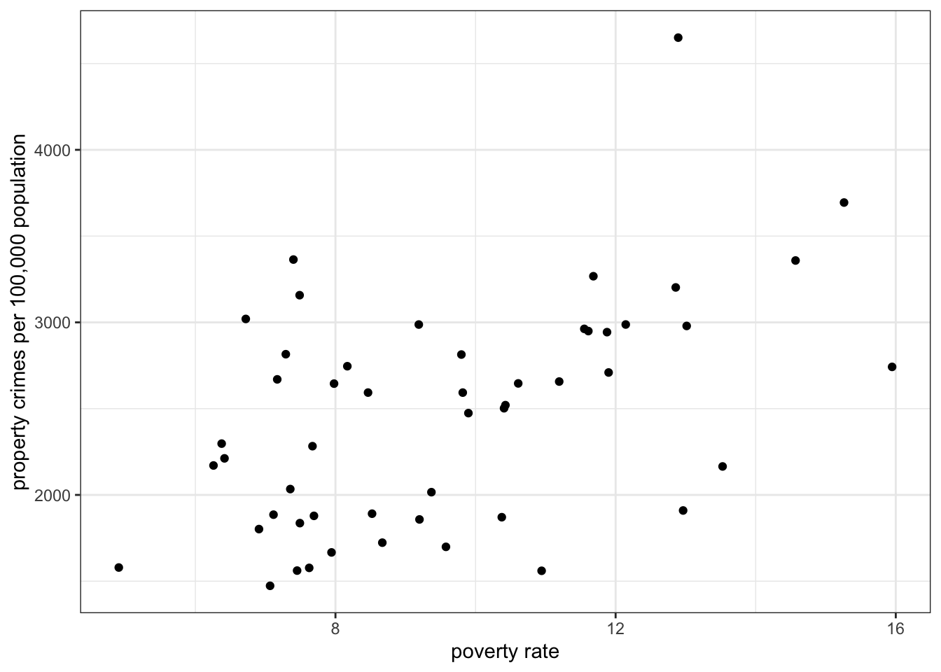
To construct the scatterplot, we plot each observation as a point, based on the value of its independent and dependent variable. For example, lets say we are interested in the relationship between the median age of the state population and violent crime in our crime data. Our first observation, Alabama, has a median age of 38.9 and a violent crime rate of 495.7 crimes per 100,000. This is plotted in Figure 3.8 below.
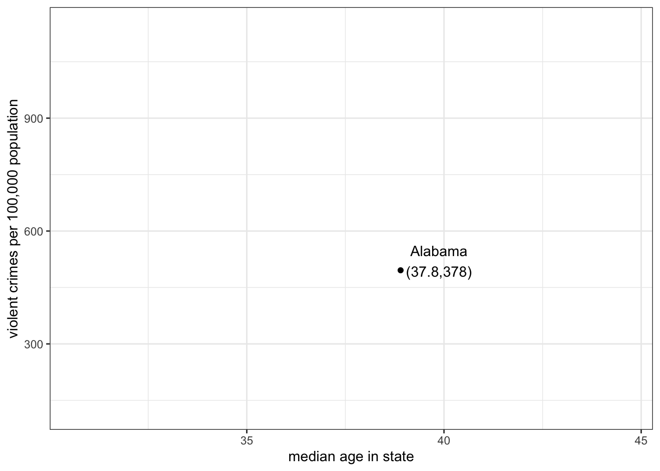
Note that I put median age on the x-axis here and crime rates on the y-axis because I am thinking of the age of the population as predicting, or explaning, crime rates, rather than vice versa.
If I repeat the process for all of my observations, I will get a scatterplot that looks like:

What are we looking for when we look at a scatterplot? There are four important questions we can ask of the scatterplot. First, what is the direction of the relationship? We refer to a relationship as positive if both variables move in the same direction. if \(y\) tends to be higher when \(x\) is higher and \(y\) tends to be lower when \(x\) is lower, then we have a positive relationship. On the other hand, if the variables move in opposite directions, then we have a negative relationship. If \(y\) tends to be lower when \(x\) is higher and \(y\) tends to be higher when \(x\) is lower, then we have a negative relationship. In the case above, it seems like we have a generally negative relationship. States with higher median age tend to have lower violent crime rates.
Second, is the relationship linear? I don’t mean here that the points fall exactly on a straight line (which is part of the next question) but rather does the general shape of the points appear to have any “curve” to it. If it has a curve to it, then the relationship would be non-linear. This issue will become important later, because our two primary measures of association are based on the assumption of a linear relationship. In this case, there is no evidence that the relationship is non-linear.
Third, what is the strength of the relationship. If all the points fall exactly on a straight line, then we have a very strong relationship. On the other hand, if the points form a broad elliptical cloud, then we have a weak relationship. In practice, in the social sciences, we never expect our data to conform very closely to a straight line. Judging the strength of a relationship visually often takes practice. I would say the relationship above is of moderate strength.
Fourth, are there outliers? We are particularly concerned about outliers that go against the general trend of the data, because these may exert a strong influence on our later measurements of association. In this case, there are two clear outliers labeled on the plot - Washington DC and Utah. Washington DC is an outlier because it has an extremely high level of violent crime relative to the rest of the data. Although it is an outlier, its placement is still generally consistent with the overall relationship - its median age is on the young side and its violent crime rate is high.Utah, on the other hand, is an outlier that goes against the general trend, because it has by far the youngest population, but also one of the lowest violent crime rates. This pattern is driven by Utah’s predominant Mormon population, who have high rates of fertility (leading to a young population) and whose church communities are able to exert a remarkable degree of social control over these young populations.
The code below shows how to create Figure 3.10.
1ggplot(crimes, aes(x=poverty_rate, y=property_rate))+
2  geom_point()+
  labs(x="poverty rate", y="property crimes per 100,000 population")+
theme_bw()x and y variable.
geom_point.
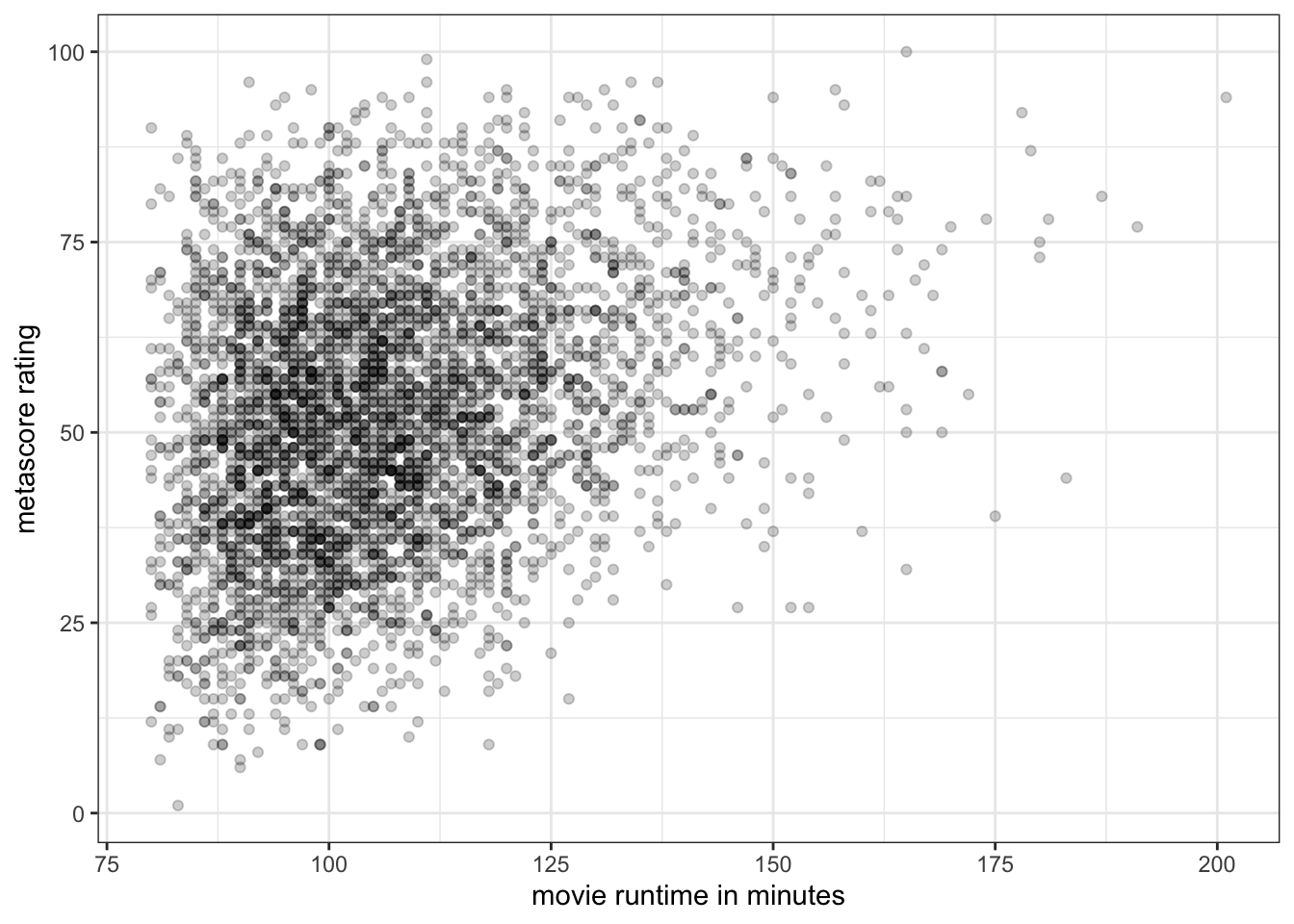
Sometimes with large datasets, scatterplots can be difficult to read because of the problem of overplotting. This happens when many data points overlap, so that its difficult to see how many points are showing. For example:
ggplot(movies, aes(x=runtime, y=metascore))+
  geom_point()+
  labs(x="movie runtime in minutes", y="metascore rating")+
  theme_bw()
In Figure 3.11, we have a difficult time understanding the density of points in the 90-120 minute range Because so many movies are in this range. These points are being plotted directly over one another, leading to a big dark blob on the plot.
One way to address this is to makre the points semi-transparent, so that as more and more points are plotted in the same place, the shading will become darker. We can do this in geom_point by setting the alpha argument to something less than one but greater than zero:
ggplot(movies, aes(x=runtime, y=metascore))+
1  geom_point(alpha=0.2)+
  labs(x="movie runtime in minutes", y="metascore rating")+
theme_bw()alpha=0.2, we make the points semi-transparent, so that we will see darker points on the plot where points overlap.
Overplotting can also be a problem with discrete variables because these variables can only take on certain values which will then exactly overlap with one another. This can be seen in Figure 3.13 which shows the relationship between age and wages in the earnings data.
ggplot(earnings, aes(x=age, y=wages))+
  geom_point()+
  labs(x="age", y="hourly wage")+
  theme_bw()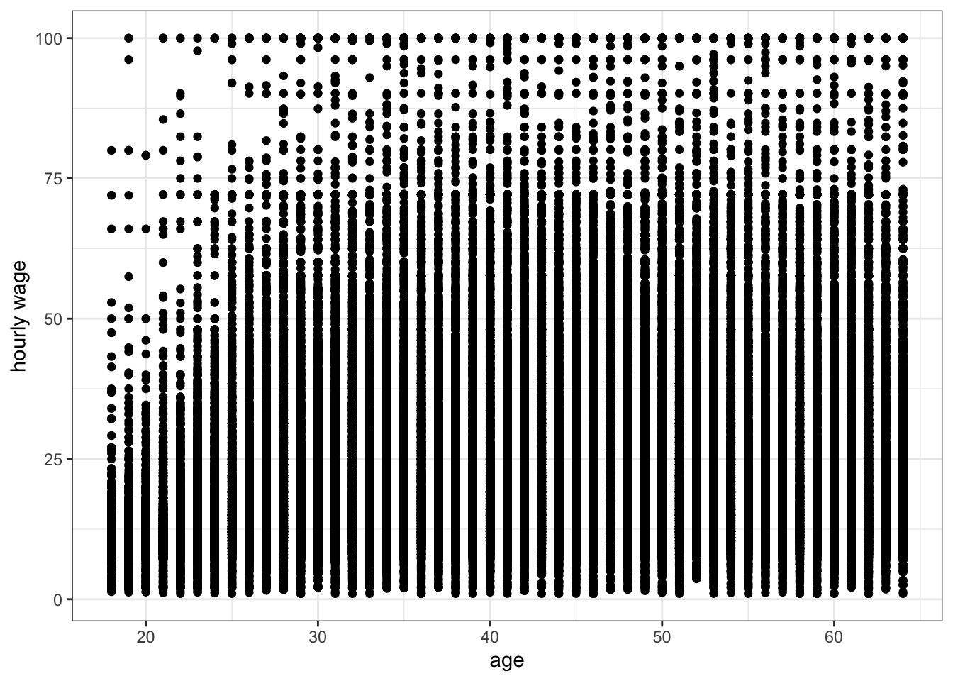
Because age is discrete, all points are stacked up in vertical bars that are difficult to understand. One solution to this problem is to jitter each point a little bit by adding a small amount of randomness to the x and y values. The randomness added won’t affect our sense of the relationship but will reduce the issue of overplotting. We can do this simply in ggplot by replacing the geom_point command with geom_jitter:
ggplot(earnings, aes(x=age, y=wages))+
  geom_jitter()+
  labs(x="age", y="hourly wage")+
  theme_bw()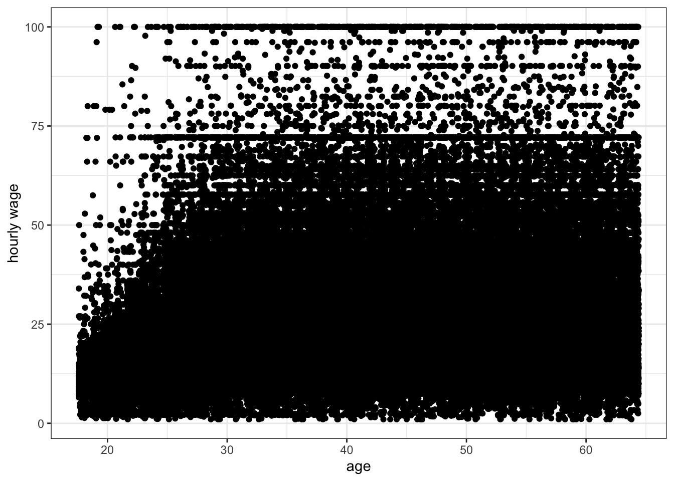
Jittering helped get rid of those vertical lines, but there are so many observations that we still have problems of understanding the density of points for most of the plot. If we add semi-transparency, we should be better able to understand the scatterplot.
ggplot(earnings, aes(x=age, y=wages))+
  geom_jitter(alpha=0.01)+
  labs(x="age", y="hourly wage")+
theme_bw()While graphical analysis is always a good first step to measuring association, it can sometimes be difficult to judge the actual degree of association in scatterplots. This is particularly true with large datasets or when the distribution of one or both variables is heavily skewed. To get a more concrete sense of the degree of association, we calculate the correlation coefficient, also known as r.
The formula for the correlation coefficient is:
\[r=\frac{1}{n-1}\sum_{i=1}^n (\frac{x_i-\bar{x}}{s_x}*\frac{y_i-\bar{y}}{s_y})\]
That looks complicated, but lets break it down step by step. We will use the association between median age and violent crimes as our example.
The first step is to subtract the means from each of our \(x\) and \(y\) variables. This will give us the distance above or below the mean for each variable.
diffx <- crimes$median_age-mean(crimes$median_age)
diffy <- crimes$violent_rate-mean(crimes$violent_rate)
The second step is to divide these differences from the mean of \(x\) and \(y\) by the standard deviation of \(x\) and \(y\), respectively.
diffx.sd <- diffx/sd(crimes$median_age)
diffy.sd <- diffy/sd(crimes$violent_rate)
Now each of your \(x\) and \(y\) values has been converted from its original form into the number of standard deviations above or below the mean. This is often called standarization. By doing this, we have put both variables on the same scale and have removed whatever original units they were measured in (in our case, years of age and crimes per 100,000).
The third step is to to multiply each standardized value of \(x\) by each standardized value of \(y\).
product <- diffx.sd*diffy.sdWhy do we do this? First consider this scatterplot of our standardized \(x\) and \(y\):
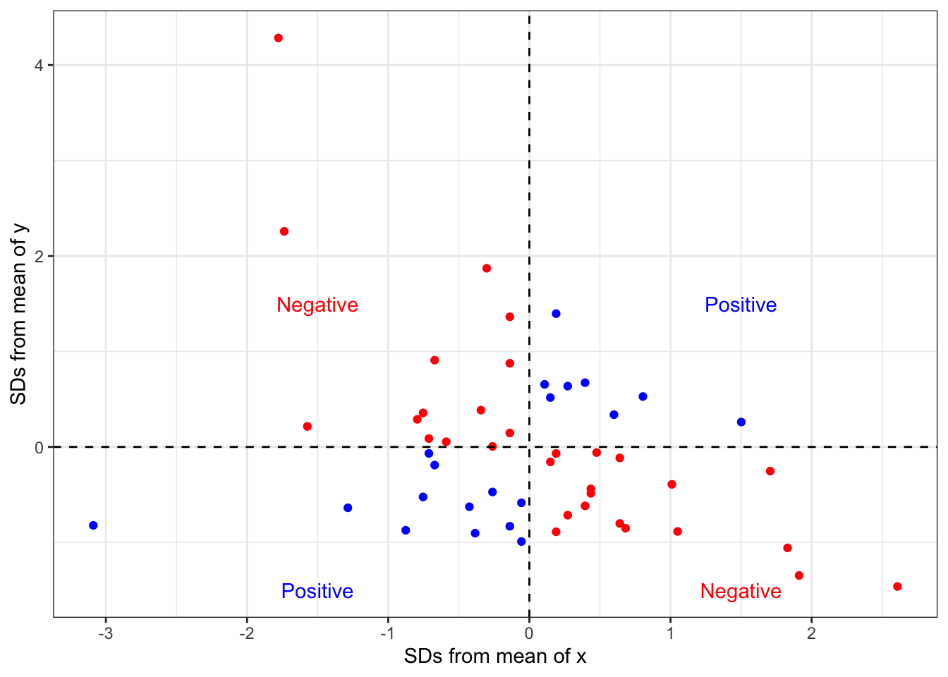
Points shown in blue have either both positive or both negative \(x\) and \(y\) values. When you take the product of these two numbers, you will get a positive product. This is evidence of a positive relationship. Points shown in red have one positive and one negative \(x\) and \(y\) value. When you take the product of these two numbers, you will get a negative product. This is evidence of a negative relationship.
The final step is to add up all this evidence of a positive and negative relationship and divide by the number of observations (minus one).
sum(product)/(length(product)-1)[1] -0.3784346This final value is our correlation coefficient. We could have also calculated it by using the cor command:
cor(crimes$median_age, crimes$violent_rate)[1] -0.3784346How do we interpret this correlation coefficient? It turns out the correlation coefficient r has some really nice properties. First, the sign of r indicates the direction of the relationship. If r is positive, the association is positive. If r is negative, the association is negative. if r is zero, there is no association.
Second, r has a maximum value of 1 and a minimum value of -1. These cases will only happen if the points line up exactly on a straight line, which never happens with social science data. However, it gives us some benchmark to measure the strength of our relationship. Figure 3.17 shows simulated scatterplots with different r in order to help you get a sense of the strength of association for different values of r.
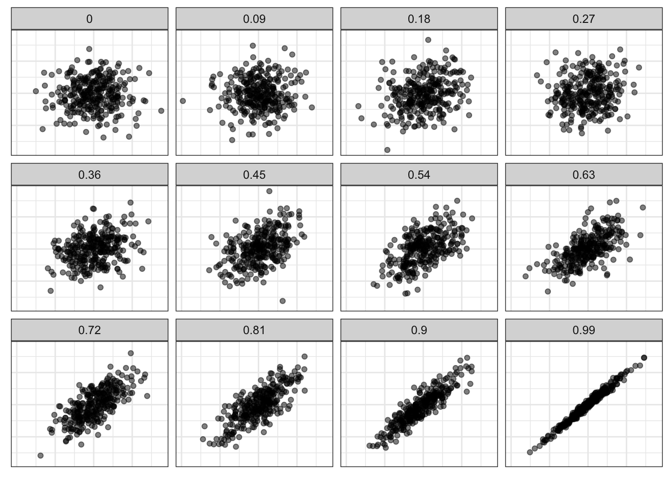
In Figure 3.17, I am only showing you positive relationships, but remember that the same thing happens in reverse when r is negative. A more negative value of r indicates a stronger relationship than a less negative value of r. An r of -1 fits a perfect straight line of a negative relationship. So, the absolute value of r is what matters in establishing the strength of the relationship.
Third, r is a unitless measure of association. It can be compared across different variables and different datasets in order to make a comparison of the strength of association. For example, the correlation coefficient between unemployment and violent crimes is 0.53. Thus, violent crimes are more strongly correlated with unemployment than with median age (0.53>0.38). The association between median age and property crimes is -0.49, so median age is more strongly related to property crimes than violent crimes (0.49>0.38).
There are also some important cautions when using the correlation coefficient. First, the correlation coefficient will only give a proper measure of association when the underlying relationship is linear. If there is a non-linear (curved) relationship, then r will not correctly estimate the association. Second, the correlation coefficient can be affected by outliers. We will explore this issue of outliers and influential points more in later chapters.